Designing Engaging Presentations: Color, Font, Layout & Media Tips
This guide provides tips on choosing backgrounds, fonts, layouts, and media files for better presentations. Learn how to create visually appealing slides that enhance your message and engage your audience effectively.

Designing Engaging Presentations: Color, Font, Layout & Media Tips
E N D
Presentation Transcript
Screen Design A Guide to Better Presentations
Choosing Your Background • Be sure to choose a style and colour consistent with your market • a slick, cool colour for a business or company presentation • a bright colourful back ground for a young child • try not to choose contrasting or violent colours - these usually distract the viewer from the image/text • try not to overwhelm the viewer with a busy background
Good Example The background is simple and uncluttered
Bad Example Cluttered and busy background
Choosing your Font Try to select a simple style Match the style to the theme contrast the font colour with the background as much as possible Keep to one font as much as possible use colour to denote headings
Good Example Clean font Style suits background Easy to read Colour contrasts
Bad Example text layout confusing • Colourinappropriate Bad font choice Styles toovaried
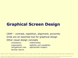
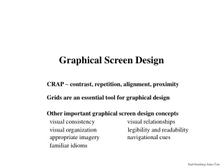
Layout Tips Keep objects balanced Avoid ‘tension points’ Use rule of thirds when possible Be aware of western reading dynamic Use scale and proportion for visual effect
Good Example • Slide is balanced • Reads left to right • Rule of thirds observed • No tension points • Scaled well
Bad Example • Unbalanced • Tension points at edge of text • Image too close to edge • to central - no thirds observed • Scale of images the same
Sound Files • Appropriate to the viewer • set at the correct volume Sound files need to be: • not too long
Video Files Video files need to be carefully selected • Keep clips short and informative • Clips should support the flow of the presentation
Remember • Unity of slides - variation should be limited • Smoothness of transition - take time to make transitions well timed and easy to watch • Focus should be on the content, not the presenters skill • Your presentation can only support your delivery - you still have to do the talking!