Download
1 / 4
40 likes | 185 Vues
Here we’ll discover some important aspects of responsive upscaling to develop a site optimized for large screens.

E N D
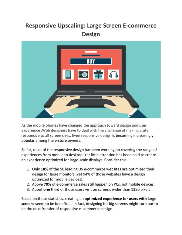
Responsive Upscaling: Large Screen E-commerce Design As the mobile phones have changed the approach toward design and user experience .Web designers have to deal with the challenge of making a site responsive to all screen sizes. Even responsive design is becoming increasingly popular among the e-store owners. So far, most of the responsive design has been working on covering the range of experiences from mobile to desktop. Yet little attention has been paid to create an experience optimized for large-scale displays. Consider this: 1.Only 18% of the 50 leading US e-commerce websites are optimized their design for large monitors (yet 94% of those websites have a design optimized for mobile devices). 2.Above 70% of e-commerce sales still happen on PCs, not mobile devices. 3.About one third of those users visit on screens wider than 1350 pixels Based on these statistics, creating an optimized experience for users with large screens seem to be beneficial. In fact, designing for big screens might turn out to be the next frontier of responsive e-commerce design.
In this article, we’ll discover some important aspects of responsive upscaling to develop a site optimized for large screens. We’ll also discuss some core principles, along with 11 ideas for upscaling different parts of the e-commerce Design. This article was originally published by the Baymard Institute. Make sure your e-commerce site will use all the space available on larger screens and your site would display the exact information when it is seen on different devices or so that it is optimized for the screen it is being displayed on. If your content is optimized for standard screens and below, you’ll notice that a lot of white space on either side of product listing page. Most e-commerce sites display their content according to a pre-determined, aesthetics-inspired product vertical. In that case, users will need enlarged thumbnails to be able to evaluate the products more accurately. Responsive upscaling is the idea of utilizing the extra space to offer users a more meaningful browsing experience, rather than just leaving it unutilized and cramming all the content into a fraction of the screen. Core Principle behind Responsive Upscaling: Same Content, Different Packaging
There are two ways to utilize the extra space provided by large screens: Insertion of additional content– this content can only be seen by viewers with larger screen displays Representation of existing elements– the existing elements on the pages are redesigned to use the extra space e.g. changing layouts, scaling sizes etc. Besides this both rules have some flaws also. Like if there's content that isn't important for standard screen display, then it’s likely to be as unimportant for large screen display. Having a bigger screen doesn't mean the user wants to see unimportant details just to fill up space. Show the same content for all devices but “package” it differently. Ideas for Responsive Upscaling On an E-Commerce Website Keeping with these principles to carry out responsive upscaling for larger displays. Let’s look some of the ideas on the same: 1.Signup overlays– these can be in-lined to become less intrusive by placing a permanent dialog box alongside above-the-fold content. 2.Header/footer shortcuts– more links can additionally be added in panels or on the footers and headers. Of course, these links should still be accessible from their original locations on the homepage and/or menus.
3.Carousel slides– carefully add carousels slides on larger displays, so that other content isn’t affected, or simply have a multiple-image display where 2-3 slides are shown simultaneously. 4.Inlining Filled cart – place the user’s cart in a more visible location to remind them of what great products they have already chosen, followed by seamless access to the checkout process. 5.More product columns– as described above, displaying extra item in the extra space, which technically doesn’t serve as ‘new content’ to ensure the product list view is optimized. Conclusion: It’s quite interesting how e-commerce site owners optimize their designs for larger screens. Responsive upscaling will help you to give a large scale display users the same superior experience your standard desktop and mobile users are enjoying. Please check Responsive scaling web design template to see a good sample of website that's optimized for both large and small screens. If you have other ideas for optimizing e-commerce websites for larger screens? Share them in the comments section.