Typography
Typography. Type Family Classifications (Type Styles) Part 1 - Review Part 2 - How to Identify Type Characteristics (1 of 4). Typography. Part 1 - Review: Typography Term and History. Typography. Typography: The design and use of typefaces as a means of communication

Typography
E N D
Presentation Transcript
Typography Type Family Classifications (Type Styles) Part 1 - Review Part 2 - How to Identify Type Characteristics (1 of 4)
Typography Part 1 - Review: Typography Term and History
Typography • Typography: • The design and use of typefaces as a means of communication • The art of arranging type to create a design • The proper placement, positioning and specification of type to ensure maximum legibility and aesthetic appeal • Typography uses the typefaces and the whitespace around and through them to create a whole design
Monks ScribePen and Ink in Scriptorium • Earliest books were written on scrolls • During Middle Ages, manuscript books were produced by monks • With pen and ink in a copy room known as a scriptorium • Monks were not allowed to talk, nor correct mistakes. Which is why errors grew in each generation of a manuscript.
Pre-Gutenberg • Nearly all books were handwritten • Created by monks, scribes, priests and scholars • In abbeys, monasteries, churches and universities all over Europe
Block Print • There was printing before Gutenberg, block printing from wood and also stone • 1460s books incorporating pictures became popular in Europe
Typography The Beginning Moveable Type
Johann Gutenberg • Invented a better printing press and moveable type • Gutenberg’s Bible • Known as the 42-Line Bible • Every page has two columns with 42 lines of text • First copies printed in 1455 • 180 copies made • 48 are known to still exist
Johannes GutenbergPlaced 1st as Most Important in Millennium Movable Type Significances • Sped up the printing process (letters were pre-cast ready to use when needed) • Reusable type for other documents • Lowered cost for books and other documents • More people able to own them • More written communication and more literacy • Biography Channel’s “Top 100 People of the Millennium” • Life Magazine’s “People from the Millennium” • A book “1,000 Years, 1,000 People: Ranking the Men and Women Who Shaped the Millennium” by Agnes Hooper Gottlieb, Henry Gottlieb, Barbara Bowers, and Brent Bowers
Gutenberg’s Fonts • To resemble hand written manuscripts Gutenberg made several versions of the same characters • Movable and reusable type • Punches were made to reproduce the same letter again and again • Later other printers began to focus on the shape of individual characters (typography)
Typography Type Family Classifications (Type Styles) Part 2 - Type Characteristics
Type Family Classifications • More that 500 years of development • Each family displays distinct visual characteristics • Serifs and Bracketing • Stroke Variation (contrast) • X-height • Counters / Bowls
Type Classifications How to Identify Type Characteristics
Type Family Characteristics • Serifs • Little marks at the top and bottom of characters (letters) • Sans Serif • “No Serifs”
Type Family Characteristics • Bracketing • A curved or wedge-like connection between the stem and serif of some fonts • Not all serifs have bracketed serifs
Serifs and Bracketing • Top: Large bracketing - Baskerville (old style) • Bottom: No bracketing - Bodoni (modern)
Type Family Characteristics • Stem • The stem is the main, usually vertical stroke of a letter • The main diagonal portion of a letterform: N, M, or Y • Also known as:stroke, a main, heavy or thick stroke of a letter • Stroke • A straight or curved diagonal line • The stroke is secondary to the main stem(s) • Some letters with two diagonals: A or V have a stem and a stroke
Type Family Characteristics • Stroke Variation (Contrast) • The difference between the thick and thin strokes
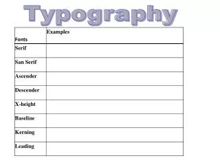
Type Family Characteristics • X-height • The height of a lowercase (small) letter x • Does not include ascenders or descenders • Ascender • Lowercase letters that extend above the x-height • Descender • Lowercase letters that extend below the baseline
Type Family Characteristics • Counters • The open space in a fully or partly closed area within a letter • Bowls • The curved stroke enclosing the counter • Examples: a,b,c,d,g,o,B,O,P,Q • counters and bowls can affect readability and an identifying factor for some typefaces
Review Questions • What is Typography? • The study and use of typefaces (and the white space around them) to create a design
Review Questions • What are Type families? • Large groupings of typefaces based on similar characteristics • Type families are also known as: • Typestyles
Review Questions • What are Serifs? • Little marks at the top and bottom of characters (letters) • Do all typestyles have serifs? • No, Sans Serif is a typestyle that has no serifs
Review Questions • What is Bracketing? • A curve or wedge-like connection between the stem/stroke and serif • Do all serifs have bracketing? • No
Review Questions • What is the main, usually vertical stroke of a letter? • A Stem • What is another name for Stem? • Stroke • Main Stroke • Thick Stroke • What is the diagonal (secondary) line? • Stroke • What is another name? • Thin Stroke
Review Questions • What is the open space in a fully or partly closed area of a letter? • Counter • What is the curved stroke enclosing the counter? • Bowl • Can counters/bowls effect the readability? • Yes
Review Questions • What is the term for the height of a lowercase a,c,e,o? • X-height • What are ascenders? • Lowercase letters that extend above the x-height • List examples of ascenders: • b,d,f,h,k,l,t • What are descenders? • Lowercase letters that extend below the base-line • List examples of descenders: • g,j,p,q,y
Typography - HistoryReferences • http://www.gutenbergdigital.de/gudi/eframes/index.htm • http://graphicdesign.spokanefalls.edu/tutorials/process/type_basics/default.htm Most Type Images: • http://www.typographydeconstructed.com/category/type-glossary/ Good / Fun YouTube Video: • http://youtu.be/tWFWJGA7qrc

