Download
1 / 17
170 likes | 193 Vues
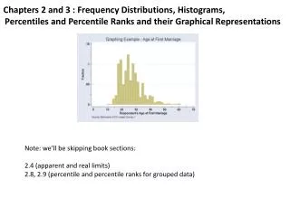
14.2. Frequency and Histograms. Warm Up. Lesson Presentation. Lesson Quiz. Holt McDougal Algebra 1. Holt Algebra 1. 14.2. Objectives. Create stem-and-leaf plots. Create frequency tables and histograms. 14.2. Vocabulary. stem-and-leaf plot frequency frequency table histogram

E N D
14.2 Frequency and Histograms Warm Up Lesson Presentation Lesson Quiz Holt McDougal Algebra 1 Holt Algebra 1
14.2 Objectives Create stem-and-leaf plots. Create frequency tables and histograms.
14.2 Vocabulary stem-and-leaf plot frequency frequency table histogram cumulative frequency
14.2 A stem-and-leaf plot arranges data by dividing each data value into two parts. This allows you to see each data value. The digits other than the last digit of each value are called a stem. The last digit of a value is called a leaf. Key: 2|3 means 23 The key tells you how to read each value.
Stem Leaves 08 8 9 9 12 3 3 4 5 9 20 1 14.2 Example 1A: Making a Stem-and-Leaf Plot The numbers of defective widgets in batches of 1000 are given below. Use the data to make a stem-and-leaf plot. 14, 12, 8, 9, 13, 20, 15, 9, 21, 8, 13, 19 Number of Defective Widgets per Batch The tens digits are the stems. Theones digitsare the leaves. List the leaves from least to greatest within each row. Title the graph and add a key. Key: 1|9 means 19
Team A: 65, 42, 56, 49, 58, 42, 61, 55, 45, 72 Team B: 57, 60, 48, 49, 52, 61, 58, 37, 63, 48 14.2 Example 1B: Making a Stem-and-Leaf Plot The season’s scores for the football teams going to the state championship are given below. Use the data to make a back-to-back stem-and-leaf plot.
Team A: 65, 42, 56, 49, 58, 42, 61, 55, 45, 72 Team A Team B Team B: 57, 60, 48, 49, 52, 61, 58, 37, 63, 48 37 9 5 2 248 8 9 8 6 552 7 8 5 160 1 3 27 14.2 Example 1B Continued Football State Championship Scores The tens digits are the stems. Theones digitsare the leaves. Put Team A’s scores on the left side and Team B’s scores on the right. Title the graph and add a key. Key: |4|8 means 48 2|4| means 42
14.2 The frequency of a data value is the number of times it occurs. A frequency table shows the frequency of each data value. If the data is divided into intervals, the table shows the frequency of each interval.
14.2 Example 2: Making a Frequency Table The numbers of students enrolled in Western Civilization classes at a university are given below. Use the data to make a frequency table with intervals. 12, 22, 18, 9, 25, 31, 28, 19, 22, 27, 32, 14 Step 1 Identify the least and greatest values. The least value is 9. The greatest value is 32.
14.2 Example 2 Continued Step 2 Divide the data into equal intervals. For this data set, use an interval of 10. Enrollment in Western Civilization Classes Step 3 List the intervals in the first column of the table. Count the number of data values in each interval and list the count in the last column. Give the table a title.
14.2 A histogram is a bar graph used to display the frequency of data divided into equal intervals. The bars must be of equal width and should touch, but not overlap.
14.2 Example 3: Making a Histogram Use the frequency table in Example 2 to make a histogram. Step 1 Use the scale and interval from the frequency table. Enrollment in Western Civilization Classes Step 2 Draw a bar for the number of classes in each interval. All bars should be the same width. The bars should touch, but not overlap.
14.2 Example 3 Continued Step 3 Title the graph and label the horizontal and vertical scales.
14.2 Cumulative frequency shows the frequency of all data values less than or equal to a given value. You could just count the number of values, but if the data set has many values, you might lose track. Recording the data in a cumulative frequency table can help you keep track of the data values as you count.
14.2 Example 4: Making a Cumulative Frequency Table The weights (in ounces) of packages of cheddar cheese are given below. 19, 20, 26, 18, 25, 29, 18, 18, 22, 24, 27, 26, 24, 21, 29, 19 a. Use the data to make a cumulative frequency table. Step 1 Choose intervals for the first column of the table. Step 2 Record the frequency values in each interval for the second column.
14.2 Example 4 Continued Step 3 Add the frequency of each interval to the frequencies of all the intervals before it. Put that number in the third column of the table. Cheddar Cheese Step 4 Title the table.
14.2 Example 4 Continued b. How many packages weigh less than 24 ounces. All packages less than 24 oz are displayed in the first two rows of the table, so look at the cumulative frequency shown in the second row. Cheddar Cheese There are 8 packages with weights under 24 oz?