Download
1 / 32
320 likes | 395 Vues
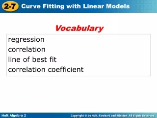
Vocabulary. regression correlation line of best fit correlation coefficient.

E N D
Vocabulary regression correlation line of best fit correlation coefficient
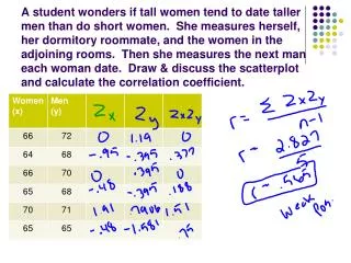
A scatter plot is helpful in understanding the form, direction, and strength of the relationship between two variables. Correlation is the strength and direction of the linear relationship between the two variables.
Helpful Hint Try to have about the same number of points above and below the line of best fit. If there is a strong linear relationship between two variables, a line of best fit, or a line that best fits the data, can be used to make predictions.
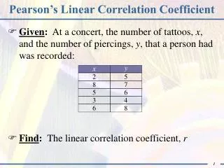
Example 1: Meteorology Application Albany and Sydney are about the same distance from the equator. Make a scatter plot with Albany’s temperature as the independent variable. Name the type of correlation. Then sketch a line of best fit and find its equation.
o o Example 1 Continued Step 1 Plot the data points. Step 2 Identify the correlation. Notice that the data set is negatively correlated–as the temperature rises in Albany, it falls in Sydney. • • • • • • • • • • •
o o Example 1 Continued Step 3 Sketch a line of best fit. Draw a line that splits the data evenly above and below. • • • • • • • • • • • This would have a strong negativecorrelation.
Check It Out! Example 1 Make a scatter plot for this set of data. Identify the correlation, sketch a line of best fit, and find its equation.
Check It Out! Example 1 Continued Step 1 Plot the data points. Step 2 Identify the correlation. Notice that the data set is positively correlated–as time increases, more points are scored • • • • • • • • • •
Check It Out! Example 1 Continued Step 3 Sketch a line of best fit. Draw a line that splits the data evenly above and below. • This would have a strong positive correlation. • • • • • • • • •
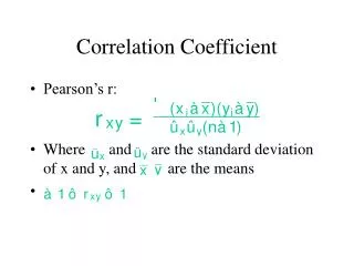
The correlation coefficientr is a measure of how well the data set is fit by a model.
Example 2: Anthropology Application Anthropologists can use the femur, or thighbone, to estimate the height of a human being. The table shows the results of a randomly selected sample.
Example 2 Continued a. Make a scatter plot of the data with femur length as the independent variable. • • • • • • • • The scatter plot is shown at right.
Example 2 Continued The slope is about 2.91, so for each 1 cm increase in femur length, the predicted increase in a human being’s height is 2.91 cm. The correlation coefficient is r ≈ 0.986 which indicates a strong positive correlation.
Example 2 Continued c. A man’s femur is 41 cm long. Predict the man’s height. The equation of the line of best fit is h ≈ 2.91l+ 54.04. Use the equation to predict the man’s height for a 41-cm-long femur, h ≈ 2.91(41) + 54.04 Substitute 41 for l. h ≈ 173.35 The height of a man with a 41-cm-long femur would be about 173 cm.
Check It Out! Example 2 The gas mileage for randomly selected cars based upon engine horsepower is given in the table.
Check It Out! Example 2 Continued a. Make a scatter plot of the data with horsepower as the independent variable. • • • • • • • • The scatter plot is shown on the right. • •
Check It Out! Example 2 Continued b. Find the correlation coefficient r and the line of best fit. The equation of the line of best fit isy ≈ –0.15x + 47.51
Check It Out! Example 2 Continued The slope is about –0.15, so for each 1 unit increase in horsepower, gas mileage drops ≈ 0.15 mi/gal. The correlation coefficient is r ≈ –0.916, which indicates a strong negative correlation.
Check It Out! Example 2 Continued c. Predict the gas mileage for a 210-horsepower engine. The equation of the line of best fit is y ≈ –0.15x+ 47.5. Use the equation to predict the gas mileage. For a 210-horsepower engine, y ≈ –0.15(210)+ 47.50. Substitute 210 for x. y ≈ 16 The mileage for a 210-horsepower engine would be about 16.0 mi/gal.
Example 3: Meteorology Application Find the following for this data on average temperature and rainfall for eight months in Boston, MA.
o Example 3 Continued a. Make a scatter plot of the data with temperature as the independent variable. The scatter plot is shown on the right. • • • • • • • •
o Example 3 Continued b.Find the correlation coefficient and the equation of the line of best fit. Draw the line of best fit on your scatter plot. The correlation coefficient is r = –0.703. • • • • • • The equation of the line of best fit isy ≈ –0.35x + 106.4. • •
Example 3 Continued c.Predict the temperature when the rainfall is 86 mm. How accurate do you think your prediction is? 86 ≈ –0.35x + 106.4 Rainfall is the dependent variable. –20.4 ≈ –0.35x 58.3 ≈ x The line predicts 58.3F, but the scatter plot and the value of r show that temperature by itself is not an accurate predictor of rainfall.
Reading Math A line of best fit may also be referred to as a trend line.
Check It Out! Example 3 Find the following information for this data set on the number of grams of fat and the number of calories in sandwiches served at Dave’s Deli. Use the equation of the line of best fit to predict the number of grams of fat in a sandwich with 420 Calories. How close is your answer to the value given in the table?
Check It Out! Example 3 a. Make a scatter plot of the data with fat as the independent variable. The scatter plot is shown on the right.
Check It Out! Example 3 b.Find the correlation coefficient and the equation of the line of best fit. Draw the line of best fit on your scatter plot. The correlation coefficient is r = 0.68169 The equation of the line of best fit is y ≈ 11.14x + 309.77
Check It Out! Example 3 c. Predict the amount of fat in a sandwich with 420 Calories. How accurate do you think your prediction is? 420 ≈ 11.1x + 309.8 Calories is the dependent variable. 110.2 ≈ 11.1x 9.9 ≈ x The line predicts 10 grams of fat. This is not close to the 15 g in the table.
Lesson Quiz: Part I Use the table for Problems 1–3. 1.Make a scatter plot with mass as the independent variable.
Lesson Quiz: Part II 2.Find the correlation coefficient and the equation of the line of best fit on your scatter plot. Draw the line of best fit on your scatter plot. r ≈ 0.68; y = 0.07x – 5.24
Lesson Quiz: Part III 3. Predict the weight of a $40 tire. How accurate do you think your prediction is? ≈646 g; the scatter plot and value of r show that price is not a good predictor of weight.
correlation coefficientis the r-value. It is a measure of how well the data set is fit to the model. line of best fit is a line that best fits a set of data. It is closest to