Download
1 / 21
210 likes | 235 Vues
Discover the basic design principles, including contrast, repetition, alignment, and proximity. Learn how to apply these principles effectively to create visually engaging and organized layouts. Explore typography tips and tricks to elevate your design game.

E N D
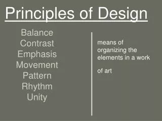
Basic Design Principles • Contrast • Repetition • Alignment • Proximity
Contrast One of the most effective ways to add visual interest to a page.
Repetition You can repeat colors, shapes, textures, line thicknesses, fonts, sizes, graphic concepts, etc. This develops the organization and strengthens the unity.
Alignment Nothing should be placed on the page arbitrarily. Every element should have some visual connection with another element on the page.
Alignment Activity “Bad” version
Alignment Activity “Good” version
Proximity Items relating to each other should be grouped close together. This helps organize information, reduces clutter, and gives the reader a clear structure.
Basic Design Principles- Recap • Contrast • Repetition • Alignment • Proximity
Typography • Sans Serif –No “feet” at the end Use for titles, subtitles, and headings e.g. Arial • Serif – Letters have “feet” Easier to read; best for body text e.g. Times New Roman
Typography • Use to add emphasis and personality to text: • “Life’s but a walking shadow, a poor player that struts and frets his hour upon the stage, and then is heard no more; it is a tale told by an idiot, full of sound and fury, Text signifying nothing.”