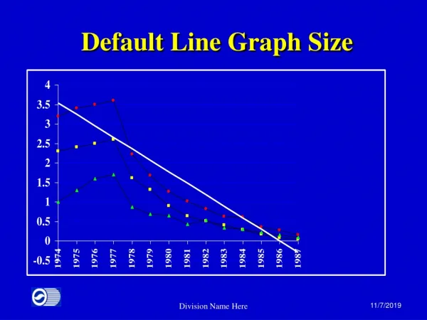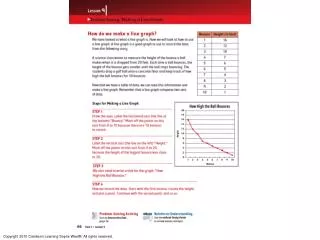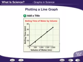
Creating a Stacked Line Graph
This guide provides a comprehensive approach to analyzing immigration trends in Canada and their demographic effects from 2010 to 2050. It covers the creation and interpretation of combination bar and line graphs, including details on population growth calculations derived from natural increase and net migration. Key steps include setting up the y-axis and x-axis with the appropriate tick marks, labeling units, and visually representing data with varied colors. Additionally, it emphasizes the importance of legends and titles for clarity in data presentation, all sourced from Statistics Canada.

Creating a Stacked Line Graph
E N D
Presentation Transcript
Creating a Stacked Line Graph Pages 54 - 55
I can… • Understand the trends in immigration to Canada’s population growth and, how and why it is changing. • Create, interpret and use combination bar/line graphs.
Demographic Impact of Immigration (2010 – 2050) eg; The highest value on the table will be ; 124.9 + 192.8 = 317.7 317.7 • The range of values for the entire table is: • 317.7 • -103.5 • 421.2 • This value will help us set up the y-axis in the next step. Calculate Population Growth data column by adding Nat. Increase and Net Migration. eg; The lowest value on the table will be ; -103.5 (Source: Statistics Canada)
Standard Sheet of linear X linear graph paper 33 boxes 42 boxes
Draw a tick mark every 2nd square. • The range of values for the entire table is: • 317.7 • -103.5 • 421.2 • This value will help us set up the y-axis. Starting from the base, label the marks as -120 , -80, -40, 0 etc… to 320 Locate the base of the y-axis at 4 squares up and 1 square in and draw a line of 22 squares Etc… 0 -40 -80 Don’t forget to identify the units on the y- axis! -120
Starting at 0 draw an x-axis completely across the paper Place a tick mark on the x-axis every 2nd square. 0 -40 At the base of the graph label every 5th mark as ‘10, ’20, ’30 etc… to ‘50 -80 -120 ‘10 ‘20 ‘30 Don’t forget to identify the units on this axis!
Line with “orange” fill below Line with “yellow” fill below Place a tick mark every 5th horizontal square and label every 2nd mark as ‘10, ’20, ’30 etc… to ‘50 Bars 0 0 -40 -40 -80 -80 -120 -120 ‘10 ‘10 ‘20 ‘20 ‘30 ‘30
Add a title which reflects content of the graph Add a legend which explains the meaning of each of the colours used. Place a tick mark every 5th horizontal square and label every 2nd mark as ‘10, ’20, ’30 etc… to ‘50 0 0 -40 -40 -80 -80 -120 -120 ‘10 ‘10 ‘20 ‘20 ‘30 ‘30 Source Author