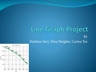
Line Graph Project
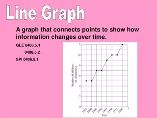
Line Graph Project. By Harleen Suri , Eliza Neights , Carina Tse. What is a Line Graph?. Graph used to represent data with an independent and dependent variable when showing changes over time Data is plotted on the graph and connected with lines. When is it Used?.

Line Graph Project
E N D
Presentation Transcript
Line Graph Project By HarleenSuri, Eliza Neights, Carina Tse
What is a Line Graph? • Graph used to represent data with an independent and dependent variable when showing changes over time • Data is plotted on the graph and connected with lines
When is it Used? • When you are showing changes over time
Real World Example • The graph shows the temperature (°F) of New York City over 6 days • Can easily see trend of data • Could be used by meteorologists
What Type of Data Do You Need? • Set of data- Can be a single or multiple or single set • Need key if using multiple sets of data
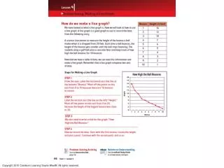
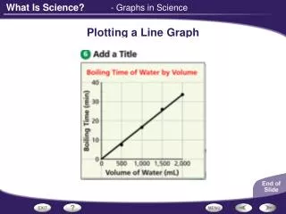
How We Made the Graph • Draw and label a x- axis and y- axis • Create a scale on each axis • Plot your data points • Connect each point with line segments • Give your graph a title
Quiz Question A TV company wants to schedule commercials during the day kids watch the most amount of TV. Mrs. Ellwood’s class was selected to complete a survey based on how much TV they watch. Find the largest increase in time TV was watched. Then, find the percent of increase of time TV was watched.
How to Solve • Find the largest increase in the graph. • From Friday to Saturday, the increase in time was greatest • Then find percent of increase to the nearest tenth 83-52 52 Difference Original = ≈ 59.6%
Advantages of Line Graphs • Can visually see the trend of the data • Can see how data increases/decreases • Can compare two sets of data • Use a line graph with multiple sets of data
Disadvantages of Line Graphs • Hard to see the specific data points when the scale is large • Sometimes the scale can change the appearance of the data
Works Cited • Evernote. Evernote, n.d. Web. 12 Feb. 2013. <https://www.evernote.com/shard/s134/sh/f11fa37a-5379-4447-a722-49ed3115b924/21ea4dd75a2f06164cb77028883a617a>. • Graphing Tutorial. Graphing Tutorial, n.d. Web. 14 Feb. 2013. <http://nces.ed.gov/nceskids/help/user_guide/graph/line.asp>. • Line Graph. New York State Intermediate Test Prep Center, 2001-2011. Web. 17 Feb. 2013. <http://www.studyzone.org/mtestprep/math8/f/linegraphles.cfm>. • Line Graphs. N.p., n.d. Web. 17 Feb. 2013. <http://mste.illinois.edu/courses/ci330ms/youtsey/lineinfo.html>. • OnlineMathLearning.com. OnlineMathLearning.com, 2005-2012. Web. 15 Feb. 2013. <http://www.onlinemathlearning.com/line-graphs.html>. • Teacher Vision. Daily Teach, 2000-2013. Web. 14 Feb. 2013. <http://www.teachervision.fen.com/tv/printables/SISA00181_3.pdf>.