Colors and Typography - Complete Guide
Get a detailed analysis on how to use color and typography in graphic design. Read and explore further.

Colors and Typography - Complete Guide
E N D
Presentation Transcript
Many desktop publishing packages and web page editors now use Lorem Ipsum as their default model text, and a search for 'lorem ipsum' will uncover many web sites still in their infancy. Various versions have evolved over the years, sometimes by accident, sometimes on purpose (injected humour and the like). Many desktop publishing packages and web page editors now use Lorem Ipsum as their default model text, and a search for 'lorem ipsum' will uncover many web sites still in their infancy. Various versions have evolved over the . COLORS & TYPOGRAPHY COMPLETE GUIDE It has survived not only five centuries, but also the leap into electronic typesetting, remaining essentially unchanged. Many desktop publishing packages and web page editors now use Lorem Ipsum as their default model text, and a search for 'lorem ipsum' will uncover many web sites still in their infancy. Various versions have evolved over the years, sometimes by accident, sometimes on purpose (injected humour and the like). It has survived not only five centuries, but also the leap into electronic typesetting, remaining essentially unchanged.
COLORS TYPOGRAPHY & As a webpage opens, it makes an instant click with the viewer. The face of the page can either make the viewer stay or leave the page. This is where the design plays a crucial role; in terms of layout, color and typography. While there are n numbers of pages that constitute an impressive website, there are certain guidelines and typography design rules to achieve that “perfect” layout. Here are some must-have rules on your list: Many desktop publishing packages and web page editors now use Lorem Ipsum as their default model text, and a search for 'lorem ipsum' will uncover many web sites still in their infancy. Various versions have evolved over the . It has survived not only five centuries, but also the leap into electronic typesetting, remaining essentially unchanged.
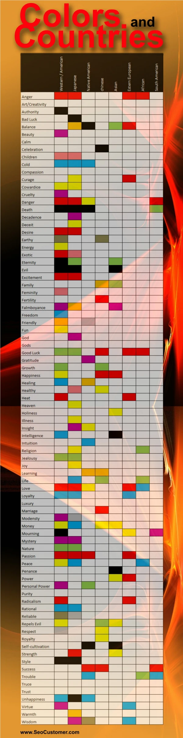
USAGE OF COLORS: It’s a known fact that objects, color and typography in graphic designplay on one’s psy- chology. Hence it is vital to keep in mind the subject of the website, its audience and their preferences. Right use of colors and placement of pictures can help in grabbing the viewers’ attention. The colors shouldn’t be too harsh or extremely subtle. One has to be careful in choosing the matching hues and shades to suit the content of the website. For instance, if it is a fun and creative page, then one can make use of vibrant colors. Whereas using light yet positive colors will suit more for the formal ones. The said fact would remain intact for graphic design trends 2018 graphic design trends 2018 as well. Any important statement should be kept loud and clear. And this is where the “highlighting” comes in. One needs to give prominence to certain text or graphic design trends content by using a different color to those parts. But at the same time, care should be taken that such portions don’t look sore or are stark comparing to the rest of the page. This highlighted content should not put put off or irritate the viewers. Always stick to one color while highlighting important lines. However if there is need to give different styles for various pointers, then plan on different icons to match the highlighted color. For instance one can make use of a different typography color combination or else borders, bubbles, buttons or shades.
USAGE OF TYPOGRAPHY: The style and design of the words and its placement have as much importance as the colors. The right kind of typography can grab the attention instantly and impress the viewers about the content. The paragraphs and its size should be well planned and presented in such a way that it doesn’t hinder the flow of reading. One has to be well acquainted with the key elements of typography while designing a layout. This includes understanding the rules of certain styles, font sizes and measurements. To make a fine impression with typogra- phy, one has to take care of choice of typeface, line length, point size, tracking, kerning, color and other design aspects. These days there are wide range of online tutorials available which will help one to master the art of typography; seeking pro- fessional typography service is not the only option.
BEWARE OF KERNING! The word “Kerning” means adjusting the spaces between characters or two letters in a text. Each tiny detail matters – hence one has to be very careful while kerning. One should not confuse this term with “Tracking”; which is used to adjust spaces between a block of text. To avoid kerning, one has to visually maintain the space between the letters throughout. TOO MANY TYPEFACES & STYLES SPOIL THE FLOW! It is always better to stay clear of confusions. For this, it is best to avoid using too many type- faces and styles. One may be tempted to play with the wide choice of styles and designs available. But it is best to choose the ones which match your content and layout. Keep it simple yet elegant. It has been sufficiently proved that a particular content doesn’t need more than two fonts; which include the headline and the body copy. One needs to constantly have a check on font size simultaneously.
WHITE SPACE COUNTS The flow of content should be given a relief at regular intervals by the “white space” or “negative space”. A well composed layout incorporates the white space in a pleasing manner and avoids clutter. Most importantly it helps the readers to find what they are looking for and keeps them free from the stress of searching. The white space should be given at the right juncture in a stra- tegic manner. It is in fact one of the basic and crucial typography design elements. For example, in an advertisement layout, headline, the logo, content and the picture should be placed in well-defined proportions; putting white space at proper places.
THE PICTURE AS A WHOLE! In the end, the appropriate usage of colors and typography will avail better views to your website. Color and typography always go hand in hand and no professional providing graphic design services in India will disagree to this said fact. By bringing in these two elements in right dose, will not only impress the existing users but also attract fresh viewers as well. While colors grab attention, typography helps in reading effortlessly. Although this post might not be a thorough rule book entirely, this will aid you to make a fine impression with your website layout. If If you want external assistance from experts, there are countless options available. Just go through the portfolio of various creative design service providers and have a glance on graphic design services price list in India. Accordingly, you can decide the best option suiting your budget and requirements.