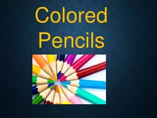
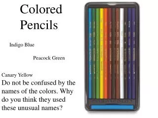
Colored Pencils
Colored Pencils. Indigo Blue. Peacock Green. Canary Yellow. Do not be confused by the names of the colors. Why do you think they used these unusual names?. Colored Pencils have the same types of values as graphite pencils. But, you create values by blending different colors together. .

Colored Pencils
E N D
Presentation Transcript
Colored Pencils Indigo Blue Peacock Green Canary Yellow Do not be confused by the names of the colors. Why do you think they used these unusual names?
Colored Pencils have the same types of values as graphite pencils. But, you create values by blending different colors together. Look closely what colors are used to create her hair?
Black is fine, but if you add a touch of blue or another color, you will get more depth. Remember “Black is Flat” Do not mix black with your colors to create a shadow, use blue, purple, etc., mix your colors instead. Edgar Degas “Ballerina”
Blend colors together by overlapping as you move across the paper.
Now we will recreate the apple. A green apple. Start with your darkest tones to be laid down first. It will give me a base to compare other tones to. Use "olive green" for this area. Throughout this entire tutorial I am using the circulism method of shading.
Circulism is a technique that many artists use in attaining a realistic skin texture in drawing. People's faces are not perfect and should not be rendered so. Circlism is basically drawing very tiny overlapping and intertwining circles. The circles do not have to be perfect to achieve this effect. Figure 1 simply illustrates circles that are overlapping and intertwining. Of coarse the circles do not need to be this perfect on a drawing, just an example. In figure 2, I did a quick example of how circulism will look when applied to a drawing. I laid down some 3B graphite and blended in a circular motion with a blending stump. The circulism technique may also be used without blending, depends on your preference
Work to the left of my dark area but make sure that everything is lighter than this. I am using olive green again. There will be two highlights in this area so I shade around them
Highlights are going to be very subtle so carefully shade them in with olive green making sure that they stay lighter than the surrounding area.. Areas that need to be darker than the olive green receive sepia overtop. Lighter areas are going to be colored with some browns. This time I use rosy beige for the highlight. Above that highlight will be another small one. This one I color with French grey 20%.
At the top left edge of the apple it to be brownish use light umber. At this point start transitioning darks into lighter colors. Use lime peal and light umber for these areas. Be sure there are some highlights around the crown of the apple. I use yellow ochre for these.
Lighter, right side to have alot of brown colors. Transition from dark area into light with burnt ochre and layer a little limepeel on top. Lay down sand color on the upper right edge
continue working on filling in the rest of the apple. For the reddish area used a combination of henna and pink. Be careful with pink. It's easy to over-do it. For the upper part of the apple used lime peel with some light umber layers in certain areas. A Brilliant white highlight on the upper right part of the apple so I shade around this area. Make sure to keep this highlight very clean.
More layers of light umber are added in the brownish areas. There is a tool made by Prismacolor called a colorless blender. It's basically a pencil that applies no color or tone and doesn't absorb any either. using this tool to blend the colors together. Compare this picture to step 11 and you will notice it's a lot smoother and polished looking. After the colors are blended I start on the stem. use Tuscan red and dark umber.
Finish working on the crown of the apple and blending the colors with my colorless blender. This drawing is very plain looking at this point so adding a background will help. Burnt ochre is applied using circulism again. Make sure your color is consistent all the way to the edges of the apple
Again, using my colorless blender, blend all the color together. At the upper right corner leave the wall unblended because it gives the wall a texture and suggests a light source
Start on the table surface. apply burnt ochre but not quite as dark as the background wall. Doing a reflection on the table also. Just basically draw the apple upside down for this reflection. The dark part of the apple is on the left side so the darker part of the reflection should be on the left also. The drawing is finished. From start to finish this took me probably about 7 or 8 hours
Did you think this was a green? Look again closely even the dark areas are different colors, blue, green, etc., not just black.
For a smoother looking blend, switch the direction of your pencil as much as possible and vary the pressure of your pencil. What color was used as a highlight in the black and brown areas?
Remember the pressure you apply determines how much color is applied to the paper. Look at the ladies lipstick on her mouth.
Leave the paper white for the areas you want to have the lightest value. Always work from light to dark. It is very hard to apply a light color over a dark color. Is this drawing better because it was drawn more realistically?
You can use all your pencil techniques with your colored pencils. Cross-hatching, stipples, etc. to show different textures and make your drawing more interesting.
Colored Pencil can be vibrant and rich in colors. What Principle of Art is used below?
What colors can you find in his face? Would the artist have been just as effective if he used pink, peach and brown? What color is his hood?
Look carefully, how many colors can you find in the car? What color did the artist use for shadow besides black? Look at the doors.
Did you think this was done by paint, not true, it was done by colored pencil. See how rich and vibrant colored pencil can be when used with the right pressure and blending techniques.