Chapter 9 Normal Distribution
Chapter 9 Normal Distribution. 9.1 Continuous distribution 9.2 The normal distribution 9.3 A check for normality 9.4 Application of the normal distribution 9.5 Normal approximation to Binomial. 9.1 Continuous Distribution. For a discrete distribution, for example

Chapter 9 Normal Distribution
E N D
Presentation Transcript
Chapter 9 Normal Distribution • 9.1 Continuous distribution • 9.2 The normal distribution • 9.3 A check for normality • 9.4 Application of the normal distribution • 9.5 Normal approximation to Binomial
9.1 Continuous Distribution • For a discrete distribution, for example Binomial distribution with n=5, and p=0.4, the probability distribution is x 0 1 2 3 4 5 f(x) 0.07776 0.2592 0.3456 0.2304 0.0768 0.01024
P(x) x A probability histogram
How to describe the distribution of a continuous random variable? • For continuous random variable, we also represent probabilities by areas—not by areas of rectangles, but by areas under continuous curves. • For continuous random variables, the place of histograms will be taken by continuous curves. • Imagine a histogram with narrower and narrower classes. Then we can get a curve by joining the top of the rectangles. This continuous curve is called a probability density (or probability distribution).
Continuous distributions • For any x, P(X=x)=0. (For a continuous distribution, the area under a point is 0.) • Can’t use P(X=x) to describe the probability distribution of X • Instead, consider P(a≤X≤b)
Density function • A curve f(x): f(x) ≥ 0 • The area under the curve is 1 • P(a≤X≤b) is the area between a and b
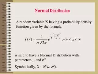
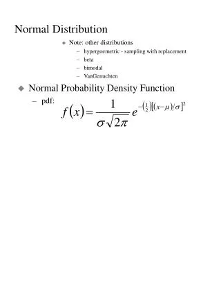
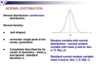
9.2 The normal distribution • A normal curve: Bell shaped • Density is given by • μand σ2are two parameters: mean and standard variance of a normal population (σ is the standard deviation)
How to calculate the probability of a normal random variable? • Each normal random variable, X, has a density function, say f(x) (it is a normal curve). • Probability P(a<X<b) is the area between a and b, under the normal curve f(x) • Table I in the back of the book gives areas for a standard normal curve with m=0 and s=1. • Probabilities for any normal curve (any m and s) can be rewritten in terms of a standard normal curve.
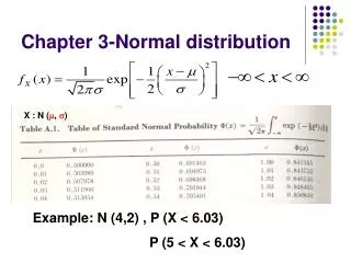
Table I: Normal-curve Areas • Table I on page 494-495 • We need it for tests • Areas under standard normal curve • Areas between 0 and z (z>0) • How to get an area between a and b? when a<b, and a, b positive area[0,b]–area[0,a]
Get the probability from standard normal table • z denotes a standard normal random variable • Standard normal curve is symmetric about the origin 0 • Draw a graph
Table I: P(0<Z<z) z .00 .01 .02 .03 .04 .05 .06 0.0 .0000 .0040 .0080 .0120 .0160 .0199 .0239 0.1 .0398 .0438 .0478 .0517 .0557 .0596 .0636 0.2 .0793 .0832 .0871 .0910 .0948 .0987 .1026 0.3 .1179 .1217 .1255 .1293 .1331 .1368 .1404 0.4 .1554 .1591 .1628 .1664 .1700 .1736 .1772 0.5 .1915 .1950 .1985 .2019 .2054 .2088 .2123 …………………… 1.0 .3413 .3438 .3461 .3485 .3508 .3531 .3554 1.1 .3643 .3665 .3686 .3708 .3729 .3749 .3770
Examples • Example 9.1 P(0<Z<1) = 0.3413 • Example 9.2 P(1<Z<2) =P(0<Z<2)–P(0<Z<1) =0.4772–0.3413 =0.1359
Examples • Example 9.3 P(Z≥1) =0.5–P(0<Z<1) =0.5–0.3413 =0.1587
Examples • Example 9.4 P(Z ≥ -1) =0.3413+0.50 =0.8413
Examples • Example 9.5 P(-2<Z<1) =0.4772+0.3413 =0.8185
Examples • Example 9.6 P(Z ≤ 1.87) =0.5+P(0<Z ≤1.87) =0.5+0.4693 =0.9693
Examples • Example 9.7 P(Z<-1.87) = P(Z>1.87) = 0.5–0.4693 = 0.0307
From non-standard normal to standard normal • X is a normal random variable with mean μ,and standard deviation σ • Set Z=(X–μ)/σ Z=standard unit or z-score of X Then Z has a standard normal distribution and
Example 9.8 • X is a normal random variable with μ=120,and σ=15 Find the probability P(X≤135) Solution:
XZ • x z-score of x Example 9.8 (continued) P(X≤150) x=150 z-score z=(150-120)/15=2 P(X≤150)=P(Z≤2) = 0.5+0.4772= 0.9772
9.3 Checking Normality • Most of the statistical tools we will use in this class assume normal distributions. • In order to know if these are the right tools for a particular job, we need to be able to assess if the data appear to have come from a normal population. • A normal plot gives a good visual check for normality.
Simulation: 100 observations, normal with mean=5, st dev=1 • x<-rnorm(100, mean=5, sd=1) • qqnorm(x)
The plot below shows results on alpha-fetoprotein (AFP) levels in maternal blood for normal and Down’s syndrome fetuses. Estimating a woman’s risk of having a preganancy associated with Down’s syndrome using her age and serum alpha-fetoprotein level H.S.Cuckle, N.J.Wald, S.O.Thompson
Normal Plot The way these normal plots work is • Straight means that the data appear normal • Parallel means that the groups have similar variances.
Normal plot In order to plot the data and check for normality, we compare • our observed data to • what we would expect from a sample of normal data.
To begin with, imagine taking n=5 random values from a standard normal population (m=0, s=1) Let Z(1) Z(2) Z(3) Z(4) Z(5)be the ordered values. Suppose we do this over and over. Sample Z(1) Z(2) Z(3) Z(4) Z(5) 1 -1.7 -0.2 0.8 1.3 1.9 2 -0.9 0.2 0.5 0.9 2.0 3 -2.3 -1.5 -0.6 0.4 1.3 ……………… Forever ___ ___ ___ ___ ___ Mean -1.163 -0.495 0 0.495 1.163 E(Z(1)) E(Z(2)) E(Z(3)) E(Z(4)) E(Z(5)) On average • the smallest of n=5 standard normal values is 1.163 standard deviations below average • the second smallest of n=5 standard normal values is 0.495 standard deviations below average • the middle of n=5 standard normal values is at the average, 0 standard deviations from average
The table of “rankits” from the Statistics in Biology table gives these expected values. For larger n, space is saved by just giving the positive values. The negative values are a mirror image of the positive values, since a standard normal distribution is symmetric about its mean of zero.
Check for normality If X is normal, how do ordered values of X, X(i) , relate to expected ordered Z values, E( Z(i) ) ? For normal with mean m and standard deviation s, the expected values of the data, X(i), will be a linear rescaling of standard normal expected values E(X(i)) ≈ m + s E( Z(i) ) The observed data X(i) will be approximately a linearly related to E( Z(i) ). X(i) ≈ m + s E( Z(i) )
If we plot the ordered X values versus E( Z(i) ), we should see roughly a straight line with • intercept m • slope s
Example Example: Lifetimes of springs under 900 N/mm2 stress i E( Z(i) ) X(i) 1 -1.539 153 2 -1.001 162 3 -0.656 189 4 -0.376 216 5 -0.123 216 6 0.123 216 7 0.376 225 8 0.656 225 9 1.001 243 10 1.539 306
The plot is fairly linear indicating that the data are pretty similar to what we would expect from normal data.
To compare results from different treatments, we can put more than one normal plot on the same graph. The intercept for the 900 stress level is above the intercept for the 950 stress group, indicating that the mean lifetime of the 900 stress group is greater than the mean of the 950 stress group. The slopes are similar, indicating that the variances or standard deviations are similar.
These plots were done in Excel. In Excel you can either enter values from the table of E(Z) values or generate approximations to these tables values. • One way to generate approximate E(Z) values is to generate evenly spaced percentiles of a standard normal, Z, distribution. • The ordered X values correspond roughly to particular percentiles of a normal distribution. • For example if we had n=5 values, the 3rd ordered values would be roughly the median or 50th percentile. • A common method is to use percentiles corresponding to .
For n=5 this would give us i 1 0.1 2 0.3 3 0.5 the 50th percentile 4 0.7 5 0.9 • For E(Z) we would use corresponding percentiles of a standard normal Z distribution. • Percentiles expressed as fractions are called quantiles. The 0.5 quantile is the 50th percentile. • Normal plots from this perspective are sometimes called Q-Q plots, since we are plotting standard normal quantiles versus the associated quantiles of the observed data.
For n = 10 values for the spring data, the corresponding normal percentiles would be i Z quantile 1 0.05 -1.64 2 0.15 -1.04 3 0.25 -0.67 4 0.35 -0.39 5 0.45 -0.13 6 0.55 0.13 7 0.65 0.39 8 0.75 0.67 9 0.85 1.04 10 0.95 1.64
For assessing whether a plotted line is fairly parallel, either the E(Z) values or the normal quantiles work fine. • If you are doing the plot by hand it’s easiest to use the E(Z) table. • If you are doing these in Excel it’s easiest to use the normal quantiles. • The function NORMINV(p,0,1) finds the Z values corresponding to a given quantile. This is the inverse of the function that finds the cumulative probability for a given Z value. Z NORMDIST probability = NORMDIST(1.645, 0, 1, TRUE) 0.95 Probability NORMINV probability = NORMINV(0.95, 0, 1) 1.645 (The TRUE in NORMDIST says to return the cumulative probability rather than density curve height.)
For data that are not normal Many types of data tend to follow a normal distribution, but many data sets aren’t particularly normal. If the data aren’t fairly normal we have several options • Transform the data, meaning change the scale. • A log or ln scale is most common. • Weights of fish • Concentrations • Bilirubin levels in blood • pH is a log scale • RNA expression levels in a microarray experiment • A reciprocal (1/Y) change of times to rates • Other powers • Square root for Poisson variables
Non-normal data continued • Use a different distribution other than a normal distribution • Weibull distribution for lifetimes • Motors at General Electric • Patients in a clinical trial
Weibull Distributions(Time to Failure – Non-binomial & Non-normal) Infant Mortality: Fail immediately or last a long time Early Failure: These do not fail immediately, but many do fail early Old-age Wearout: Very few of these fail until they were out
Non-normal data continued • Use a nonparametric methods which doesn’t assume any distribution • Finding a distribution that models the data well rather than nonparametric • Allows us to develop a more complete model • Allows us to generalize to other situations • Gives us more precise information for the same amount of effort
The methods in this class largely apply to normal data or data that we can transform to normal. • The EPA fish example is a good example of transforming data with a log transformation. • Geometric means and harmonic means arise when we are working with transformed data. • For example fish weights are usually analyzed in the log scale. Having a mean in the log scale we want to put this value back into the original scale, for example grams. The back-transformed mean from the log scale is the geometric mean. The back-transformed mean from a reciprocal scale (rates), is the harmonic mean. Back-transformed differences between geometric means correspond to ratios in the original scale.
Suppose ln(X) = Y ~ N(m, s2). This means Y (or ln(x)) distributed as normal with mean m and variance s2. The geometric mean is em, the back-transformed population mean in the ln scale. If we have the difference between two means in the ln scale then back-transforming give us = ratio of geometric means.