
Charts
E N D
Presentation Transcript
Goals By the end of this lecture, you should … • Understand why statisticians use charts to represent data. • Understand how to use different types of charts for different purposes. • Understand how to create a chart in Excel.
Charts • Charts • Used as a data analysis tool. Graphical representations of data are easier to interpret than numbers. • Used as a presentation tool for the same reason.
Common Chart Elements • All charts have some elements in common, including: • Data Range • X & Y Axes • Upper & Lower Bounds • Labels • Graph Type
Data Range • The graph is a pictorial interpretation of data. Generally, you will create a spreadsheet that holds or generates some type of data, then use the graph to illustrate the data. When you define a graph, you will need some way to explain the data being depicted. You can always select the data you want from a spreadsheet range.
X and Y Axes • The X axis is the horizontal border of the chart. The Y axis is the vertical border. Most spreadsheet programs try to guess what data you want plotted as the X axis and what data you want as the Y axis. If the graph looks completely wrong, you might want to look for some kind of feature that allows you to change the X - Y orientation.
Upper and Lower Bounds • You might want to specify the upper and lower limits of the axes. The program will usually try to guess what you want, but you may still need to modify it.
Labels • There will usually be an option for setting or changing the labels on a graph. This will allow you to put informative labels on the graph to make it easier to read. At the minimum, you should label the X and Y axes.
Graph Type • You have the option to select/change the type of graph that is displayed. The chart type should be chosen carefully and is dependent on the data to be displayed.
Column/Bar Charts • Univariate analysis • Data represented as vertical columns or horizontal bars that run from 0 to the value of the datum. • The height of a column corresponds to the magnitude of the datum. • Data values are on the y-axis for a column chart and the x-axis in a bar chart. Opposite axis contains data labels only. • You may chart multiple data series in a single chart for comparison purposes.
Dow Jones Average Line Charts • Univariate analysis • Data represented as single-valued points. • Data values are on the y-axis. X-axis contains data labels only. • Best used for showing a trend over a given period of time.
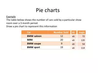
Pie Charts • Univariate analysis • Data represented as an area in a circle expressed as a percentage of a whole. • Number of categories should be kept to a minimum (<10). • “Other” category should represent a small percentage (if used).
Area Charts • Univariate analysis • Combination of pie and line charts. Each x-axis category represents a set of values as a percentage of a whole.
Scatter Plot • Multivariate analysis • Plots x,y coordinate pairs as points so there are actually two values associated with a single point on the chart. • Used to illustrate a dependence of one set of values on the other. Y-axis (dependent).
Resources • Allen, Jeff. N207 Lecture Notes.