Control charts
Control charts : A lso known as Shewhart charts or process- behaviour charts , in statistical process control are tools used to determine whether or not a manufacturing or business process is in a state of statistical control.

Control charts
E N D
Presentation Transcript
Control charts : Also known as Shewhart charts or process-behaviour charts, in statistical process control are tools used to determine whether or not a manufacturing or business process is in a state of statistical control.
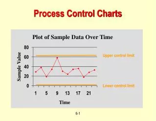
Comparison of univariate and multivariate control data Control charts are used to routinely monitor quality. Depending on the number of process characteristics to be monitored, there are two basic types of control charts. The first, referred to as a univariate control chart, is a graphical display (chart) of one quality characteristic. The second, referred to as a multivariate control chart, is a graphical display of a statistic that summarizes or represents more than one quality characteristic. Characteristics of control charts If a single quality characteristic has been measured or computed from a sample, the control chart shows the value of the quality characteristic versus the sample number or versus time. In general, the chart contains a center line that represents the mean value for the in-control process. Two other horizontal lines, called the upper control limit (UCL) and the lower control limit (LCL), are also shown on the chart. These control limits are chosen so that almost all of the data points will fall within these limits as long as the process remains in-control. The figure below illustrates this. Chart demonstrating basis of control chart
A control chart consists of: • Points representing a statistic (e.g., a mean, range, proportion) of measurements of a quality characteristic in samples taken from the process at different times [the data] • The mean of this statistic using all the samples is calculated (e.g., the mean of the means, mean of the ranges, mean of the proportions) • A center line is drawn at the value of the mean of the statistic • The standard error (e.g., standard deviation/sqrt(n) for the mean) of the statistic is also calculated using all the samples • Upper and lower control limits (sometimes called "natural process limits") that indicate the threshold at which the process output is considered statistically 'unlikely' are drawn typically at 3 standard errors from the center line
One of the most important actions that can help maintain the quality of any good or service is to collect relevant data consistently over time, plot it, and examine the plots carefully. All statistical process control charts plot data (or a statistic calculated from data) versus time, with control limits designed to alert the analyst to events beyond normal sampling variability. STATGRAPHICS Centurion provides a very extensive collection of control charts. These include: 1. Basic charts for variable datain which each point represents the most recent data, including X-Bar and R charts, X-Bar and S charts, X-Bar and S-squared charts, Median and Range charts, and Individuals charts based on X and MR(2).
2. Basic charts for attribute data, including P, NP, U, and C charts. 3. Time-weighted chartsin which the points plotted are calculated from both current and historical data, including MA, EWMA, and CuSum charts. 4. Multivariate charts, designed for situations where multiple correlated measurements are collected. 5. ARIMA control charts for autocorrelated data in which the samples collected from one time period to the next are not independent. 6. Toolwear charts for monitoring data that is expected to follow a trend line, not remain constant at a fixed level. 7. Acceptance control charts for high Cpk processes, where the control limits are placed at a fixed distance from the specification limits rather than the centerline of the chart. 8. CuScore charts, which are designed to detect specific types of patterns when they occur.
Basic Variables Charts The classical type of control chart, originally developed back in the 1930's, is constructed by collecting data periodically and plotting it versus time. If more than one data value is collected at the same time, statistics such as the mean, range, median, or standard deviation are plotted. Control limits are added to the plot to signal unusually large deviations from the centerline, and run rules are employed to detect other unusual patterns.
Basic Attributes ChartsFor attribute data, such as arise from PASS/FAIL testing, the charts used most often plot either rates or proportions. When the sample sizes vary, the control limits depend on the size of the sample
Time-Weighted ChartsWhen data is collected one sample at a time and plotted on an individuals chart, the control limits are usually quite wide, causing the chart to have poor power in detecting out-of-control situations. This can be remedied by plotting a weighted average or cumulative sum of the data, not just the most recent observation. The average run length of such charts is usually much less than that of a simple X chart.
Multivariate Control ChartsWhen more than one variable are collected, separate control charts are frequently plotted for each variable. If the variables are correlated, this can lead to missed out-of-control signals. For such situations, STATGRAPHICS provides several types of multivariate control charts: T-Squared charts, Generalized Variance charts, and Multivariate EWMA charts. In the case of two variables, the points may be plotted on a control ellipse.
ARIMA Control ChartsWith today's automated data collection systems, samples are frequently collected at closely spaced increments of time. Any sort of process dynamics introduces correlation into successive measurements, which causes havoc with standard control charts that assume independence between successive samples. In such cases, a control chart that captures the dynamics of the process must be used to properly detect unusual events when they occur.The proper chart for such situations is often an ARIMA control chart, which is based upon a parametric time series model for process dynamics. Such charts either plot the residual shocks to the system at each time period, or they display varying control limits based upon predicted values one period ahead in time.
Toolwear ChartsControl charts can also be used to monitor processes in which the mean measurement is expected to change over time. This commonly occurs when monitoring the wear on a tool, but also arises in other situations. The control charts for such cases have a centerline and control limits that follow the expected trend.
Acceptance Control ChartsFor processes with a high Cpk, requiring the measurements to remain within 3 sigma of the centerline may be unnecessarily restrictive. In such cases, the process may be allowed to drift, as long as it does not come too close to the specification limits. A useful type of control chart for this case is the Acceptance Control Chart, which positions the control limits based on the specification limits rather than the process mean.
All control charts have three basic components: • a centerline, usually the mathematical average of all the samples plotted. • upper and lower statistical control limits that define the constraints of common cause variations. • performance data plotted over time.
Things to look for: • The point of making control charts is to look at variation, seeking special causes and tracking common causes. Special causes can be spotted using several tests: • 1 data point falling outside the control limits • 6 or more points in a row steadily increasing or decreasing • 8 or more points in a row on one side of the centerline • 14 or more points alternating up and down
REPORTED BY: Mary Joy Ramirez Nicos Joe-MhariePader Rechille Joy EncisoTablatin Florence NugalCanaoay “THANK YOU SO MUCH”