Control Charts
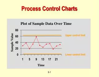
Control Charts. Control Charts allow a company’s performance over time to be analyzed by combining performance data, average, range and standard deviation. Control charts usually used to analyze a process the company performs. Data.

Control Charts
E N D
Presentation Transcript
Control Charts • Control Charts allow a company’s performance over time to be analyzed by combining performance data, average, range and standard deviation. Control charts usually used to analyze a process the company performs.
Data • The data used in the control charts we will discuss (X bar and R Charts) are samples of a population • From Gillette example 15 hours become 15 subgroups representing the total population of razor blades and each subgroup will have 5 data values n = 5. Data
Table of Data from Gillette Example 5 measurements for each subgroup Subgroups
Calculations for the Data • Find themean (X)and the range for each subgroup • X = ( Σ xi ) / n • R = Max (xi) – Min (xi) • Find the mean of the X and Range • X = ( Σ X i ) / (#of sub groups ) • R = ( Σ Ri ) / (# of sub groups )
Limits to our Control charts • Upper and lower control limits represent 3 standard deviations above and 3 standard deviations below the mean line respectfully. • Instead of calculating the standard deviation for all of the sample data we use these simple equations
Control Limit Equations • X (UCLx) = X + A2*R • X (LCLx) = X - A2*R Where A2 can be found on page 237 of your Intro to IE textbook • R (UCLR) = D4*R • R (LCLR) = D3*R Where D4 and D3 can be found on page 237 of your Intro to IE textbook.
Control Chart Analysis • To analyze the control charts it is important to remember that the data is represented over six standard deviations, there are three standard deviations from the mean line to the upper control limit and three from the mean to the lower control limit. To help analyze the charts, it is important to divide the chart area into six sections A, B, and C representing the standard deviations.
Interpreting the Control Chart • To interpret the data we first look at the R chart. The R chart represents the variety in the data and if the variety is to great than there is no need to look at the X control chart. • The chart is out of control if one or a combination of the following four examples occur:
Process out of Control 1. If one point falls outside of the 3 sigma control limits (beyond zone A)
Process out of Control • If two out of any three successive points fall in zone A of the same side
Process out of Control 3. If four out of any five successive points fall in or beyond zone B of the same side
Process out of Control 4. If eight successive points fall in or beyond zone C of the same side