Control Charts
Control Charts. Robin Henderson Royal Infirmary of Edinburgh Margrethe van Dijke Western General Hospital, Edinburgh National Stroke Audit Coordinators. Control Charts. Charts have been used in healthcare for a very long time! Carl Wunderlich 1861.

Control Charts
E N D
Presentation Transcript
Control Charts Robin Henderson Royal Infirmary of Edinburgh Margrethe van Dijke Western General Hospital, Edinburgh National Stroke Audit Coordinators
Control Charts Charts have been used in healthcare for a very long time! Carl Wunderlich 1861
Florence Nightingale – the “passionate statistician” - is believed to have invented a type of chart
The horizontal line at 98.2 °F indicates “normal” temperature
The red horizontal lines indicate the normal range 97.5 to 98.8 °F
The run chart has now been converted to a control chart – Walter Shewhart 1924
Typical Temperature Chart of Patient With Smallpox Infection Henderson, D. A. et al. JAMA 1999;281:2127-2137. The control chart helps us to distinguish between “common cause” variation and “special cause” variation
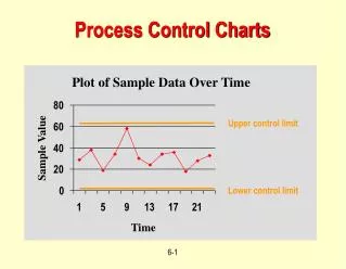
A run chart of the monthly proportion of patients with recorded swallow screens at RIE
To turn this run chart into a control chart we have to calculate a centre line and limits. The calculations are quite easy to do but most users get a computer to perform the calculations and plot the chart. An Excel tool may be downloaded from: - http://www.indicators.scot.nhs.uk/SPC/SPC.html
All points fall between the tram lines and there are no “unusual” patterns of variation so there is no evidence of any special cause variation
We have evidence of improvement! If the average had remained at 66 then nine in a row above 66 would be most unlikely
It appears that a campaign by SALT staff has been effective and increased the average monthly proportion of patients screened from 66% to 82%.
The mean waiting time from referrals being received to patients being seen in the NV Clinic has decreased from 11.3 to 3.5.
The mean percentage of DEFCVD patients seen in the NV Clinic within seven days since referral has being received has increased from 28.8 to 91.5.
How do you know that your stroke care is improving? Control charts are a very useful tool for addressing this question. “Display is an obligation!” John Tukey 1986 Have a go!
Thank You Very Much! Telephone 0131 242 6934 e-mail Robin.Henderson@luht.nhs.uk