Statistical Analysis - Graphical Techniques
Systems Engineering Program. Department of Engineering Management, Information and Systems. EMIS 7370/5370 STAT 5340 : PROBABILITY AND STATISTICS FOR SCIENTISTS AND ENGINEERS. Statistical Analysis - Graphical Techniques. Dr. Jerrell T. Stracener, SAE Fellow. Leadership in Engineering.

Statistical Analysis - Graphical Techniques
E N D
Presentation Transcript
Systems Engineering Program Department of Engineering Management, Information and Systems EMIS 7370/5370 STAT 5340 : PROBABILITY AND STATISTICS FOR SCIENTISTS AND ENGINEERS Statistical Analysis - Graphical Techniques Dr. Jerrell T. Stracener, SAE Fellow Leadership in Engineering
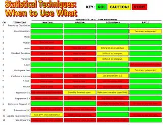
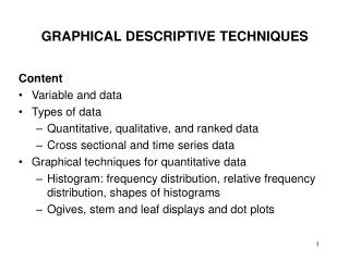
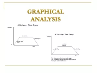
Time Series Graph or Run Chart • Box Plot • Histogram and Relative Frequency Histogram • Frequency Distribution • Probability Plotting
Time Series Graph or Run Chart • A plot of the data set x1, x2, …, xn in the order • in which the data were obtained • Used to detect trends or patterns in the data • over time
Box Plot • A pictorial summary used to describe the • most prominent statistical features of the data • set, x1, x2, …, xn, including its: • - Center or location • - Spread or variability • - Extent and nature of any deviation from symmetry • - Identification of ‘outliers’
Box Plot • Shows only certain statistics rather than all the • data, namely • - median • - quartiles • - smallest and greatest values in the sample • Immediate visuals of a box plot are the center, • the spread, and the overall range of the data
Box Plot Given the following random sample of size 25: 38, 10, 60, 90, 88, 96, 1, 41, 86, 14, 25, 5, 16, 22, 29, 34, 55, 36, 37, 36, 91, 47, 43, 30, 98 Arranged in order from least to greatest: 1, 5, 10, 14, 16, 22, 25, 29, 30, 34, 36, 36, 37, 38, 41, 43, 47, 55, 60, 86, 88, 90, 91, 96, 98
Box Plot • First, find the median, the value exactly in the • middle of an ordered set of numbers. • The median is 37 • Next, we consider only the values to the left of • the median: • 1, 5, 10, 14, 16, 22, 25, 29, 30, 34, 36, 36 • We now find the median of this set of numbers. • The median for this group is (22 + 25)/2 = 23.5, • which is the lower quartile.
Box Plot • Now consider the values to the right of the • median. • 38, 41, 43, 47, 55, 60, 86, 88, 90, 91, 96, 98 • The median for this set is (60 + 86)/2 = 73, which • is the upper quartile. • We are now ready to find the interquartile range • (IQR), which is the difference between the upper • and lower quartiles, 73 - 23.5 = 49.5 • 49.5 is the interquartile range
lower extreme lower quartile median upper extreme mean 10 20 30 40 50 60 70 80 90 100 0 Box Plot The lower quartile 23.5 The median is 37 The upper quartile 73 The interquartile range is 49.5 The mean is 45.1 upper quartile
Histogram A graph of the observed frequencies in the data set, x1, x2, …, xn versus data magnitude to visually indicate its statistical properties, including - shape - location or central tendency - scatter or variability Guidelines for Constructing Histograms – Discrete Data
Guidelines for Constructing Histograms – Discrete Data • If the data x1, x2, …, xn are from a discrete • random variable with possible values y1, y2, …, yk • count the number of occurrences of each value • of y and associate the frequency fi with yi, • for i = 1, …, k, • Note that
Guidelines for Constructing Histograms – Continuous Data • If the data x1, x2, …, xn are from a continuous • random variable • - select the number of intervals or cells, r, • to be a number between 3 and 20, as an • initial value use r = (n)1/2, where n is the • number of observations • - establish r intervals of equal width, starting • just below the smallest value of x • - count the number of values of x within • each interval to obtain the frequency • associated with each interval • - construct graph by plotting (fi, i) for • i = 1, 2, …, k
Histogram and Relative Frequency Example To illustrate the construction of a relative frequency distribution, consider the following data which represent the lives of 40 carbatteries of a given type recorded to the nearest tenth of a year.The batteries were guaranteed to last 3 years.
Histogram and Relative Frequency Example For this example, using the guidelines for constructing a histogram, the number of classes selected is 7 with a class width of 0.5. The frequency and relative frequency distribution for the data are shown in the following table.
Histogram and Relative Frequency The following diagram is a relative frequency histogram of the battery lives with an approximate estimate of the probability density function superimposed.
Probability Plotting • Data are plotted on special graph paper • designed for a particular distribution • - Normal - Weibull • - Lognormal - Exponential • If the assumed model is adequate, the plotted • points will tend to fall in a straight line • If the model is inadequate, the plot will not • be linear and the type & extent of departures • can be seen • Once a model appears to fit the data • reasonably well, percentiles and parameters can • be estimated from the plot
Probability Plotting General Procedure We need value estimates corresponding to each of the sample values in order to plot the data on the probability paper. These estimates are accomplished with what are called median ranks. Median ranks represent the 50% confidence level (“best guess”) estimate for the true value of F(t), based on the total sample size and the order number (first, second, etc.) of the data.
Benard’s Approximation There is an approximation that can be used to estimate median ranks, called Benard’s approximation. It has the form: where n is the sample size and i is the sample order number. Tables of median ranks can be found in many statistics and reliability texts.
Probability Plotting Procedure • Step 1: Obtain special graph paper, known asprobability paper, designed for the distribution under • examination. Weibull, Lognormal and Normal paper • are available at: • http://www.weibull.com/GPaper/index.htm • Step 2: Rank the sample values from smallest • to largest in magnitude i.e., X1 X2 ..., Xn.
Probability Plotting General Procedure • Step 3: • Plot the Xi’s on the paper versus • or , • depending on whether the marked axis • on the paper refers to the % or the proportion • of observations. The axis of the graph paper on • which the Xi’s are plotted is referred to as • the observational scale, and the axis for • as the cumulative scale.
Probability Plotting General Procedure • Step 4: If a straight line appears to fit the data, • draw a line on the graph, ‘by eye’. • Step 5: Estimate the model parameters from • the graph.
Weibull Probability Plotting Paper If the cumulative probability distribution function isWe now need to linearize this function into the form y = ax +b
Weibull Probability Plotting Paper Then which is the equation of a straight line of the form y = ax +b
Weibull Probability Plotting Paper where and
Weibull Probability Plotting Paper which is a linear equation with a slope of b and an intercept of . Now the x- and y-axes of the Weibull probability plotting paper can be constructed. The x-axis is simply logarithmic, since x = ln(T) and
Weibull Probability Plotting Paper cumulative probability(in %) x
Probability Plotting - Example To illustrate the process let 10, 20, 30, 40, 50, and 80 be a random sample of size n = 6.
Probability Plotting - Example Based on Benard’s approximation, we can now calculate F(t) for each observed value of X. For example, for x2=20, ^
Probability Plotting - Example In summary, ^
Probability Plotting - Example Now that we have y-coordinate values to go with the x-coordinate sample values so we can plot the points on Weibull probability paper. ^ F(x)(in %) x
^ F(x)(in %) Probability Plotting - Example The line represents the estimated relationship between x and F(x): x
Probability Plotting - Example In this example, the points on Weibull probability paper fall in a fairly linear fashion, indicating that the Weibull distribution provides a good fit to the data. If the points did not seem to follow a straight line, we might want to consider using another probability distribution to analyze the data.
Example - Probability Plotting Given the following random sample of size n=8, which probability distribution provides the best fit?
40 Specimens 40 specimens are cut from a plate for tensile tests. The tensile tests were made, resulting in Tensile Strength, x, as follows: Perform a statistical analysis of the tensile strength data.
40 Specimens Time Series plot: By visual inspection of the scatter plot, there seems to be no trend. Therefore, sample appears to be a random sample.
40 Specimens Using the descriptive statistics function in Excel, the following were calculated:
40 Specimens Using the histogram feature of excel the following data was calculated: and the graph: From looking at the Histogram and the Normal Probability Plot, we see that the tensile strength can be estimated by a normal distribution.
40 Specimens lower extreme median upper quartile lower quartile upper extreme mean 45 50 55 60 65 40 Box Plot The lower quartile 49.45 The median is 53.03 The mean 52.6 The upper quartile 55.3 The interquartile range is 5.86
40 Specimens ^ F(x) ^ f(x) The tensile strength distribution can be estimated by
Solve the Example using Minitab http://www.minitab.com/en-US/default.aspx