Charts
Charts. Charts are used to help people understand numerical data through visualization. Appropriate charts can provide different perspectives, details, overviews, generalizations, and trends in data.

Charts
E N D
Presentation Transcript
Charts • Charts are used to help people understand numerical data through visualization.
Appropriate charts can provide different perspectives, details, overviews, generalizations, and trends in data. • These visual language devices filter knowledge and provide appropriate chunking, structuring, and pacing in the presentation of data.
Scientists often distinguish charts from graphs. • Charts present numerical relations on a comparative basis. • Graphs present a functional relation between dependent and independent variables.
Examples of scientific charts • Bar chart, • pie chart, • various pictorial charts
Examples of scientific graphs • Continuous line plots on linear-linear coordinate scales, • on semi-logarithmic coordinate scales, • on log-log coordinate scales
Electronic spreadsheets usually do not make that distinction. • They take a more business orientation and refer to them both as charts. That’s what we do here, matching Excel’s terminology.
Basic issues in designing and implementing graphic presentations: Simplicity, clarity, and consistency are essential for good chart design. Keep extraneous text to a minimum.
Both legibility and readability can be significantly improved through the selection of graphic elements and the layout of the material.
Legibility • Legibility deals with the reader’s ability to successfully find, identify, and absorb what a chart denotes.
Readability • Readability concerns the chart’s interpretation and appeal.
Spreadsheet packages offer a variety of chart types for accomplishing this.
Column Bar Line Pie XY (scatter) Area Doughnut Radar Surface Bubble Stock Cone, cylinder, and pyramid Excel supplies:
You can create any one of these in Excel by first selecting the cells whose values are to be displayed in the chart. • Then click the Chart Wizard button on the standard toolbar and choose from among the options presented on the resulting series of dialog boxes.
Column charts • A column chart shows the data as vertical bars. • A column chart shows data changes over a period of time or illustrates comparisons among items. • Categories are organized horizontally, values vertically, to emphasize variation over time.
Stacked column charts show the relationship of individual items to the whole. • Step charts are column charts without space between the columns.
The 3-D perspective column chart compares data points along two axes. • In this 3-D chart, you can compare four quarters of sales performance in one division with the performance of two other divisions.
Bar chart • A bar chart displays the data as horizontal bars. • It is used to illustrate comparisons among individual items. • Categories are organized vertically, values horizontally, to focus on comparing values and to place less emphasis on time. • Stacked bar charts show the relationship of individual items to the whole.
Line chart • A line chart shows data plotted with or without markers at the data point locations and with or without line segments connecting the points. • A line chart shows trends in data at equal intervals, discretely or continuously.
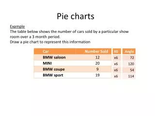
Pie chart • A pie chart displays the data in a circle divided into sectors. • It shows the proportional size of items(out of 100%) that make up a data series to the sum of the items. • NB: It always shows only one data series and is useful when you want to emphasize a significant element.
To make small sectors/slices easier to see, you can group them together as one item in a pie chart and then break down that item in a smaller pie or bar chart next to the main chart.
XY (scatter) chart • A scatter chart is like a line chart but with a greater variety of built-in axes for proportional calibrations. • An xy (scatter) chart either shows the relationships among the numeric values in several data series or plots two groups of numbers as one series of xy coordinates. • It shows uneven intervals or clusters of data and is commonly used for scientific data.
When you arrange your data, place x values in one row or column, and then enter corresponding y values in the adjacent rows or columns.
Area chart • An area chart shows the area under a curve. • It is usually used to emphasize the magnitude of change over time. • By displaying the sum of the plotted values, an area chart also shows the relationship of parts to a whole. • For example, an area chart might emphasize increased sales in Washington and illustrate the contribution of each state to total sales.
Doughnut chart • Like a pie chart, a doughnut chart shows the relationship of parts to a whole, but it can contain more than one data series. Each ring of the doughnut chart represents a data series.
Radar chart • In a radar chart, each category has its own value axis radiating from the center point. Lines connect all the values in the same series.
Surface chart • A surface chart is useful when you want to find optimum combinations between two sets of data. • As in a topographic map, colors and patterns indicate areas that are in the same range of values.
Bubble chart • A bubble chart is a type of xy (scatter) chart. The size of the data marker indicates the value of a third variable. • To arrange your data, place the x values in one row or column, and enter corresponding y values and bubble sizes in the adjacent rows or columns. • For example, a chart might show that Company A has the most products and the greatest market share, but not the highest sales.
Stock chart • The high-low-close chart is often used to illustrate stock prices. • This chart can also be used for scientific data, for example, to indicate temperature changes. • You must organize your data in the correct order to create this and other stock charts.
A stock chart that measures volume has two value axes: one for the columns that measure volume, the other for the stock prices. • You can include volume in a high-low-close or open-high-low-close chart.
Cone, cylinder, and pyramid • The cone, cylinder, and pyramid data markers are variations of columns and bars. They can add a special effect to 3-D column and bar charts. • So instead of having bars and columns you use cones, cylinders, and pyramids.
The ones most used in the business environment are: • Line • Bar and column • Pie
Line charts • These use a line to connect data points on a measurable area, e.g. a Cartesian grid, to show one dependent variable plotted against an independent variable, such as time. • With a line chart you can show long series of data, interpolate between points, extrapolate beyond known data values, and compare several data lines.
Line charts (cont.) • The purpose of a line chart is to emphasize a trend rather than actual amounts.
Guidelines in designing a line chart • Since there are the data point lines and grid and axis lines, make the data lines the thickest. • Make the grid lines thin or leave them out. • Axes should be medium weight ; they should be part of the rectangle that defines the entire data area.
Line chart (cont.) • If there’s enough room around the data area, place the tick marks and scale values outside the area. • If there is more than one line, distinguish them by color or texture. • Avoid presenting more than 5 data lines. • Be careful that when lines overlap, they are in an order where textures or colors won’t be mixed.
Line chart (cont.) • For legibility keep all typography horizontal, if possible. • Sans serif fonts in a single font design are often the most legible (Marcus 1992:101). • The title can be centered but a stronger structure is flush left aligned with the left side of the data area rectangle.