Bar Chart Evaluation Tool for comparing quantitative data
ABB Basic Quality Tools Series. Bar Chart Evaluation Tool for comparing quantitative data. Bar Chart - Content. What is it for?. For general display and communication of numeric data. To illustrate much information concisely. For comparing similar sets of data, showing changes between sets.

Bar Chart Evaluation Tool for comparing quantitative data
E N D
Presentation Transcript
ABB Basic Quality Tools Series Bar ChartEvaluation Tool for comparing quantitative data © ABB Group, 9AKK105151D0101 July 15, 2010 Slide 1
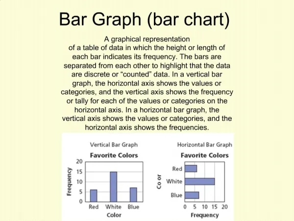
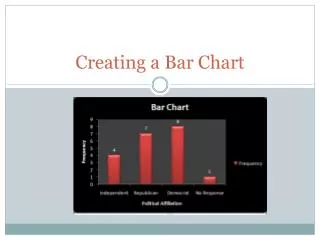
Bar Chart - Content What is it for? • For general display and communication of numeric data. • To illustrate much information concisely. • For comparing similar sets of data, showing changes between sets. Where could I use it? • To show the need for improvement. • To show how the project has improved target data. • When presenting results for effect. Understanding of service complaints How do I use it? • Define purpose of using chart. • Identify type of chart to use. • Collect data to display. • Plot the chart. • Interpret the chart. Risks and how to avoid them Example © ABB Group, 9AKK105151D0101 July 15, 2010 Slide 2
Bar Chart - What is it for? • Uses of this tool: • The Bar Chart is used to compare sets of similar data. • It can show changes of one set of data over time or can be used to compare separate data sets. • Its visual nature makes it useful for communications. • Pictorial graphs are a form of Bar Charts which have a more visual impact. • Radar charts provide visual clarity on trends on several criteria. • Pie charts present much information graphically to give a concise overview of a situation. • Expected Benefits: • The display of clear data allows decisions to be made quickly and easily. • Visual display helps with communication, agreement and gaining commitment to decisions. © ABB Group, 9AKK105151D0101 July 15, 2010 Slide 3
Bar Chart - Where could I use it? • Background: • Bar Charts are widely used and understood, making them an ideal tool for simple communications. • Pictorial graphs are a special form of Bar Chart that are less precise but more effective for presentation. • Radar charts give an overall view based on several crieria • Pie Charts provide a very compact form of illustration. • Uses: • Use it, rather than a line chart, to show discrete numerical quantities (rather than continuous change). • Use the Bar Chart to compare performance data and identify possible projects. • It can also be used during the analysis phase to identify specific problems to address. • It can be used to visualise improvement during a project lifecycle. • Powerful in presenting data in a simple way where the main areas of difference are clearly visible. Supporting tables of data are available for the details. © ABB Group, 9AKK105151D0101 July 15, 2010 Slide 4
Bar Chart - How do I use it? Procedure and Guidance Notes: • Clarify what you want to gain from using the chart. • For example, ‘Identification and agreement of improvement needs.’ Define purpose of using chart • The Bar Chart can be used in several ways, for example to compare several sets of data, showing each data set stacked in one bar or with side-by-side bars. • There are other forms of similar chart which may be used. • Pie Charts show proportion, but not absolute amounts • Pictorial graphs increase the visual impact • Radar charts show data in a round group. • Choose the type of chart that will best meet your purpose. For example using a stacked chart to show the contributions of different items. • Pictorial graphs and Radar charts have a high visual impact. • Pie charts show information very compactly. Identify type ofchart to use • Collect the data to show in the Chart. • Check Sheets can be used to collect manual data. Collect data to display • Plot the chart as planned. • Microsoft Excel/ Power Point have a number of different Bar Chart formats available and can produce charts easily and quickly. Plot the chart • The difference in heights of bars are usually significant. • Review the chart to meet your purpose and find meaning in what is displayed. Interpret the chart © ABB Group, 9AKK105151D0101 July 15, 2010 Slide 5
Bar Chart - Risks and how to avoid them • Risks : • If the wrong chart is selected, for example a Histogram instead of a Bar Chart or a Bar Chart instead of a Pareto Chart, then this can lead to incorrect decisions or confusing communications. • Invalid data or errors in copying data. • Steps to avoid them : • Be clear about what you want to achieve with the chart and verify, before using it, that it is the best tool for the job. • Where unexpected results occur, the first step should be to check that the data is valid. © ABB Group, 9AKK105151D0101 July 15, 2010 Slide 6
Bar Chart - Example 1. Define purpose of using chart Understanding of service complaints 2. Identify type of chart to use For exploration: stacked bar and side-by-side 3. Collect data to display 4. Plot the chart 5. Interpret the chart more Little variation in issues across regions North and West have more Marketing issues; East has R&D issues. © ABB Group, 9AKK105151D0101 July 15, 2010 Slide 7
R&D issues 25 20 15 North 10 Supplier issues Marketing issues 5 South 0 East West People issues Finance issues Pictorial Graph & Pie Chart - Example Pictorial Graph Number of aircraft bought by company Pie Chart % of investment in companies Radar Chart Regional issues © ABB Group, 9AKK105151D0101 July 15, 2010 slide 8