
Uploaded by
martina-mccall
7 SLIDES
177 VUES
70LIKES
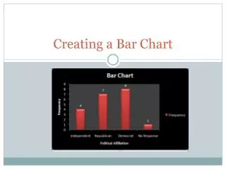
Political Affiliation Distribution Chart
DESCRIPTION
Visualize political affiliation frequency using a bar chart. Highlight and customize columns, add axis titles, and choose chart colors.
Download
1 / 7
Télécharger la présentation 
Political Affiliation Distribution Chart
An Image/Link below is provided (as is) to download presentation
Download Policy: Content on the Website is provided to you AS IS for your information and personal use and may not be sold / licensed / shared on other websites without getting consent from its author.
Content is provided to you AS IS for your information and personal use only.
Download presentation by click this link.
While downloading, if for some reason you are not able to download a presentation, the publisher may have deleted the file from their server.
During download, if you can't get a presentation, the file might be deleted by the publisher.
E N D
Presentation Transcript
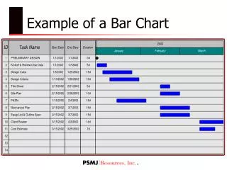
Create the chart • Highlight the columns of Political Affiliation and Frequency • Insert Column 2D column
Create axes titles • Chart Tools Layout Axis Title • Horizontal Title Title below axis • Vertical Title Rotated Title
Chart Colors • Chart Tools Design Choose the color from the list
Delete gridlines • Chart Tools Layout Gridlines None
Add Data Labels • Chart Tools Layout Data Labels Outside End


More Related