How to Create a Pie Chart on Mac for Frequency Distribution
Learn how to easily create a pie chart on your Mac to visualize data from a frequency distribution. Start by highlighting the columns for Political Affiliation and Percentage by holding down the Control and Alt buttons. Access the chart feature by navigating to Charts > Pie > 2D Pie. Add data labels to show percentages and customize your chart layout. You can position the chart title above the chart and adjust the legend to appear on the right side for better readability. This tutorial provides step-by-step instructions to create informative pie charts.


How to Create a Pie Chart on Mac for Frequency Distribution
E N D
Presentation Transcript
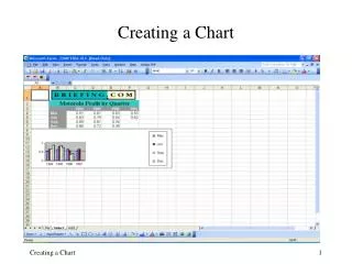
Creating a Pie Chart On a Mac
Create a Frequency Distribution • Refer to the tutorial creating a frequency distribution
Pie Chart • Highlight the columns of Political Affiliation and Percentage • Hold the control + alt button to highlight only these two columns • Charts Pie 2D Pie
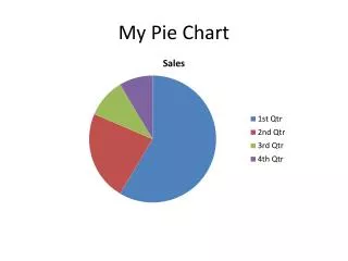
Add Data Labels • Chart Layout Data Labels Percentage
Chart Title • Chart Layout Chart Title Above Chart
Format Legend • Chart Layout Legend Legend at Right