
Uploaded by
hayden
2 SLIDES
225 VUES
30LIKES
Effective Data Collection Using Pie Charts for Visual Insights
DESCRIPTION
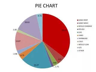
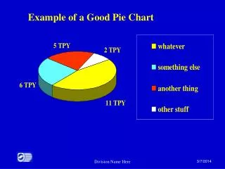
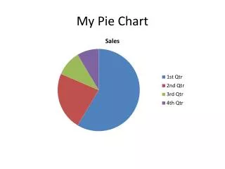
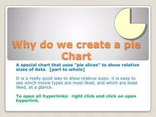
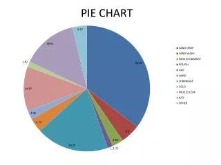
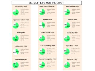
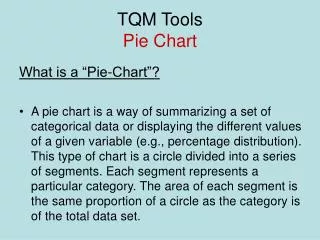
Data collection is essential for effective analysis, and pie charts can present this data visually to enhance understanding. By segmenting data into slices representing different categories or portions, pie charts make it easy to compare parts of a whole. This method is especially useful for displaying survey results, demographic information, and resource distributions. In this guide, we explore best practices for gathering data suitable for pie chart representation and tips to create impactful visualizations that communicate insights effectively.
Download
1 / 2
Télécharger la présentation 
Effective Data Collection Using Pie Charts for Visual Insights
An Image/Link below is provided (as is) to download presentation
Download Policy: Content on the Website is provided to you AS IS for your information and personal use and may not be sold / licensed / shared on other websites without getting consent from its author.
Content is provided to you AS IS for your information and personal use only.
Download presentation by click this link.
While downloading, if for some reason you are not able to download a presentation, the publisher may have deleted the file from their server.
During download, if you can't get a presentation, the file might be deleted by the publisher.
E N D


More Related