Typography
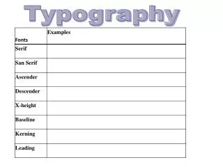
Typography. In Modern Publication Design. Compiled by Dianne Smith, CJE Alief Hastings High School Houston, TX. Part I:. Type Classifications. Some Classifications of Type. Serif. There are several methods of classifying typefaces. Following are five of the most common classifications:.

Typography
E N D
Presentation Transcript
Typography In Modern Publication Design Compiled by Dianne Smith, CJE Alief Hastings High School Houston, TX
Part I: Type Classifications
Some Classifications of Type Serif There are several methods of classifying typefaces. Following are five of the most common classifications: Sans Serif Script/Cursive Text/Black Decorative/Novelty
In publication design, the following type classifications are the most commonly used: Serif Used for body text Sans Serif Used for headlines, ads and other display type; also used for captions and body text in small doses
Serif No serifs Serif The basic difference between Serif and Sans Serif types is the decorative stroke which appears on the main strokes of Serif letters. Sans Serif type does not have these strokes.
The decorative strokes which characterize serif type help guide the eye from one letter to the next, making the type easy to read. The serifs help the eye identify what the letter is even when only a portion of a group of letters can be seen, and the mind fills in the rest. Which of the following is easier to make out? Sans Serif Type Serif Type
Serif Type Serif type has a long tradition in the printing industry. Through the centuries, serif type has undergone a few transformations, but one thing has remained constant: serif types are easy to read because the small, decorative strokes and the combination of thick and thin lines help to lead the eye on to the next letter, making it an excellent choice for body text.
Some Serif Typefaces Centaur: Garamond: Palatino: Times Roman: Century Schoolbook: These are just a few of the thousands of Serif typefaces. Although these typefaces have similarities because they all have decorative strokes, there are some subtle differences making each typeface unique.
Sans Serif Type The first sans serif (without serifs) typefaces appeared in 1816, butdid not gain acceptance for 100 years. In the 1920s, influenced by Germany’s Bauhaus school of design, type designers created typefaces almost totally devoid of ornamentation. Sans serif typefaces are highly readable in larger sizes, making them excellent choices for headlines and display purposes.
Script/Cursive Type A Parisian printer created the first script type in 1643. Script typefaces resemble hand-writing because the letters are joined. These type styles are excellent choices for certain types of advertising and for wedding invitations. They would not be appropriate for large blocks of body text because they are difficult to read.
Text/Black Type When Johann Gutenberg produced his movable type, the letterforms mimicked the hand-lettered style of writing of the time. The letters were very ornate and by today’s standards, are very difficult to read. Today Text or Black typefaces are used mainly for effect, in larger sizes. Some newspapers use them for their nameplates.
Here are a few nameplates from newspapers which use a Text typeface. Use of a text or black typeface for the nameplate projects a very conservative image for the paper.
Decorative/Novelty Type Decorative or novelty typefaces have been created for special purposes: to set a mood for an advertisement, to help illustrate an idea, or some other creative purpose.These are best used in large sizes because they are too difficult to read in body text.
Some Examples of Decorative/Novelty Type Thousands of decorative/novelty typefaces have been created, not only by commercial typographers, but by amateurs who are using some of the type creation software programs, such as Adobe Fontographer. These are used for special purposes and often help to set a mood for a feature story in a newspaper.
Part I: Type Classifications Summary
Classifications of Type 1. Serif Type: • Characterized by decorative strokes on the ends of the main strokes • Very readable type, good choice for body text
Classifications of Type A a A A A 2. Sans Serif Type • Characterized by the lack of decorative strokes on the ends of the main strokes. • Not as easy to read as serif type; good to use in large sizes, such as for headlines or other display purposes.
Classifications of Type 3. Script/Cursive • Type resembles handwritten letters. • Can be formal or casual. • Good for certain types of ads and invitations.
Classifications of Type 4. Text/Black • Type resembles handwritten letters. • Very formal • Difficult to read in small sizes • Used for some newspaper nameplates
Classifications of Type 5. Decorative/Novelty Type • Type created for special occasions • Usually very casual • Can be used to set mood for story
The End Presentation will repeat in 10 seconds.

