Download
1 / 30
300 likes | 319 Vues
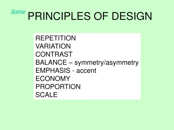
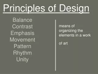
Principles of Design. Paul Rand “What is good Art or Design?”. Balance Contrast Movement, Direction 4) Economy. 5) Emphasis 6) Proportion 7) Rhythm 8) Unity & Variety. 8 PRINCIPLES OF DESIGN. Why do we need design principles?.

E N D
Balance Contrast Movement, Direction 4) Economy 5) Emphasis 6) Proportion 7) Rhythm 8) Unity & Variety 8 PRINCIPLES OF DESIGN
Why do we need design principles? • Our goal - is to learn how to communicate clearly, make design elements work well together to produce clear and concise messaging (a unified whole). • Designprinciples are rules that help to structure elements on a page.
BALANCE In general is seen as equal visual weight (“heaviness” or “lightness” of the forms arranged in a composition).Balance can help us to decide how to interpret a work of art. Norwegian Flyer for a Chair Norwegian Flyer for a Chair
Different Types of Balance Symmetrical Balance: - an even placement of visual weight in the design Asymmetrical Balance: - creates uneven spaces, a sense of imbalance & tension - gives a dynamic suggestion of visual movement - refers to a psychological or “felt” balance - space and shapes don’t need to be evenly dispersed on a page Radial Symmetry: - relates to images emitting from a point (Ex: like ripples from a pebble tossed into a pond)
Symmetrical Balance – The vertical axis is the implied center of gravity. Forms on either side of the axis correspond to one another other in size, shape and placement. Tibetan Mandala – “world in harmony” Deer’s Skull with Pedernal, Georgia O’Keeffe, 1936
SYMMETRICAL BALANCE The Two Fridas, Frida Kahlo, 1939
ASYMMETRICAL BALANCE 2 sides do not match, but the image seems to be well balanced because the visual weight in the two halves is similar. Death and Life, Gustav Klimt, 1911
Why is Balance Important? Balance is vital. A design can be ruined by poor balance! Balance should not be 50/50 in a boring mathematical sense. Different elements should add up to balance. How to Achieve Balance? Colors: all colors have visual weight Baby Blue = Light; Brown = Heavy
How to Achieve Balance? Shapes: squares can appear heavier than circles, etc. Lines: thick lines appear heavier than thin lines Size: larger = heavier
ASYMMETRICAL BALANCE A larger form is visually heavier than a smaller form. • A dark form is usually • heavier than a light • form of the same size.
ASYMMETRICAL BALANCE • A textured form appears • heavier than a smooth • form of the same size. • Two or more small • shapes can balance • a larger one.
ASYMMETRICAL BALANCE • A complex form is visually • heavier than a simple one • of the same size. • A smaller darker form • can balance a larger • light form.
How do you achieve balance if you don’tplace objects in the center? 1. Apply the Rule of Thirdsa) create a grid that tri-sects the image horizontally and vertically b) objects should be put at points where lines intersect c) objects should be aligned along common axis
“The Rule of Thirds” - Video http://www.peachpit.com/podcasts/episode.aspx?e=3cf32bfb-fb67-4109-9f03-4b000558036e
2. Balance positive & negative space a) pay attention to negative space (it’s weight, mass) b) negative space defines subject c) pay attention to the frame (paper edge, image edge)
Contrast – refers to differences in values, colors, textures, shapes, & other elements - can create visual excitement - can help add interest to the work If all the art elements - value, for example - are the same, the result is monotonous & unexciting.
The juxtaposition of opposing elements. Ex. opposite colors on the colorwheel - red / green, blue / orange, etc. Contrast in tone or value – lightvs dark. Contrast in direction – horizontal vs vertical. CONTRAST Death and Life, Gustav Klimt, 1911
Find 8 Different Types of Contrast Below Still Life with Apples and Peaches, Paul Cezanne, 1905, oil on canvas
8 Types of Contrast (Ex: Cezanne’s work): - intricate pattern vs. no pattern - hard edge vs. soft edges - dark, middle and light values - pure colors vs. muted colors - cool colors vs. warm colors - textured surface vs. smooth surface - organic shapes vs. geometric shapes - large shapes vs. small shapes
Emphasis– our attention is drawn to certainparts of the composition or one area. Focal Point– when the emphasis is ona relatively small, clearly defined area. Subordination– certain areas of the imageare purposefully made less interesting to allow other, more important areas to stand out.
Emphasisin Graphic Design - is also known as dominance - the first thing the eye sees on a design - Emphasis is used by artists to create dominance and focus in their work. - Artists can emphasize color, value, shapes, or other art elements to achieve dominance. - Various kinds of contrast can be used to emphasize a center of interest. Emphasis– What is It Used For?
Still Life with Compotier, Pitcher, and Fruit, Paul Sezanne, 1892-94
Emphasis– Why is it Important? Helps to create a specific start point on the design and, thus, let the viewer know where to start looking/reading. Helps the viewer to follow the correct direction, get information in the correct order, etc. It gets the viewer’s attention.
“The Box” Movie Poster “Amelie” Movie Poster
“NY I Love You” Movie Poster “Fame” Movie Poster
Emphasis– What to Avoid? • Be careful that your dominant element doesn’t • overwhelm the whole image. Too much dominance • and the viewer will see nothing else. • Many dominant features in a view tend to be distracting; the eye is drawn from one to another without the opportunity to focus on one major element.