Introduction to Graphics in R
440 likes | 586 Vues
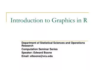
Introduction to Graphics in R. Department of Statistical Sciences and Operations Research Computation Seminar Series Speaker: Edward Boone Email: elboone@vcu.edu. What is R?.

Introduction to Graphics in R
E N D
Presentation Transcript
Introduction to Graphics in R Department of Statistical Sciences and Operations Research Computation Seminar Series Speaker: Edward Boone Email: elboone@vcu.edu
What is R? • The R statistical programming language is a free open source package based on the S language developed by Bell Labs. • The language is very powerful for writing programs. • Many statistical functions are already built in. • Contributed packages expand the functionality to cutting edge research. • Since it is a programming language, generating computer code to complete tasks is required.
Getting Started • Where to get R? • Go to www.r-project.org • Downloads: CRAN • Set your Mirror: Anyone in the USA is fine. • Select Windows 95 or later. • Select base. • Select R-2.4.1-win32.exe • The others are if you are a developer and wish to change the source code.
Getting Started • The R GUI?
Getting Started • Opening a script. • This gives you a script window.
Getting Started • Basic assignment and operations. • Arithmetic Operations: • +, -, *, /, ^ are the standard arithmetic operators. • Matrix Arithmetic. • * is element wise multiplication • %*% is matrix multiplication • Assignment • To assign a value to a variable use “<-”
Getting Started • How to use help in R? • R has a very good help system built in. • If you know which function you want help with simply use ?_______ with the function in the blank. • Ex: ?hist. • If you don’t know which function to use, then use help.search(“_______”). • Ex: help.search(“histogram”).
Importing Data • How do we get data into R? • Remember we have no point and click… • First make sure your data is in an easy to read format such as CSV (Comma Separated Values). • Use code: • D <- read.table(“path”,sep=“,”,header=TRUE)
Working with data. • Accessing columns. • D has our data in it…. But you can’t see it directly. • To select a column use D$column.
Working with data. • Subsetting data. • Use a logical operator to do this. • ==, >, <, <=, >=, <> are all logical operators. • Note that the “equals” logical operator is two = signs. • Example: • D[D$Gender == “M”,] • This will return the rows of D where Gender is “M”. • Remember R is case sensitive! • This code does nothing to the original dataset. • D.M <- D[D$Gender == “M”,] gives a dataset with the appropriate rows.
Basic Graphics • Histogram • hist(D$wg)
Basic Graphics • Add a title… • The “main” statement will give the plot an overall heading. • hist(D$wg , main=‘Weight Gain’)
Basic Graphics • Adding axis labels… • Use “xlab” and “ylab” to label the X and Y axes, respectively. • hist(D$wg , main=‘Weight Gain’,xlab=‘Weight Gain’, ylab =‘Frequency’)
Basic Graphics • Changing colors… • Use the col statement. • ?colors will give you help on the colors. • Common colors may simply put in using the name. • hist(D$wg, main=“Weight Gain”,xlab=“Weight Gain”, ylab =“Frequency”, col=“blue”)
Basic Plots • Box Plots • boxplot(D$wg)
Boxplots • Change it! • boxplot(D$wg,main='Weight Gain',ylab='Weight Gain (lbs)')
Box-Plots - Groupings • What if we want several box plots side by side to be able to compare them. • First Subset the Data into separate variables. • wg.m <- D[D$Gender=="M",] • wg.f <- D[D$Gender=="F",] • Then Create the box plot. • boxplot(wg.m$wg,wg.f$wg)
Boxplots - Groupings boxplot(wg.m$wg, wg.f$wg, main='Weight Gain (lbs)', ylab='Weight Gain', names = c('Male','Female'))
Boxplot Groupings • Do it by shift • wg.7a <- D[D$Shift=="7am",] • wg.8a <- D[D$Shift=="8am",] • wg.9a <- D[D$Shift=="9am",] • wg.10a <- D[D$Shift=="10am",] • wg.11a <- D[D$Shift=="11am",] • wg.12p <- D[D$Shift=="12pm",] • boxplot(wg.7a$wg, wg.8a$wg, wg.9a$wg, wg.10a$wg, wg.11a$wg, wg.12p$wg, main='Weight Gain', ylab='Weight Gain (lbs)', xlab='Shift', names = c('7am','8am','9am','10am','11am','12pm'))
Scatter Plots • Suppose we have two variables and we wish to see the relationship between them. • A scatter plot works very well. • R code: • plot(x,y) • Example • plot(D$metmin,D$wg)
Scatterplots plot(D$metmin,D$wg,main='Met Minutes vs. Weight Gain', xlab='Mets (min)',ylab='Weight Gain (lbs)')
Scatterplots plot(D$metmin,D$wg,main='Met Minutes vs. Weight Gain', xlab='Mets (min)',ylab='Weight Gain (lbs)',pch=2)
Line Plots • Often data comes through time. • Consider Dell stock • D2 <- read.csv("H:\\Dell.csv",header=TRUE) • t1 <- 1:nrow(D2) • plot(t1,D2$DELL)
Line Plots plot(t1,D2$DELL,type="l")
Line Plots plot(t1,D2$DELL,type="l",main='Dell Closing Stock Price', xlab='Time',ylab='Price $'))
Overlaying Plots • Often we have more than one variable measured against the same predictor (X). • plot(t1,D2$DELL,type="l",main='Dell Closing Stock Price',xlab='Time',ylab='Price $')) • lines(t1,D2$Intel)
Overlaying Graphs lines(t1,D2$Intel,lty=2)
Adding a Legend • Adding a legend is a bit tricky in R. • Syntax • legend( x, y, names, line types) X coordinate Corresponding line types Y coordinate Names of series in column format
Adding a Legend legend(60,45,c('Intel','Dell'),lty=c(1,2))
Paneling Graphics • Suppose we want more than one graphic on a panel. • We can partition the graphics panel to give us a framework in which to panel our plots. • par(mfrow = c( nrow, ncol)) Number of rows Number of columns
Paneling Graphics • Consider the following • par(mfrow=c(2,2)) • hist(D$wg, main='Histogram',xlab='Weight Gain', ylab ='Frequency', col=heat.colors(14)) • boxplot(wg.7a$wg, wg.8a$wg, wg.9a$wg, wg.10a$wg, wg.11a$wg, wg.12p$wg, main='Weight Gain', ylab='Weight Gain (lbs)', • xlab='Shift', names = c('7am','8am','9am','10am','11am','12pm')) • plot(D$metmin,D$wg,main='Met Minutes vs. Weight Gain', xlab='Mets (min)',ylab='Weight Gain (lbs)',pch=2) • plot(t1,D2$Intel,type="l",main='Closing Stock Prices',xlab='Time',ylab='Price $') • lines(t1,D2$DELL,lty=2)
Summary • R is an environment in which publication quality graphics can be generated. • Similar statements control the graphics functions • Main • Xlab • Ylab
Summary • All of the R code and files can be found at: