Download

1 / 8
80 likes | 183 Vues
Learn how to draw and interpret climate graphs to compare the climates of two distinct cities - Greenwich, England (51˚50' N, 0˚00' E) and New Delhi, India (28˚37' N, 77˚13' E), located at different latitudes. Explore their positions on a global scale and understand the differences in attire due to varying climates. Discover the significance of climate data analysis using climate graphs. Unveil the average temperature and rainfall patterns using these informative graphs derived from meteorological data.

E N D
Lets compare the climates of 2 completely different cities of the world Greenwich, England Lat. 51˚ 50' N, Long. 00 ˚ 00' E New Delhi, India Lat. 28˚ 37' N, Long. 77˚ 13' E
So where are they on a Global scale? Greenwich, England Lat. 51˚ 50' N, Long. 00 ˚ 00' E New Delhi, India Lat. 28˚ 37' N, Long. 77˚ 13' E Equator
So how do both climates compare? The people having their photo taken above at the prime meridian line in Greenwich are wearing clothes for colder weather (Big jackets, high boots and long pants. The people having their photo taken above in New Delhi look to be wearing clothes for hotter weather (short sleeved, light clothed and sunglasses)
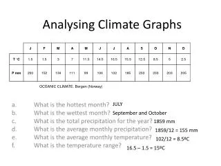
Lets look at the climate data over a period of 12 months for both cities • Pretty boring and not a very convenient way when looking for climatic patterns • So that is why Climate Graphs were created.
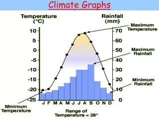
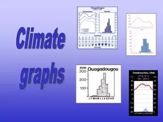
So...what are climate graphs? • Climate graphs show the average temperature and rainfall experienced at a particular place throughout the year. • They consist of a line graph showing averagemonthly temperature and a simple column graphshowing averagemonthly rainfall figures. • Climate graphs are constructed using data collected by meteorologists.