Essential Elements for Creating Effective Scatter Graphs
Scatter graphs are vital for illustrating the relationship between two values using plotted points. To ensure clarity and accuracy, a scatter graph must include several key elements: a descriptive title, properly labelled axes with units, even scales starting from zero, clearly marked points (preferably crosses), and a line of best fit to indicate the relationship between data points. Understanding these components enhances the graph's effectiveness in displaying patterns, correlations, and trends, allowing for better interpretation and analysis.

Essential Elements for Creating Effective Scatter Graphs
E N D
Presentation Transcript
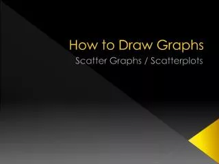
How to Draw Graphs Scatter Graphs / Scatterplots
A scatter graph is a graph that uses a series of points to find a relationship between two values. Sometimes an equation can be found.
What a scatter graph needs The 2nd graph is better than the first. What are the 5 main ways the 2nd graph is better?
What a scatter graph needs. A scatter graph must have; • A title. • Labelled axis with a name, a symbol and a unit. e.g. Time, T (hours) • Even scales that, if possible, start at 0. • Clearly marked points. Use a cross not a dot. • If there is a relationship (pattern) there should be a “line of best fit”.
1. Title You need a title that tells the reader what the graph is showing. The title should be approximately 1 sentence long.
2. Labelled Axis You need labels on each axis. If it is possible a label should have 3 things. • A name • A one letter symbol • A unit in brackets showing what the axis is measured in e.g. Force, F (N) Diamond Size, D (carats) Temperature, T (oC)
3. Even Scales The numbers on each axis must be; • The same amount apart. • The same distance apart. The numbers should start at zero if possible.
4. Clearly Marked Points Use a cross not a dot.
5. Line of Best Fit A line of best fit is a line that shows the pattern in the results. The line shows an average result. • It can go through points. • It does NOT need to go through points. • It does NOT need to go through zero. • It should go as close to as many points as possible.
Strong Relationship Weak Relationship We describe the relationship shown by the points on a graph by how well it lines up with the “line of best fit”. If the line is going up we call it “positive”. If the line is going down we call it “negative”. Most points line up Only a few points line up
Most of the time we choose from this list of descriptions. • Strong positive relationship • Moderate positive relationship • Weak positive relationship • No obvious relationship • Weak negative relationship • Moderate negative relationship • Strong negative relationship
Pages 363-364 Copy the 7 graphs from pages 363 and 364 as examples. Draw a line of best fit on each graph. Use the labels on the last slide to describe each relationship shown in the graphs.
Correlation When the word correlation is used for a scatter graph it means pattern or relationship. These points show a strong positive relationship. These points show a strong positive correlation.
Interpolation This means reading a number off the line of best fit. This number is between the highest and lowest points. On this graph we can use interpolation to find that at 12s the distance was 25.
Extrapolation This means reading a number off the line of best fit. This number is above the highest or below the lowest points. On this graph we can use extrapolation to find that at 17.5s the distance was 36.