Download
1 / 17
170 likes | 296 Vues
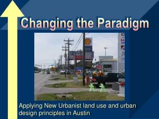
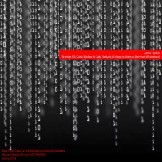
Jason Lipshin Exercise #2: Case Studies in Data Analysis (5 Ways to Make a Story out of Numbers). Real-Time Cities: an Introduction to Urban Cybernetics Harvard Design School: SCI 0646900 Spring 2014. Narrative Title.

E N D
Jason Lipshin Exercise #2: Case Studies in Data Analysis (5 Ways to Make a Story out of Numbers) Real-Time Cities: an Introduction to Urban Cybernetics Harvard Design School: SCI 0646900 Spring 2014
Narrative Title • For this assignment, I tried to assemble a wide variety of different methods for analyzing data and making it legible, as well as meaningful, to the user. Some of these methods include: • Real-time mapping • Network diagrams emphasizing density of edges to communicate information • Affective, wearable displays on the body, using light and color • Additionally, many of the projects I have assembled here have a “critical design” element. They are objects that are meant to catalyze reflection and thought, rather than strictly be functional. 1 | Milk 2 | They Rule 3 | Warning Signs 4 | Stock Market Skirt 5 |Luna Helmet
1 | Milk (Esther Polak, 2004) Milk is an art project which attempts to make legible the global supply chain behind a carton of milk, “from the udder of a cow in Latvia to the consumer’s plate in the Netherlands.” The milk was tracked via GPS devices and its movement was tracked in real-time on an online map. The image below is from the Milk project’s installation at the Making Things Public exhbition, curated by Bruno Latour. Project Video: http://www.youtube.com/watch?v=9MSnD4DrUwo
1 | Milk What is the raw data? Answer: The raw data is the location of the milk in its production process. What processes are deployed to transform the raw data to information? Answer: the path of the milk is visualized and tracked on a map, so that global production processes behind the milk are made more visible to the consumer. What is the information that is the outcome of the aforementioned processes? Answer: the global supply chain becomes more visible to the average consumer. In other words, the processes by which milk travels from the udder of a cow to a consumer’s refrigerator is visualized, revealing a path or journey that was previously more opaque.
1 | Milk How the act of sensing or access to raw data leads to comparison, judgment, reflection, reasoning, and abstraction? Answer: Again, reflection is catalyzed in the consumer by means of making a previously opaque process more visible. Consumers are unlikely to think about the tremendous journey that their product made in order to make it to the store, but this project encourages users to think about their food more in terms of systems and the tremendous production apparatus necessary to produce even a simple carton of milk. How the sum of all the above processes is resulting in a limited sort of agency for the data-driven construct? Answer… …
2 | They Rule (Josh On, 2004) They Rule aims to provide a glimpse into the incestuous relationships amongst the global ruling class. It focuses on the boards of some of the most powerful U.S. companies and aims to highlight the ways in which the same directors will often lead multiple corporations. The user can explore the close-knit relationships and concetrations of power in these networks by clicking on a particular person node. That person’s connections will then be displayed, such that the user can better understand these connections in an exploratory way. Project Video: http://www.youtube.com/watch?v=9MSnD4DrUwo
2 | They Rule What is the raw data? Answer: The raw data is the connections between CEOs and some of the world’s most powerful corporations. What processes are deployed to transform the raw data to information? Answer: The “They Rule” visualization makes concentrations of power more explicit by making visible the connections between corporations. Although there is a pretense of diversity, this visualization aims to show that power is actually concentrated in very few hands. What is the information that is the outcome of the aforementioned processes? Answer: The visualization aims to make concentrations of power more visible to the user. Although the raw data about who holds a top position at a Fortune 500 company is freely available on the web, it is hard to see such stark concentrations of power without taking a look at a network diagram such as this.
2) They Rule How the act of sensing or access to raw data leads to comparison, judgment, reflection, reasoning, and abstraction? Answer: Visualizing this information as a network diagram allows the user to see concentrations of power in a more stark way. When a single node displays a greater concentration or clustering of edges, it is clear that that particular individuals has connections to the boards of many top companies and holds a highly disproportionate amount of power compared to everyday Americans. How the sum of all the above processes is resulting in a limited sort of agency for the data-driven construct? Answer… …
3 | Warning Signs (Nien Lam, 2011) Warning Signs is a visualization of air pollution within the immediate environment around the user. When the wearer adorns the sensing sweater, if carbon monoxide is in the air at higher than normal levels, the piece subtly changes color and lights up. Project Video: http://www.youtube.com/watch?v=9MSnD4DrUwo
3|Warning Signs What is the raw data? Answer: Carbon Monoxide levels immediately surrounding the wearer of the sweater. What processes are deployed to transform the raw data to information? Answer:Warning Signs transforms the raw data into intensity of light and color which is legible to the user. The information produced is more affective in nature, rather than logical and rational. However, it’s aim is still to inform and produce critical reflection. What is the information that is the outcome of the aforementioned processes? Answer: The visualization aims to make environmental air quality more legible to the user, but in a more real time, localized, and engaging fashion than is typically deployed in more top-down initiatives aiming to inform the general public about air quality.
3) Warning Signs How the act of sensing or access to raw data leads to comparison, judgment, reflection, reasoning, and abstraction? Answer: When air quality is visualized directly on the body and as a pair of lungs, there is a greater sense of immediacy about how environmental air quality affects one’s personal health. How the sum of all the above processes is resulting in a limited sort of agency for the data-driven construct? Answer… …
4 | Stock Market Skirt (Nancy Patterson, 1996) Stock Market Skirt is a feminist art project that extracts and analyzes stock prices from online stock market quote pages on the internet. These values are then used to determine whether to raise or lower a skirt via a stepper motor. According to the artist’s website: “when the stock prices rises, the hemline is raised; when the stock market prices fall; the hemline is lowered.” Project Video: http://www.youtube.com/watch?v=9MSnD4DrUwo
4|Stock Market Skirt What is the raw data? Answer: Real-time data on the stock market. What processes are deployed to transform the raw data to information? Answer: The raw stock data is actuated as the height of the skirt’s hemline. What is the information that is the outcome of the aforementioned processes? Answer: The information attempts to make a connection between wealth and female sexuality. It is a sensing project with a feminist orientation, hoping to use data in a politically rhetorical fashion.
4) Stock Market Skirt How the act of sensing or access to raw data leads to comparison, judgment, reflection, reasoning, and abstraction? Answer: : The information attempts to make a connection between wealth and female sexuality. It is a sensing project with a feminist orientation, hoping to use data in a politically rhetorical fashion. It is not meant necessarily to comment specifically on the data, but uses the data in order to make a political statement. How the sum of all the above processes is resulting in a limited sort of agency for the data-driven construct? Answer… …
5|Luna Helmet (Florian Floyd Mueller, 2014) Luna Helmet is an art / criical design project that makes personal health data more social. It visualizes heart rate data on a helmet, allowing drivers and other bike riders aware of the personal exertion level of the rider. Project Video: http://www.youtube.com/watch?v=9MSnD4DrUwo
5| Luna Helmet What is the raw data? Answer: Heart rate data from the wearer’s pulse. What processes are deployed to transform the raw data to information? Answer: The raw heart rate data is transformed into color, light intensity, and rhythm which is readable those in the immediate vicinity of the rider. What is the information that is the outcome of the aforementioned processes? Answer: The heart rate data becomes more legible in a social fashion, rather than as solely for personal uses.
5) Luna Helmet How the act of sensing or access to raw data leads to comparison, judgment, reflection, reasoning, and abstraction? Answer: Visualizing this information as a network diagram allows the user to see concentrations of power in a more stark way. When a single node displays a greater concentration or clustering of edges, it is clear that that particular individuals has connections to the boards of many top companies and holds a highly disproportionate amount of power compared to everyday Americans. How the sum of all the above processes is resulting in a limited sort of agency for the data-driven construct? Answer… …