Basic Typography
Basic Typography. Typography. The art and practice of making words both readable and legible . Readability: how easy a text is to read. Legibility: speed with which each word is recognized. Basic Anatomy. Baseline. Alphabet. Uppercase Letter. Lowercase Letters. Basic Anatomy.

Basic Typography
E N D
Presentation Transcript
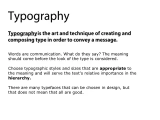
Typography • The art and practice of making words both readable and legible. • Readability: how easy a text is to read. • Legibility: speed with which each word is recognized.
Basic Anatomy Baseline Alphabet Uppercase Letter Lowercase Letters
Basic Anatomy Ascenders Counters Alphabet X-Height, or Body Baseline Descender
Basic Anatomy Serif Alphabet Serif Baseline
Variations & Form • Sans Serif • Serif • Bold • Italic • Bold Italic
Basic Type Measurements • point 1/72 inch size & linespacing • pica 1/6 inch line length / column depth
Type Sizes • Display type 14 pt. or larger • Text type smaller than 14 pt.
Other Measurements • Em space (mutton) • En space (nut)
Horizontal Spacing • Letterspacing • Word Spacing • Tracking • Kerning
Kerning Texas
Kerning Texas T exas
Vertical Spacing • Leading aka Linespacing
Categories of Type • Romans • Sans Serifs • Slab Serifs (Egyptians) • Scripts* • Miscellaneous / Novelty
Romans • Based on traditional letterforms • Very readable / legible • Two characteristics: Typography
Sans Serifs • Contemporary • Two characteristics: Typography
Slab Serifs (Egyptians) • Combine characteristics of romans & sans serifs: Typography
Scripts • resembles handwriting • resembles handwriting
Miscellaneous / Novelty • Mood
How do we read? • CAPS vs. lowercase typography TYPOGRAPHY
Serif vs. Sans Serif You will find that the serifs on a typeface facilitate the horizontal flow necessary to comfortable reading. As sans serif typefaces do not have serifs, some people find them difficult or uncomfortable to read. The designer should be aware of this and decide for himself whether to use a serif or a sans serif typeface. Which do you find easier to read?
Serif vs. Sans Serif • You will find that the serifs on a typeface facilitate the horizontal flow necessary to comfortable reading. As sans serif typefaces do not have serifs, some people find them difficult or uncomfortable to read. The designer should be aware of this and decide for himself whether to use a serif or a sans serif typeface. Which do you find easier to read?
Black on White or Vice Versa? Is it more difficult to read white type on a black background or black type on a white background? White type on a black background has a tendency to sparkle, which distracts the eye and makes reading difficult. Is it more difficult to read white type on a black background or black type on a white background? White type on a black background has a tendency to sparkle, which distracts the eye and makes reading difficult.
Boldvs. Regular Bold type can be very effective when used for emphasis or in small quantities. When the designer uses bold type in large quantities, he must ask himself if the excessive blackness of the type is actually aiding legibility.
Bold vs. Regular Bold type can be very effective when used for emphasis or in small quantities. When the designer uses bold type in large quantities, he must ask himself if the excessive blackness of the type is actually aiding legibility.
Designing with Text Type • Aesthetics • Appropriateness • Legibility Leading Line Length • Graphics Standards • Corporate identity
Arranging the Type • justified • unjustified - flush left, ragged right - flush right, ragged left • centered • asymmetrical
Designing withDisplay Type • Relationship to text type • Mood? • Setting ALL CAPS all lowercase Cap First Letter Of Every Word. Cap First Letter of Important Words. Cap first letter of first word only.
Designing with Display Type • Breaking Lines Designing with Display Type Designingwith Display Type
Designingwith Display Type • Breaking Lines • Arrangement • Attention-getters • Letterspacing • Word Spacing • Punctuation • Optical Alignment

