Reporting Frequency
Reporting Frequency. Frequency Tables Histograms. Reporting Frequency: Frequency Tables and Histograms Review: Stem-and-Leaf Plots, and Line Plots. Warm Up. Problem of the Day. Lesson Presentation. Course 2. Warm Up Jason deposits $200 in an account that earns

Reporting Frequency
E N D
Presentation Transcript
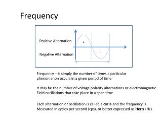
Reporting Frequency Frequency Tables Histograms
Reporting Frequency: Frequency Tables and Histograms Review: Stem-and-Leaf Plots, and Line Plots Warm Up Problem of the Day Lesson Presentation Course 2
Warm Up Jason deposits $200 in an account that earns 3.6% simple interest. How long until the total amount $300. Almost 14 years Course 2
Problem of the Day Books A, B, C, and D are on the bookshelf. A is between C and B. B is between A and D. D is not on the right. What is the order of the books from right to left? D, B, A, C Course 2
Learn to organize and interpret data in frequency tables and histograms. Review organizing data in stem-and-leaf plots, and line plots.
Vocabulary frequency table cumulative frequency histogram stem-and-leaf plot line plot
Stems Leaves 2 4 7 9 3 0 6 Things we know: Stem-and-Leaf Plot A stem-and-leaf plot can be used to show how often data values occur and how they are distributed. Each leaf on the plot represents the right-hand digit in a data value, and each stem represents left-hand digits. Key:2|7 means 27
Example 1: Organizing and Interpreting Data in a Stem-and-Leaf Plot The data shows the number of years coached by the top 15 coaches in the all-time NFL coaching victories. Make a stem-and-leaf plot of the data. Then find the number of coaches who coached fewer than 25 years. 33, 40, 29, 33, 23, 22, 20, 21, 18, 23, 17, 15, 15, 12, 17 Step 1: Order the data from least to greatest. Since the data values range from 12 to 40, use tens digits for the stems and ones digits for the leaves.
Stems Leaves Example 1 Continued The data shows the number of years coached by the top 15 coaches in the all-time NFL coaching victories. Make a stem-and-leaf plot of the data. Then find the number of coaches who coached fewer than 25 years. 33, 40, 29, 33, 23, 22, 20, 21, 18, 23, 17, 15, 15, 12, 17 Step 2: List the stems from least to greatest on the plot. The stems are the tens digits. 1 2 3 4
Stems Leaves Example 1 Continued The data shows the number of years coached by the top 15 coaches in the all-time NFL coaching victories. Make a stem-and-leaf plot of the data. Then find the number of coaches who coached fewer than 25 years. 33, 40, 29, 33, 23, 22, 20, 21, 18, 23, 17, 15, 15, 12, 17 Step 3: List the leaves for each stem from least to greatest. The stems are the tens digits. The leaves are the ones digits. 8 5 5 7 7 2 1 2 3 4 0 3 2 3 9 1 3 3 0
Stems Leaves 8 5 5 7 7 2 1 2 3 4 0 3 2 3 9 1 3 3 0 Example 1 Continued Step 4: Add a key and a title. Number of Years Coached The stems are the tens digits. The leaves are the ones digits. Key: 2 | 1 means 21. 11 coaches coached fewer than 25 years.
Your Turn: Example 2 The list shows the number of times each soccer player can bounce the ball on their knee. How many soccer players can bounce the ball more than 36 times. 55, 60, 33, 30, 23, 45, 28, 41, 62, 29, 35, 40, 43, 37, 68, 30, 61, 27, 38, 41 Step 1: Order the data from least to greatest. Since the data values range from 23 to 68, use tens digits for the stems and ones digits for the leaves.
Stems Leaves Your Turn: Example 2 Continued The list shows the number of times each soccer player can bounce the ball on their knee. How many soccer players can bounce the ball more than 36 times. 55, 60, 33, 30, 23, 45, 28, 41, 62, 29, 35, 40, 43, 37, 68, 30, 61, 27, 38, 41 Step 2: List the stems from least to greatest on the plot. The stems are the tens digits. 2 3 4 5 6
Stems Leaves 2 3 4 5 6 Your Turn: Example 2 Continued The list shows the number of times each soccer player can bounce the ball on their knee. How many soccer players can bounce the ball more than 36 times. 55, 60, 33, 30, 23, 45, 28, 41, 62, 29, 35, 40, 43, 37, 68, 30, 61, 27, 38, 41 Step 3: List the leaves for each stem from least to greatest. The stems are the tens digits. The leaves are the ones digits. 8 7 3 9 0 7 3 8 0 5 1 1 0 3 5 5 8 1 2 0
Stems Leaves 8 7 3 9 2 3 4 5 6 0 7 3 8 0 5 1 1 0 3 5 5 8 1 2 0 Your Turn: Example 2 Continued Step 4: Add a key and a title. Number of times a Soccer Player can bounce the ball on their knee The stems are the tens digits. The leaves are the ones digits. Key: 4 | 0 means 40. 12 soccer players can bounce the ball on their knee more than 36 times.
Example 3: Organizing and Interpreting Data in a Line Plot Make a line plot of the data. How many hours per day did Morgan babysit most often? Number of Babysitting Hours in July
0 1 2 3 4 5 6 7 8 DAY 2 Period 3 Example 3 Continued Make a line plot of the data. How many hours per day did Morgan babysit most often? Step 1: The data values range from 0 to 8. Draw a number line that includes this range.
0 1 2 3 4 5 6 7 8 Example 3 Continued Make a line plot of the data. How many hours per day did Morgan babysit most often? Step 2: Put an X above the number on the number line that corresponds to the number of babysitting hours in July. XXXXXX XXXX XXXX XXX XXX XXX XX XX X The greatest number of X’s appear above the number 6. This means that Morgan babysat most often for 6 hours.
Your Turn: Example 4 Make a line plot of the data. How many slices of pizza did most people eat? Number of Slices eaten per Person
0 1 2 3 4 5 6 Example 4 Continued Make a line plot of the data. How many slices of pizza did most people eat? Step 1: The data values range from 0 to 6. Draw a number line that includes this range.
0 1 2 3 4 5 6 Example 4 Continued Make a line plot of the data. How many slices of pizza did most people eat? Step 2: Put an X above the number on the number line that corresponds to the number slices of pizza eaten per person. XXXXXX XXXX XXX XXX XXX X X The greatest number of X’s appear above the number 2. This means that most people ate 2 slices of pizza.
A frequency table is best used to keep track of and organize data! We can even use them to help keep up with data as we are conducting our surveys!
A frequency table is a way to organize data into categories or groups. It lists each item in a data set with the number of times it occurs. By including a cumulative frequency column in your table, you can keep a running total of the frequencies in each category.
A frequency table contains 3 columns. # of Cats in Homes
February Temperatures in 20 Cities Cumulative Frequency Average Highs Frequency DAY 2 Period 2, 1 Example 5: Organizing and Interpreting Data in a Frequency Table The list shows the average high temperatures for 20 cities on one February day. Make a cumulative frequency table of the data. How many cities had average high temperature below 59 degrees? 69, 66, 65, 51, 50, 50, 44, 41, 38, 32, 32, 28, 20, 18, 12, 8, 8, 4, 2, 2 Step 1: Choose a scale that includes all of the data values. Then separate the scale into equal intervals. 0–19 20–39 40–59 60–79
February Temperatures in 20 Cities Cumulative Frequency Average Highs Frequency Example 5 Continued The list shows the average high temperatures for 20 cities on one February day. Make a cumulative frequency table of the data. How many cities had average high temperature below 59 degrees? 69, 66, 65, 51, 50, 50, 44, 41, 38, 32, 32, 28, 20, 18, 12, 8, 8, 4, 2, 2 Step 2: Find the number of data values in each interval. Write these numbers in the “Frequency” column. 0–19 7 20–39 5 40–59 5 3 60–79
February Temperatures in 20 Cities Cumulative Frequency Average Highs Frequency 0–19 7 20–39 5 40–59 5 3 60–79 Example 5 Continued The list shows the average high temperatures for 20 cities on one February day. Make a cumulative frequency table of the data. How many cities had average high temperature below 59 degrees? 69, 66, 65, 51, 50, 50, 44, 41, 38, 32, 32, 28, 20, 18, 12, 8, 8, 4, 2, 2 Step 3: Find the cumulative frequency for each row by adding all the frequency values that are above or in that row. 7 12 17 20 17 cities had average high temperature below 59 degrees.
English Exam Grades Cumulative Frequency Grades Frequency Your Turn: Example 6 The list shows the grades received on an English exam. Make a cumulative frequency table of the data. How many students received a grade of 79 or below? 85, 84, 77, 65, 99, 90, 80, 85, 95, 72, 60, 66, 94, 86, 79, 87, 68, 95, 71, 96 Step 1: Choose a scale that includes all of the data values. Then separate the scale into equal intervals. 60–69 70–79 80–89 90–99
English Exam Grades Cumulative Frequency Grades Frequency 60–69 70–79 80–89 90–99 Your Turn: Example 6 Continued The list shows the grades received on an English exam. Make a cumulative frequency table of the data. How many students received a grade of 79 or below? 85, 84, 77, 65, 99, 90, 80, 85, 95, 72, 60, 66, 94, 86, 79, 87, 68, 95, 71, 96 Step 2: Find the number of data values in each interval. Write these numbers in the “Frequency” column. 4 4 6 6
English Exam Grades Cumulative Frequency Grades Frequency 4 60–69 4 70–79 80–89 6 6 90–99 Your Turn: Example 6 Continued The list shows the grades received on an English exam. Make a cumulative frequency table of the data. How many students received a grade of 79 or below? 85, 84, 77, 65, 99, 90, 80, 85, 95, 72, 60, 66, 94, 86, 79, 87, 68, 95, 71, 96 Step 3: Find the cumulative frequency for each row by adding all the frequency values that are above or in that row. 4 8 14 20 8 students received grades of 79 or below.
What is a Histogram? Period 3 Day 3 • A histogram is a bar graph with no spaces between the bars. The height of each bar shows the frequency of data within that interval. The intervals of a histogram are of equal size and do not overlap.
Histogram Example 7 Class Test Scores Frequency Test Scores
Histograms Example 8 95 flashlights are tested until they fail. The table gives the times taken ( hours ) until failure. Find 2 or more things wrong with the histogram which represents the data in the table.
Histograms Example 8 Continue Answer: Time taken for 95 components to fail • There is no title. • There are no units on the x-axis. Time to failure (Hours)
Histogram– a bar graph that gives the frequency of each • value. • In a histogram, the horizontal axis is like a number line • divided into equal widths. • Each width represents a data value or range of data values. • The height of each bar indicates the frequency of • that data value or range of data values.
*Ex 10. The given data shows the # of people in 24 vehicles that passed a designated checkpoint. 1, 4, 1, 2, 2, 1, 3, 1, 3, 2, 2, 6, 4, 2, 1, 1, 2, 4, 3, 1, 2, 4, 2, 3. a.) Make a frequency table for these data. b.) Make a histogram from the frequency table.
*Ex11. Use the relative frequencies given to estimate the probability that a randomly selected customer will rent a canoe for 5 or more hours. Question: What % rented a canoe for 5, 6, 7, and 8 hours?
Histograms are used to show the frequency of data. Very similar to bar graphs, but use intervals on the X axis. Bars do touch. Histograms have a title. Histograms have two axes which are labeled. Histogram
NOW LET US GET THAT PROJECT DONE Frequency Tables Histograms