Paranoia - When Darkness Falls
90 likes | 192 Vues
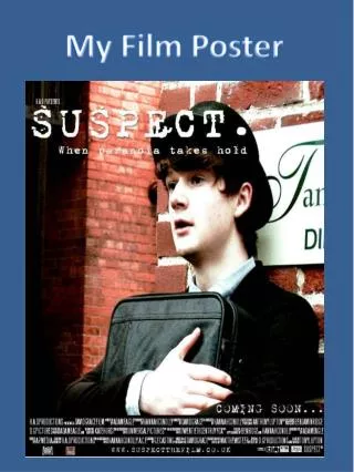
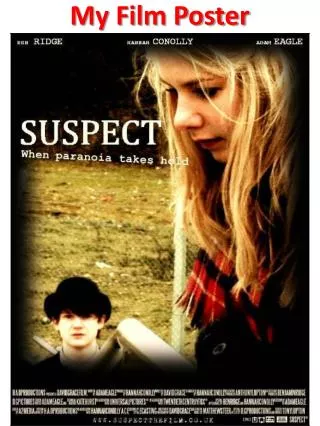
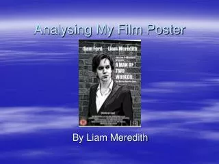
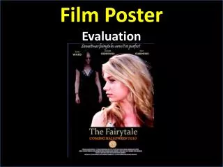
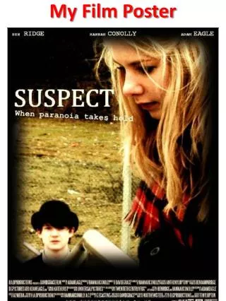
An intriguing Psychological Thriller film poster inviting the audience to question the enigmatic relationship between two characters. The poster features a femme fatale exuding power and a male character oozing anxiety, set in a dark, mysterious backdrop. With a clinical color scheme and bold typography, it aims to captivate the audience's curiosity and create a sense of unease. The combination of layout, font, and image positioning enhances the poster's realism, appealing predominantly to a teenage audience.

Paranoia - When Darkness Falls
E N D
Presentation Transcript
Aim The main aim of any poster is to advertise the film and make the audience want to see it. I didn’t want to alienate the audience but I wanted them to ask questions about the content of the film through the images and theme represented visually on the poster. I also wanted to create enigma within the narrative inviting the audience to question the relationship between the two characters.
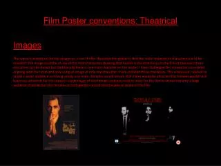
Research I have tried to make my poster as generic as possible by including all key aspects of film posters. I researched famous posters to look at the requirements and to get some interesting ideas. I particularly looked at Psychological Thrillers, because that is the genre of my film. As you can see they all have black on them somewhere. Some of theme include warm colours, and others cooler- I decided cooler colours would suite my style of film more effectively. As you can see, the majority of the titles are white on a black background, I liked this style, so decided to do the same.
Genre & Target Audience Genre My film is Psychological Thriller. I wanted to make this clear thought the poster as well as the film. I feel I made this clear through the look on the male characters face. He portrays the feeling of anxiety. The woman gives the impression that she is empowered and superior, her image is more prominent on the poster, and she looks unafraid; a kind of femme fatale. Target Audience The target audience of our film is a 12. This is because it contains adult themes and story line and after reading through the British Board of Film Classification (BBFC) requirements. The poster has teenagers on it, therefore appealing to fellow teenagers.
Layout TitleI have positioned this in the top left side of the poster. This is because it then has a black background making the white title stand out by the black vs. White contrast. It therefore makes it easy to read. The title is quite big but it fits perfectly into the specific segment. Font Title font= Cambria Math It looks like a headline and is in upper case so that it stands out. Tag line font= Courier New Its chose this because it looks like an old type righter font. Credits The credits make the poster look more professional so I was pleased to find I could download the specific font like the originals. We also included a website, as they are widely used to create a ‘buzz’ around the film, showcase the actors, teaser posters and trailers.
Layout Actors NamesI have positioned the actors names in order of importance from left to right, as they do in film posters. The text is white to match the rest of the text on the poster. Tagline ‘When paranoia takes hold’ I have slanted the words to accentuate the fact that there is something wrong. The in-balance between the title and tagline reinforces the words in it ‘paranoia’ in particular.
Image Colour Scheme I chose to put all the text it in white to match the title and also because it gives the poster a clinical feel to link back to paranoia as it is a mental illness. The hostile setting demonstrates the uneasiness of the scene. I muted the colours in the picture to reflect the mystery . I increased the intensity and brightness of the photo to make it more eye-catching. I added a black boarder to the poster to frame the photo and to show the film is dark which creates fear. The blackness represents death and isolation.
Image Character PositioningWhat does the character positioning telll the audience about the two characters? I purposefully put the female character in the foreground of the photo to show that she has the power in the film. From looking at other posters I know it is effective to have at least one character to look out at the audience. This is because it draws them in.
Strengths & Weaknesses Strengths I made sure I followed generic characteristics to make sure my poster look as realistic as possible. The composition abides by the rules of posters from the same genre. WeaknessesI would have liked to have enhanced the resolution of the photograph.