AS Evaluation
AS Evaluation . In what ways does your media product use, develop or challenge the forms and conventions of real media products?. Cover: the title.

AS Evaluation
E N D
Presentation Transcript
In what ways does your media product use, develop or challenge the forms and conventions of real media products?
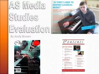
Cover: the title The word “Bolt” has connotations of strength and escapism, which would appeal to the target rebellious male and female target audience.I had originally planned on having a lightning bolt font so I used Stencil STD as a stand in. Eventually I gave up looking for a lightning font and decided to keep my stand in but enlarge it significantly and have the letters stretched upwards. This changed the eventual theme of my cover as it was originally planned to be lightning influenced but the Stencil STD font inspired me to take a different approach to my cover. The yellow colour keeps with my lightning idea but I decided against changing it as I believed it was very eye-catching and it reminded me of Kerrang!’s tactic of being very ‘in-your-face’ and noisy. My cover theme was Kerrang! Meets NME.
Cover: colours My whole AS product follows the colour scheme of red, white, black and yellow. This was inspired by both NME and Kerrang! as the former follows a red, white and black code and the latter follows the same as my own cover. I did this to make my cover look more effective, stylish and organised so it will appeal to a teenage / young adult audience. I believe the colours portray a strong atmosphere as they are bold and vibrant which conforms with the rebellious attitude that Kerrang! Magazine tries to portray. The black background was used to provide more emphasis on the main photo, and also to portray a darker, more teenage theme to the cover. Rock music also uses the colours red, black and yellow regularlybecause they are eye-catching and striking, so I believe fans of the genre will pick up on that conformity.
Cover: images There is only one image on my front cover, which was a conscious choice as I wanted to emulate how NME sometimes use this technique. I researched a lot of covers and I believed that using only one main image would direct the most amount of attention onto my main article, which I believe would be good technique to market my product. Saying that I used 1 main image is a slight change of truth, in reality I took 3 individual photos (see right) and using Photoshop, I edited them and merged them to make 1 main picture. I wanted the picture to reflect the cliché of rebellious, angst-y band photos seen on NME and Kerrang! And I feel I achieved my aim sufficiently. The decision to use young models was with the intention of appealing to my teenage target audience.
Cover: fonts As mentioned earlier, the font for my title is Stencil STD, which originally just a big, bulky stand-in for my original plans of lightning bolt, but it quickly shaped how my magazine piece turned out. It is eye-catching and it has quite a military feel to it which I believe, young people will connect with. I use Stencil STD for the main pieces of text, as I believed it was too good of a font too waste due to it’s ability to attract the attention of a passer-by. The text below the main headline is in Orator STD, which I chose it because it was a thin and spread out font which strongly contrasted with the Stencil STD. The font I used for “The nation’s favourite magazine” was Copperplate Gothic Bold, which I chose to emulate a similar feature found on empire magazines where it says, “The world’s biggest movie magazine”. I chose the font to be as close to the empire font as I can. This is a development for a music magazine as I am conforming to a movie magazine feature.
Contents Page My contents page follows the same colour scheme as my cover, which I did deliberately to create cohesion between my pieces. The font “Stencil STD” is also carried over from my previous piece to show continuity. I chose to use only 3 pictures of people as I felt that they would draw attention away from the text but they are effective at emphasising some of the main articles in magazine. I chose that particular picture of Ben Flynn (Boy with microphone) as it contrasts with the striking and angst-y picture on my cover. I felt this would allow my readers to see there are multiple layers to Ben, and will compel them to read more about the band. The editorial is a typical feature of music magazine, especially Kerrang! so I decided to emulate this convention in my own personal piece. The text being tilted and oversized is a change from cover as I wanted to show readers that my magazine isn’t the same on every page. This feature can be found on Kerrang! And AP magazine as it suggests break away from the tidy and neat conventions and adding something a bit more rebellious, which I feel would connect with my readers. Contents pages’ tend to have a different layout to front covers as they have a different purpose. The purpose of a front cover is to attract attention to and advertise the magazine as a product, whereas the contents page is traditionally viewed after the purchase where the product can give information to the consumer, which is the purpose of a contents page. However, the contents page may also be viewed prior to purchase by an inquisitive consumer, so the contents page also has a secondary purpose of advertising , which is why there is still eye-catching font and striking photos.
Double Page Spread My double page spread is a combination of both my contents and cover as I tilted some of the text to follow on from my cover as well as the photograph of Ben Flynn by a microphone. I use the same colour scheme and basic fonts that I started on my cover but I also develop on the font front, by adding minion pro for my main block of text as I felt it looked professional and similar to a real magazine. The font I used for the yellow captions at the bottom is Lucida Sans as that is the exact font used by Kerrang! So I decided to use this convention. I used elephant on the yellow text to the left describing the songs, as it similarly as bold and eye-catching as Stencil STD but easier to read especially when the font is smaller. Structurally, I follow the same layout as a certain issue of Kerrang!, as I felt it looked very effective and inspired me to do the same.
