Download
1 / 39
390 likes | 445 Vues
Learn about the seven quality tools, their purposes, applications, and benefits in improving processes and solving problems effectively.

E N D
Seven Quality Tools Presented by: Arif Altaf
Objective • Present an overview of Seven Quality Tools • Address purpose and applications • Highlight benefits
Why Do This? The Deming Chain Improve Quality Decrease Costs Improve Productivity Decrease Price Increase Market Stay in Business Provide More Jobs Return on Investment
Six Problem Solving Steps • Identify • recognize the symptoms • Define • Agree on the problem and set boundaries • Investigate • Collect data • Analyze • Use quality tools to aid • Solve • Develop the solution and implement • Confirm • Follow up to ensure that the solution is effective
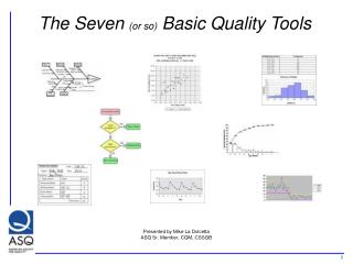
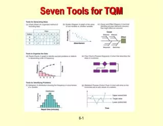
Seven Quality Tools • Cause and Effect Diagrams • Flow Charts • Checksheets • Histograms • Pareto Charts • Control Charts • Scatter Diagrams
Quality ToolBrainstorming Rules • Diverse group • Go around room and get input from all – one idea per turn • Continue until ideas are exhausted • No criticism • Group ideas that go together • Look for answers
Quality Tool Cause and Effect Diagrams
Fishbone Diagram Purpose: Graphical representation of the trail leading to the root cause of a problem How is it done? • Decide which quality characteristic, outcome or effect you want to examine (may use Pareto chart) • Backbone –draw straight line • Ribs – categories • Medium size bones –secondary causes • Small bones – root causes
Cause & Effect Diagrams Benefits: • Breaks problems down into bite-size pieces to find root cause • Fosters team work • Common understanding of factors causing the problem • Road map to verify picture of the process • Follows brainstorming relationship
Cause & Effect Diagrams Sample Manpower Materials Typos Source info incorrect Wrong source info Didn’t follow proc. Dyslexic Transposition Wrong purchase order Poor training Incorrect shipping documents Glare on display Temp. Corrupt data No training Environment No procedure Keyboard sticks No communications Software problem Methods Machine
Quality Tool Flow Charts
Flow Charts Purpose: Visual illustration of the sequence of operations required to complete a task • Schematic drawing of the process to measure or improve. • Starting point for process improvement • Potential weakness in the process are made visual. • Picture of process as it should be. Benefits: • Identify process improvements • Understand the process • Shows duplicated effort and other non-value-added steps • Clarify working relationships between people and organizations • Target specific steps in the process for improvement.
Flow ChartsTop Down Benefits • Simplest of all flowcharts • Used for planning new processes or examining existing one • Keep people focused on the whole process How is it done? • List major steps • Write them across top of the chart • List sub-steps under each in order they occur
Flow chartsLinear Benefits • Show what actually happens at each step in the process • Show what happens when non-standard events occur • Graphically display processes to identify redundancies and other wasted effort How is it done? • Write the process step inside each symbol • Connect the Symbols with arrows showing the direction of flow Toolbox
Quality Tool Checksheets
Checksheets Purpose: • Tool for collecting and organizing measured or counted data • Data collected can be used as input data for other quality tools Benefits: • Collect data in a systematic and organized manner • To determine source of problem • To facilitate classification of data (stratification)
Quality Control Tool Histograms
Histograms Purpose: To determine the spread or variation of a set of data points in a graphical form How is it done?: • Collect data, 50-100 data point • Determine the range of the data • Calculate the size of the class interval • Divide data points into classes Determine the class boundary • Count # of data points in each class • Draw the histogram Stable process, exhibiting bell shape
Histograms Benefits: • Allows you to understand at a glance the variation that exists in a process • The shape of the histogram will show process behavior • Often, it will tell you to dig deeper for otherwise unseen causes of variation. • The shape and size of the dispersion will help identify otherwise hidden sources of variation • Used to determine the capability of a process • Starting point for the improvement process
Quality Control Tool Pareto Charts
Pareto Charts Purpose: Prioritize problems. How is it done? • Create a preliminary list of problem classifications. • Tally the occurrences in each problem classification. • Arrange each classification in order from highest to lowest • Construct the bar chart
Pareto Charts Benefits: • Pareto analysis helps graphically display results so the significant few problems emerge from the general background • It tells you what to work on first
Pareto Charts Pareto Charts Weighted Pareto • Weighted Pareto charts use the quantity of defects multiplied by their cost to determine the order.
Quality Control Tool Control Charts
Control Charts Purpose: The primary purpose of a control chart is to predict expected product outcome. Benefits: • Predict process out of control and out of specification limits • Distinguish between specific, identifiable causes of variation • Can be used for statistical process control
Control Charts • Strategy for eliminating assignable-cause variation: • Get timely data so that you see the effect of the assignable cause soon after it occurs. • As soon as you see something that indicates that an assignable cause of variation has happened, search for the cause. • Change tools to compensate for the assignable cause. • Strategy for reducing common-cause variation: • Do not attempt to explain the difference between any of the values or data points produced by a stable system in control. • Reducing common-cause variation usually requires making fundamental changes in your process
Control Charts • Control Chart Decision Tree • Determine Sample size (n) • Variable or Attribute Data • Variable is measured on a continuous scale • Attribute is occurrences in n observations • Determine if sample size is constant or changing
Control Charts Control Chart Decision Tree X bar , R n = 2 to 10 n >10 X bar, S Variable data n = 1 IX, Moving Range Start Constant n p (fraction defective) or np (number def. Per sample Percent data Attribute Data Changing n p Count data c (defects per sample or u defects per unit Constant n Changing n u
Control Charts What does it look like? • Adding the element of time will help clarify your understanding of the causes of variation in the processes. • A run chart is a line graph of data points organized in time sequence and centered on the median data value.
Control ChartsIndividualX charts How is it done? • The data must have a normal distribution (bell curve). • Have 20 or more data points. Fifteen is the absolute minimum. • List the data points in time order.Determine the range between each of the consecutive data points. • Find the mean or average of the data point values. • Calculate the control limits (three standard deviations) • Set up the scales for your control chart. • Draw a solid line representing the data mean. • Draw the upper and lower control limits. • Plot the data points in time sequence.
Control Charts • Next, look at the upper and lower control limits. If your process is in control, 99.73% of all the data points will be inside those lines. • The upper and lower control limits represent three standard deviations on either side of the mean. • Divide the distance between the centerline and the upper control limit into three equal zones representing three standard deviations.
Control Charts • Search for trends: • Two out of three consecutive points are in zone “C” • Four out of five consecutive points on the same side of the center line are on zone “B” or “C” • Only one of 10 consecutive points is in zone “A”
Control Charts • Basic Control Charts interpretation rules: • Specials are any points above the UCL or below the LCL • A Run violation is seven or more consecutive points above or below the center (20-25 plot points) • A trend violation is any upward or downward movement of five or more consecutive points or drifts of seven or more points (10-20 plot points) • A 1-in-20 violation is more than one point in twenty consecutive points close to the center line
Quality Control Tool Scatter Diagrams
Scatter Diagrams Purpose: To identify the correlations that might exist between a quality characteristic and a factor that might be driving it • A scatter diagram shows the correlation between two variables in a process. • These variables could be a Critical To Quality (CTQ) characteristic and a factor affecting it two factors affecting a CTQ or two related quality characteristics. • Dots representing data points are scattered on the diagram. • The extent to which the dots cluster together in a line across the diagram shows the strength with which the two factors are related.
Scatter Diagrams How is it done?: • Decide which paired factors you want to examine. Both factors must be measurable on some incremental linear scale. • Collect 30 to 100 paired data points. • Find the highest and lowest value for both variables. • Draw the vertical (y) and horizontal (x) axes of a graph. • Plot the data • Title the diagram The shape that the cluster of dots takes will tell you something about the relationship between the two variables that you tested.
Scatter Diagrams • If the variables are correlated, when one changes the other probably also changes. • Dots that look like they are trying to form a line are strongly correlated. • Sometimes the scatter plot may show little correlation when all the data are considered at once. • Stratifying the data, that is, breaking it into two or more groups based on some difference such as the equipment used, the time of day, some variation in materials or differences in the people involved, may show surprising results
Scatter Diagrams • You may occasionally get scatter diagrams that look boomerang- or banana-shaped. • To analyze the strength of the correlation, divide the scatter plot into two sections. • Treat each halfseparately in your analysis Benefits: • Helps identify and test probable causes. • By knowing which elements of your process are related and how they are related, you will know what to control or what to vary to affect a quality characteristic.


![Seven Quality Tools [Statistical Process Control]](https://cdn3.slideserve.com/6416179/seven-quality-tools-statistical-process-control-dt.jpg)