
Charts
E N D
Presentation Transcript
Charts • Presenting data • Good data presentation skills are important. • Poor graphs and tables lead to the wrong conclusions being drawn
Displaying your data • There are some good rules of thumb for displaying numerical data: • Simple is always better • Graphs, tables and charts can be used together • Use clear titles and labels • Provide descriptions of the main points • Don’t compare variables with diiferent scales of magnitude
Choosing the best graph • Line graphs • These are used to display frequency distributions over time • The y-axis represents frequency • The X-axis represents time or different groups • Use different colours or patterned lines to represent different groups
Line graphs can consist of straight lines or curved segments: • Lines – use straight lines to connect ‘real’ data points • Curves – use to represent functional relations between data points or to interpolate data • Use a line graph: • To display long data rows • To forecast data values • To compare different graphs • To find and compare changes over time • To recognise correlation and variation between values
If the x-axis requires an interval scale • To display interactions over two levels on the x-axis • When it defines meaningful patterns (i.e. a zigzag line) • Do not use a line graph: • If the x-axis has non-numeric values
Bar charts • Use bar charts to: • Present small data sets over a nominal (e.g. countries, testing conditions) or interval scale (e.g. time) • Compare data • Do not use bar charts for: • Comparisons – it is better to use one-dimensional scattergraphsbecause it is not dominated by bars or columns • Larger data sets – use line charts instead
Always try to arrange the groups that define the bars in a natural order – for example, age • If a natural order does not exist, define categories by name • Position the bars vertically or horizontally • Always make the bars the same width • The length of a bar should be proportional to the frequency of the event
Clustered bar charts • Bars are presented as clusters of subgroups • These are useful for comparing values across categories • They are sometimes referred to as stacked bar charts
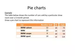
Pie charts • This is a circular (360o) graphic representation of data • It compares groups or subgroups to the whole group or category using differently coloured or patterned segments • Segments may be pulled out of the pie for emphasis (an ‘exploded’ pie chart)
Use pie charts to: • Convey approximate proportional relationships (relative amounts) at a point in time • Compare part of a whole at a given point in time • Emphasise a small proportion of data • Do not use pie charts: • For exact comparisons of values, because estimating angles is difficult • To rank data – use column/bar charts in this case; use multiple column/bar charts for grouped data • If proportions vary greatly • Do not use multiple pie charts to compare corresponding parts
Always exercise care in the use of pie charts • Pie charts cannot represent values beyond 100% • Each pie chart is valid for one point in time only • Pie charts are only suited to presenting percentage values • People find it harder to estimate angles than distances
How to create graphs • Your teacher will now demonstrate how to create a chart using the coffee producers file
Legends, titles and labels • Every chart should have a title that describes what it represents, such as ‘Sale of Chickens in November’ • If a bar chart or pie chart is being displayed then there is usually a legend • This is placed near the chart to describe what is represented in it • Some chart wizards will include a legend even if it is not required, in these cases delete it!
Make sure axes are labelled and titled • Ensure the segments of pie charts are clearly labelled or a visible legend is provided • Sometimes both are needed
Printing charts • When you produce a chart it is almost certainly on the same screen as the data associated with it • If the chart is going to be used away from the spreadsheet, for instance for inserting into a newsletter, you may want to copy it separately from the data • Planning what data to use and what is not is an important skill to develop