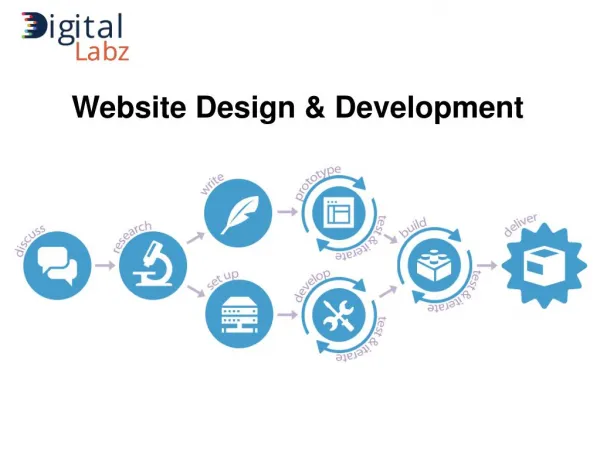
Make Your Website Mobile-Friendly with Web Development Agency
While talking about mobile-friendly in context to web development is all about the display and text and how it appeared on a smaller screen. People will be able to contact your company easily if you have a mobile-friendly website. It helps to gain more visibility and lead generation. All in all, Google also prioritize mobile-friendliness as its main algorithm. To start with the process, take a Google mobile-friendly test. If you fail in it, you need to overhaul your website by getting help from a good web development agency.


Make Your Website Mobile-Friendly with Web Development Agency
E N D
Presentation Transcript
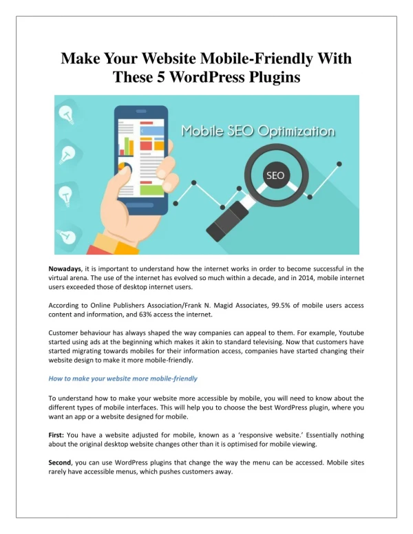
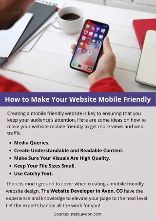
Make Your Website Mobile-Friendly with Web Development Agency Do you know most of the global audience uses mobile phones to carry out their searches? Yes, according to the statistics, around 70% of the people prefer to use mobile phones compared to desktop. Thus, making your websites mobile-friendly should be your absolute endeavour. While talking about mobile-friendly in context to web development is all about the display and text and how it appeared on a smaller screen. People will be able to contact your company easily if you have a mobile-friendly website. It helps to gain more visibility and lead generation. All in all, Google also prioritize mobile-friendliness as its main algorithm. To start with the process, take a Google mobile-friendly test. If you fail in it, you need to overhaul your website by getting help from a good web development agency. Have a look at below given important steps to make your website mobile-friendly: Pick A Mobile-Friendly Theme To develop a mobile-friendly website, choosing a theme that works well on mobile matters. Make sure to do relevant searches while doing it on the WordPress platform. What if your selected theme is not mobile-friendly? You can make it one! Ask any web development services provider to alter the width of the theme according to mobile size. They can do it just using one line of code. Use Readable Fonts Content of the website really matters, or your viewers will not be able to find what are they looking for! Website development agency stress using a bit bigger size so that it can be read easily on the small screen. Not only readability but also use different categories like services, FAQ and other sections, so viewers get easy access to their questions. If you put every text on the home page itself, it will confuse your audience. Don’t Forget the Viewport Meta Tag If your website opens on your mobile as the same size as that of desktop, you will experience weird scrolls. Moreover, you need to move the screen on your phone to read all the written text. That’s when the viewport metatag comes into action. It helps your website alter its width when accessed from a mobile phone. So, it pretty sure for you have to add this meta tag to your website when you are aiming for a mobile-friendly site.
Conduct Regular Test Even if your website looks good today, changes in mobile technology can make it unresponsive later. After altering the website, spend some time scrolling and searching your website to see whether it works and performs well as you expected. Listen to other’s opinions on your websites to make them more mobile-responsive and user-friendly. Take help from a good website development services provider to make it more friendly. Modify Button Placement While aiming for a responsive website, modifying button placement is merely important so that the viewers can touch them. Placing them too tightly will definitely irritate your users. Using the appropriate spacing & alignments is just a way to solve this issue. Placing some bigger buttons and a little far from each other will help the audience click more easily. Add Mobile-Friendly Images Do you know virtual content on your website has more important than text? Yes, it’s true! People will come to your website if you have eye-catching stuff on your website. But, adding images or videos to your website should be done in care with the help of web development agency. The size and quality of all the images should be as light as possible. Uploading heaving images will impact the speed of your website badly. Conclusion To design a mobile-friendly website, you need to have every detail regarding the IT technology or you will get stuck in the middle. Let us handle things for you if you don't have much experience. We advise you to come to MKR Techsoft, a top-tier web development agency that renders only outstanding mobile-friendly websites.