Download
1 / 16
160 likes | 279 Vues
In this session, students will learn how to effectively create and format 2D X-Y plots in MATLAB. We will cover scatter plots, line types, and how to manage multiple datasets on the same graph. Proper formatting techniques will ensure your plots convey clear information, including titles, legends, and axis labels. We will delve into examples using the plot() function, alongside practical activities to reinforce learning. Students will leave equipped to produce professional and effective graphical representations of data.

E N D
2D Plots 1 ENGR 1181 MATLAB 12
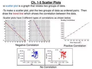
2D (x-y) plot polar plot 3D plot Plotting in the Real World Similar to graphing in Excel, we can generate plots in MATLAB to graphically display information. MATLAB has a variety of plot types available, though we will focus on 2D X-Y plots. Proper formatting allows for information to be clearly conveyed to the audience.
Today's Learning Objectives • After today’s class, students will be able to: • Create scatter plots in MATLAB with good graphing conventions (e.g., legend, line styles, title, multiple plots on same graph).
Function: plot() • Ex: >> plot(x_vec, y_vec) • Will generate a line where x_vec is the vector of x values and y_vec is the vector of corresponding y values
Plot Example Let's create two vectors and plot them! Distance = [ 2 6.5 7 7 5.5 4 6 8 ]; Intensity1 = [ 1 2 3 5 7 7.5 8 10 ]; Intensity2= [2 4 5 6 7 8 9 10]; >> plot(Intensity1, Distance)
Plot Example 1 • Vectors MUST be same length! • MATLAB defaults to blue lines without markers • Title, legend, axis labels, etc. are not included unless you give those commands
Line Specifiers • Allow you to change the type of line and markers on the plot • Refer to your book, or type: help plot for syntax and options
Let's change our plot! dashed lines red lines asterisk markers >> plot(Intensity1, Distance, '-- r *') Plot Example 2
Multiple Curves on Same Plot Multiple sets of data can be plotted together: >> plot(x1,y1,'specifiers',x2,y2,'specifiers') Let's change our plot to include both sets of intensity data: >> plot(Intensity1, Distance,'-- r *', Intensity2,Distance, ': g')
1st set of data has red dashed lines with asterisk markers 2nd set of data has green dotted lines …still no labels or title Plot Example
Plot Formatting • Title: title('Distance vs. Intensity') • Axis Labels: xlabel('Intensity , w/m^2')ylabel('Distance, m') • Legend: legend('Data Set 1', 'Data Set 2’)
Now it is nicely labeled with good graphing practices! The legend: it's in the way! Change the location: >> help legend legend('Data Set 1', 'Data Set 2', 'Location', 'SouthEast') Plot Example
Plot Example • Much better!! • Plot is properly formatted with a descriptive title, labelled axes, and a legend that is in a good location
Important Takeaways • The vectors of x and y values must be the same length to make a plot. • There are many options for line specifiers, which is useful when there are multiple curves on the same plot. • All plots must be formatted with a title, labeled axes, and legend if applicable.
Preview of Next Class • 2D Plots 2 • Plotting with fplot() command • Polar plots in MATLAB • Multiple plots in the same figure using the subplot() command
What’s Next? • Review today’s Quiz #12 • Open the in-class activity from the EEIC website and we will go through it together. • Then, start working on MAT-12 homework. • Prepare for the next class by reading about 2D Plots 2.