
Understanding Line Plots in Statistics: Data Collection and Analysis
Line plots are informative diagrams that display data along a number line, providing a visual representation of collected information. They can start from any number, not necessarily zero. In this activity, you'll create a line plot based on your personal data, such as the number of siblings and weekly hours spent on electronics. We'll explore how to determine the range of your data and identify outliers and clusters. This hands-on approach will enhance your understanding of statistics and the usefulness of visual data presentation.


Understanding Line Plots in Statistics: Data Collection and Analysis
E N D
Presentation Transcript
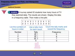
What is statistics? • When you collect, organize, and analyze data
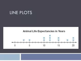
What is a line plot? • A diagram that shows data on a number line • It does not have to start at zero • You should use some sort of scale
Let’s make a line plot! • Take TWO post-it notes • On post-it #1, write the number of siblings you have. Count yourself too! • On post-it #2, write the number of hours you spend on average each week on some form of electronics (ex: cell, video games, internet)
How do I find the Range? • Range = from what number to what number does all the data fall under? • Outliers = data points that are much larger or smaller than the other data points. • Clusters = groups of data points.


![!Plots in Behror! @9211552233 [Plots on NH-8], Neemrana](https://cdn4.slideserve.com/7139500/slide1-dt.jpg)