Data - Frequency Tables and Line Plots
Data - Frequency Tables and Line Plots. Joseph Williams Modified by Charlotte Stripling. M7D1.b Construct frequency Distributions Objective : Create and interpret frequency tables and line plots. Vocabulary. Data - information, often given in the form of numbers or categories.

Data - Frequency Tables and Line Plots
E N D
Presentation Transcript
Data - Frequency Tables and Line Plots Joseph Williams Modified by Charlotte Stripling M7D1.b Construct frequency Distributions Objective: Create and interpret frequency tables and line plots.
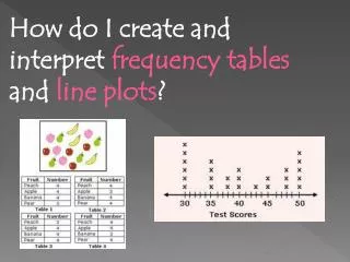
Vocabulary Data - information, often given in the form of numbers or categories. Frequency Table – a table that displays the number of times each item or category occurs in a data set. Line Plot – a number line diagram that uses X marks to show the frequencies of items being tallied.
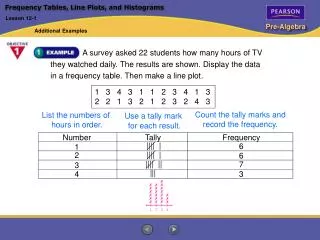
Making a Frequency Table Numerical Data: Data consisting of numbers, not categories. Numerical Questions: How many books have students read last month?
Making a Line Plot Is a visual of the frequency distribution. Line plots are NOT used for categorical data. Draw a number line whose scale starts at or before the minimum data value and stops at or after the maximum data value. Use a consistent increment.
Completed Line Plot - When the items being tallied are numbers, a line plot can be used to visually display numerical data. A line plot uses X marks above a number line to show the frequencies. The X marks above the number line show the frequencies. XXXXXX XXXXX XXXXX The Number Line shows the number of books read. XXXX XX 1 2 3 4 5 6 7 Number of Books Read
Making a Frequency Table Categorical data: data that can be placed into categories. Categorical question: What is your favorite color? NOTE: Categorical data can be shown in a frequency table but not a line plot.
Variability in Data Distributions • Outliers-Unusually high or low values in a distribution. • Clusters-An group of data values with higher frequency than surrounding values. • Gaps-Areas in the scale where there is a lack of data values.
Analyze the Data Now look at the Frequency Tables and the Line Plots from your notes to see if you can identify any outliers, clusters or gaps.