Download

1 / 33
350 likes | 382 Vues
Learn how to organize qualitative and quantitative data into frequency tables and distributions. Understand the importance of class intervals and frequency polygons for presenting data effectively.

E N D
Describing Data:Frequency Tables, FrequencyDistributions, and Graphic Presentation Chapter 2
GOALS • Organize qualitative data into a frequency table. • Present a frequency table as a “bar chart” (Excel they are called column chart) or a pie chart. • Organize quantitative data into a frequency distribution. • Present a frequency distribution for quantitative data using histograms, frequency polygons, and cumulative frequency polygons.
Mutually Exclusive • An individual, object, or measurement is included in only one category • It can’t be in two categories • Example: A particular phone call cannot originate with both AT&T and MCI
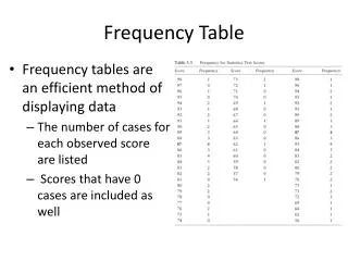
Frequency Table • Frequency Table: A grouping of qualitative data into mutually exclusive classes (categories) showing the number of observations in each class
Relative Class Frequencies • Class frequencies can be converted to relative class frequencies to show the fraction of the total number of observations in each class. • A relative frequency captures the relationship between a class total and the total number of observations.
Textbook: Bar Charts Excel: Column Chart In Excel, this is a Column chart. Column charts are good for Nominal Level Data. Notice that the columns do not touch.
Frequency Distribution A Frequency distribution is a grouping of data into mutually exclusive categories showing the number of observations in each class. • The raw data are more easily interpreted if organized into a frequency distribution • The resulting frequency distribution helps a person to quickly see the “shape” of the data • Although the frequency distribution will result in the loss of some detail, seeing patterns in the data can help a person to make better decisions
5 Steps To Organize Raw Data Into A Frequency Distribution • Step 1: Decide on Number of Classes • Step 2: Determine The Class Interval • Step 3: Set The Individual Class Limits • Step 4: Tally The Data Into Classes • Step 5: Count The Tallies in Each Class & Present the Frequency Distribution
Step 1: Determining The Number Of Classes General guidelines that are not always possible to follow. Thus, making Frequency Distributions is often refer to as an “art”. • Goal is to use just enough classes so you can see the “shape” of the data. • You must use professional judgment. • Useful recipe to determine the number of classes: 2k ≥ n n = total observations k = number of classes • Best to use 5 < k < 15
Definitions • Class Interval • Distance between lower limit of class and lower limit of the next class • The class interval is obtained by subtracting the lower limit of a class from the lower limit of the next class (also midpoint to midpoint) • Class Midpoint (Class Mark) • The midpoint can be thought of as the “typical value” for the class • This is the average of the upper and lower class limits: (Lower class limit + upper class limit)/2
Class interval should be the same for every interval If they are not equal graphs may be misleading, & calculations may be problematic In some cases, where there is a potential for many empty classes, unequal class interval may be necessary The classes all taken together must cover at least the distance from the lowest value in the raw data up to the highest value: Step 2: Determine The Class Interval Or Width
EXAMPLE – Creating a Frequency Distribution Table Ms. Kathryn Ball of AutoUSA wants to develop tables, charts, and graphs to show the typical selling price on various dealer lots. The table on the right reports only the price of the 80 vehicles sold last month at Whitner Autoplex.
Constructing a Frequency Table - Example • Step 1: Decide on the number of classes. A useful recipe to determine the number of classes (k) is the “2 to the k rule.” such that 2k> n. There were 80 vehicles sold. So n = 80. If we try k = 6, which means we would use 6 classes, then 26 = 64, somewhat less than 80. Hence, 6 is not enough classes. If we let k = 7, then 27 128, which is greater than 80. So the recommended number of classes is 7. • Step 2: Determine the class interval or width. The formula is: i (H-L)/kwhere i is the class interval, H is the highest observed value, L is the lowest observed value, and k is the number of classes. ($35,925 - $15,546)/7 = $2,911 Round up to some convenient number, such as a multiple of 10 or 100. Use a class width of $3,000
Step 3: Set The Individual Class Limits • Classes must be mutually exclusive • Avoid overlapping or unclear class limits: • Include lower limit • Exclude upper limit • Example of class limits: • $12,000 up to $15,000 and $15,000 up to $18,000 • $12,000 & $14,999 belong in the first class • $15,000 belongs in the second class • Avoid open ended classes (problems with graphing) • The lower limit of the first class should be a multiple of the class interval (not always possible) • Convenient multiples of ten are useful • You must compare the actual range to the range implied by the number of classes & class interval General guidelines that are not always possible to follow. Thus, making Frequency Distributions is often refer to as an “art”.
Constructing a Frequency Table - Example • Step 3: Set the individual class limits
Constructing a Frequency Table • Step 4: Tally the vehicle selling prices into the classes. • Step 5: Count the number of items in each class.
Observed Patterns: • Range: about $15,000 to about $36,000 • Concentration between $18,000 & $27,000 • Largest concentration is in $18,000 - $21,000 class • Typical Value = (18+21)/2 = 19.5 K. • Two sold for $33,000 or more • 8 sold for less than $18,000
Relative Frequency Distribution To convert a frequency distribution to a relative frequency distribution, each of the class frequencies is divided by the total number of observations.
Graphic Presentation of a Frequency Distribution The three commonly used graphic forms are: • Histograms • Frequency polygons • Cumulative frequency distributions
Histogram Histogram for a frequency distribution based on quantitative data is very similar to the column charts (book says: bar chart) showing the distribution of qualitative data. The classes are marked on the horizontal axis and the class frequencies on the vertical axis. The class frequencies are represented by the heights of the bars. The columns must touch in order to visually articulate that the class interval spans from lower class limit to upper class limit.
Other Notes About Histogram • Histograms constructed from Relative Frequency Distributions look the same (have the same shape), but instead, the vertical axis would show percentages • Histograms must have the columns touching: • The columns must touch in order to visually articulate that the class interval spans from lower class limit to upper class limit (a continuous variable) • For nominal or ordinal level data, the columns are not drawn adjacent to each other • The category labels are usually words
Frequency Polygon • A frequency polygon also shows the shape of a distribution and is similar to a histogram. • It consists of line segments connecting the points formed by the intersections of the class midpoints and the class frequencies.
Second Example of a Cumulative Frequency Distribution (prices of vehicles are lower)
Cumulative Frequency Polygon • Plot line on coordinate system • X-axis = Upper limit of class • Y-axis (Left) = Cumulative Frequency • Y-axis (Right) = % • First point on graph is: (lower limit of first class, 0)
Cumulative Frequency Polygon 50% of the vehicles sold for less than about $19,500
Cumulative Frequency Polygon 25 of the vehicles sold for less than about $17,500
Cumulative Frequency Polygon 80% of the vehicles sold for less than about $24,000