Pivot Tables
Pivot Tables. Need HW and exam. Why?. A pivot table gives you a way to group, summarize and compare data in a spreadsheet. You can do the same tasks with programming (COUNTIF and SUMIF), but they are much easier and faster with pivot tables.


Pivot Tables
E N D
Presentation Transcript
Pivot Tables Need HW and exam
Why? • A pivot table gives you a way to group, summarize and compare data in a spreadsheet. • You can do the same tasks with programming (COUNTIF and SUMIF), but they are much easier and faster with pivot tables. • Pivot tables really shine when applied to large file, but we will work with a small one.
Can… • Quickly summarize data • Calculate totals, averages, counts, etc. based on any numeric fields in your table • Make Data from table into charts
To start • Your data should be in a contiguous rectangular table. (Get rid of any blank rows or columns within the data .) • Every column should have a heading. (If you don't have any headers at all, right-click on the row number for the top row in the data field and choose "Insert" from the pop-up menu. You can then enter headers into the new row.)
Steps • Select your data range. (If you just select the upper left corner, and your data is contiguous and surrounded by blank rows and columns, Excel will figure it out.) • Insert the Pivot Table by going to the Insert tab and then clicking the Pivot Table icon.
Steps • Choose where you want to place the pivot table. For starters, select the New Worksheet.
The new worksheet will open • You can now generate the report from this table • You can perform various operations on this table for better visualization and presentation of data.
Place a check mark next to any fields you want to include on the PivotTable on the "Field List" that appears on the right side of the Excel window. • See pivot 1. recall: it sums by default • As you add fields, Excel will automatically place them into one of the four PivotTable areas, represented by the four small boxes at the bottom of the "Field List." (next slide)
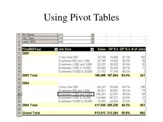
Column Labels: This area contains the fields that determine the arrangement of data shown in the columns of the pivot table. Row Labels: This area contains the fields that determine the arrangement of data shown in the rows of the pivot table. Values: This area contains the fields that determine which data are presented in the cells of the pivot table — they are the values that are summarized in its last column (summed by default). Report Filter: This area contains the fields that act as the filters for the report. So, for example, if you designate the Year Field from a table as a Report Filter, you can display data summaries in the pivot table for individual years or for all years represented in the table.
Dragging • Instead of clicking the boxes by the field names, you can drag them to the boxes at the bottom • See pivot 2
Value field settings • Pivot 3 shows how many hours I taught each term. • To see how many courses I taught each term • Click on arrow in Values section. • Select Value Field Settings. • Choose Count to count the number of entries. • Could choose average, max, min, etc.
Subcategories • Add another row label, course. • Drag semester below course to see the difference. • The minus next to the label can be clicked to collapse it. • Unclick course to delete it (or drag it back up).
Pivoting • These things are called Pivot Tables. • "Pivot" means turn. • Let's change the axes. In pivot2 swap year and semester.
Filters • You can apply a filter to your data to only see selected items • See pivot filter. I chose only specific classes • You might want to only see entries greater than or less than a certain number, or the top 10 values, etc.
Filters • Pivot 2 Click on the arrow next to Row Labels and click on Value Filters. • Then click on >=. Type 100. OK. 2014 disappears cause only 90. • Instead choose Top 10 • The box that appears gives you the choice of picking several things.
Filters • It allows you to select how many. • Select 1. • Leave Items unchanged as the next choice. • All we have is sum so leave that alone. OK. • Now it shows only 2 courses. • You can clear the filter so all the data shows again.
Pivot chart • Create a PivotChart • Open Pivot Table Tools Options tab. • Click Pivot Chart in the Tools Group. • Choose Clustered Column chart. Click OK. • Move the chart below the Pivot Table. • Save the workbook.
Resources • http://www.dummies.com/how-to/content/the-essentials-of-excel-2010-pivot-tables-and-pivo.html • http://office.microsoft.com/en-us/excel-help/create-or-delete-a-pivottable-or-pivotchart-report-HP010342375.aspx • https://www.youtube.com/watch?v=l0a0dCgFA5g • I don’t get the table skeleton that he gets, but I can drag and drop into boxes • https://www.youtube.com/watch?v=qMGILHiLqr0 • Put these in links on webpage