Quick guide to using pivot tables
Quick guide to using pivot tables. Quick guide. The following slides quickly show you how to get the information you want from pivot tables… Pivot tables are easy to use! They are flexible, so a wide range of users can get the information they want with just a few mouse-clicks!. Quick guide.


Quick guide to using pivot tables
E N D
Presentation Transcript
Quick guide • The following slides quickly show you how to get the information you want from pivot tables… • Pivot tables are easy to use! • They are flexible, so a wide range of users can get the information they want with just a few mouse-clicks!
Quick guide • This quick guide gives quick examples to show you how to • Filter pivot tables • Delve deeper into the data • View figures as percentages • This document uses the ‘Detailed Demographic Trend Data’ file for demonstration purposes, which can be downloaded from the following page: • Detailed Trend Data • You may find it useful to open the file and follow the steps as this guide takes you through them
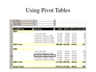
Filtering tables • I want to know how many visitors came to ‘visit friends and relatives’ (VFR) between 2000 and 2007. • 1. Click on the filter ‘down’ arrow by the ‘purpose’ variable. • 2. Select VFR from the drop-down list and then press ‘OK’. • 3. The ‘VFR’ figures will be displayed in the table 1 2
Delving Deeper into the data • I want to view the VFR figures alongside the other ‘journey purposes’. • Simply drag the ‘purpose’ variable into the left hand side of the pivot table. • The ‘VFR’ figures will be displayed in the table alongside the other ‘journey purposes’
Delving Deeper into the data • To delve even deeper into the data you can filter the table in the same way as before or drag more variables. Filter the tables to look at data for visitors from the USA, for example Or drag more variables if you want to look at gender within purpose, for example
Viewing figures as percentages • You’ll notice that the Excel file has an additional worksheet called ‘Demographic Trends %’. Click on the tab at the bottom of the page to view this sheet. At first, the male + female percentages don’t quite add up to 100% because some responses were blank or D/K. Filter the gender tab to remove D/K and blank responses to remove them from the base size Drag the ‘gender’ variable into the left hand side of the pivot table • One again, you can dig deeper into the data by dragging additional variables or filtering the tables
Quick guide • The following slides quickly show you how to display different splits of trend data using pivot charts • Pivot charts are easy to use! • They are flexible, so a wide range of users can get the information they want with just a few mouse-clicks!
Quick guide • This quick guide gives quick examples to show you how to • Filter the chart to only show the data for visitors that you are interested in • Add more series to the chart • This document uses the following data file for demonstration purposes: • Detailed Trend Data 2000-2007P • You may find it useful to open the file and follow the steps as this guide takes you through them
Simple Filtering (1) • I am interested in seeing how visits, nights and spend have changed over the last few years for the Spanish market • 1. Click on the ‘Country of Residence Chart’ worksheet to view the pivot chart. • 2. Click on the filter ‘down’ arrow by the ‘country’ variable. • 3. Select ‘Spain’ and click OK • The chart will show figures for visits, nights, and spend from Spanish residents 2 3 1
Simple Filtering (2) • I want to use the chart in a presentation, but only want to show the visits and spend figures on the chart • 1. Click on the filter ‘down’ arrow on the ‘Data’ list • 2. Deselect ‘Nights’ and ‘Sample’ so that only ‘Visits’ and ‘Spend’ are selected. Click OK. • The chart will update to reflect the changes • 3. Click on the ‘Chart Title’ to change it to something relevant! • Make any cosmetic changes necessary and then copy and paste the chart into your presentation 3 1 2
Adding series to the chart (1) • We can now see how Spanish residents’ visits to the UK and spend in the UK have changed over the last few years but I now want to compare visits and spend data for Spanish residents with visitors from Canada and India. • 1. Drag the ‘Country’ variable over to the right hand side of the chart • This will add many extra data series to the chart – it will look like a mess at first so we need to remove the ones we do not want to display! • Move onto the next slide to see how to do this… 1
Adding series to the chart (2) • We need to remove all the data series that we do not want to display, and only display Canada, Spain, and India. • 1. Click on the filter ‘down’ arrow on the ‘Country’ list • 2. Deselect ‘Show All’ to deselect all the countries from the list. Tick on the (now empty) boxes next to Canada, Spain, and India to select them. Click on OK. • Now only the data series for Canada, Spain, and India will be displayed • Make any cosmetic changes to the chart if necessary 1 2