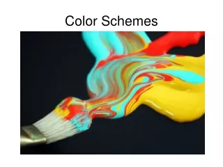
COLOR SCHEMES
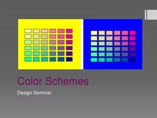
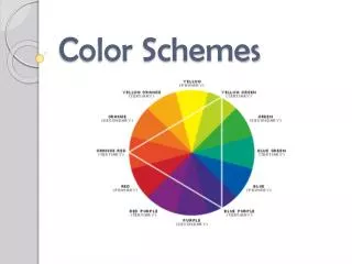
COLOR SCHEMES. Color Schemes/Harmonies. Color harmonies are the choice of colors used in design Color harmonies affect our feelings, perceptions and interactions Color harmonies create style and appeal . Using one color, and tints, tones and shades of that color. monochromatic.
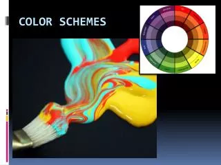

COLOR SCHEMES
E N D
Presentation Transcript
Color Schemes/Harmonies • Color harmonies are the choice of colors used in design • Color harmonies affect our feelings, perceptions and interactions • Color harmonies create style and appeal
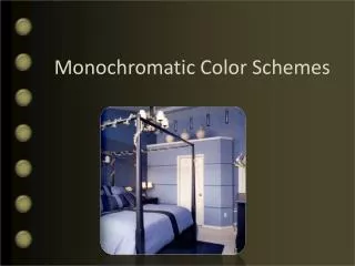
Using one color, and tints, tones and shades of that color monochromatic
Using colors next to each other On the color wheel analogous
Using colors opposite each other on the color wheel Complementary
DOUBLE COMPLEMENTARY Using two sets of complementary colors
SPLIT COMPLEMENTARY Using one color, and the colors on either side of it’s complement
TRIAD Using three colors equal distance from each other on the color wheel
NEUTRAL Using whites, black, grays and beiges
ACCENTED-NEUTRAL • Small amounts of another color(s) added to a neutral color scheme to give the room more interest. • Example: black, white, red
WARM COLORS • Colors on the warm side of the spectrum…red, yellow, and orange. • Close in a space, create feelings of warmth, activity and excitement
COOL COLORS Colors on the cool side of the spectrum…blue, violet, and green. Cool colors expand a space, create feelings of cool, calm and relaxed
Once you have considered factors that affect your color choices… • Begin with a color concept, such as a dominant color. • Favorite color, color of a rug, piece of furniture, color that sets the desired mood to create. • Rule of thumb: • Avoid too much and too little color • Large quantities of intense color can overpower
Remember the factors that affect color choices…… • Mood • What mood do you want to create • People • Think about the people who will be in the area • Style • The style may influence the color choice(s).Spanish style = rust colored walls • Items in the room • Choose an item in the room, and one of it’s colors as the main color for your room. Then choose accent colors based on your knowledge of color schemes. • Time • The amount of time that will be spent in the room • Existing Colors • Some room components can’t be changed so incorporate them. • Adjacent Rooms • Create a unified look with rooms that you can see. • Lighting • Natural light shows objects in true colors. Artificial lights make color appear blue or yellow
Using Color Correctly • Colors seem more intense when applied to large areas. Choose a color several tints lighter than the color actually desired. • Using contrasting colors draws attention. Remember, too many strong contrast values in a room can be confusing and tiring. • Choosing colors that have similar values will create a restful mood in the room. • Color schemes/harmonies look better when one color, the base color, dominates. When you use equal amounts of two or more colors, your eyes become confused and your color selection seems cluttered
The value of a hue changes the apparent size of a room. • Dark ceiling (dull) appears lower and closer and light (bright) colored walls appear further away. • If a room is small, choose colors that will make the room appear larger. (tints, low-intensity colors, and cool hues) • Lighter walls makes it appear larger • If a room is very large, choose colors that will make it look smaller. (Shades, high-intensity colors, and warm hues) • Darker walls make a room appear smaller • Bright colors convey an informal environment • Use High-intensity colors in small amounts such as accent colors in accessories or small pieces of furniture. • Black unifies when a number of colors are used.
Which colors would you use in the following places? • Hospital Recovery Room • Meat Store • Visiting Football Teams Locker Room • Fast Food Restaurant • Fine Dining Restaurant • Bedroom • Child’s Play Room
Portfolio Page Assignments • You will choose 4 of the following color schemes and do portfolio pages like we have done in the past. • Warm Colors Complementary • Cool Colors Triad • Monochromatic Neutral • Analogous Accented Neutral Each page will have a title identifying the color scheme mounted at the top of the page. Each page will have a complete sentence describing the color scheme and where it is seen &/or how it is used mounted at the bottom. Each page will have a miniature color wheel with the color scheme colored and mounted.