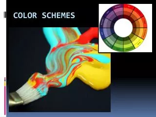
COLOR SCHEMES
COLOR SCHEMES. COLOR SCHEMES Definition: http://en.wikipedia.org/wiki/Color_scheme. In color theory, a color scheme is the choice of colors used in design for a range of media. For example, the use of a white background with black text is an example


COLOR SCHEMES
E N D
Presentation Transcript
COLOR SCHEMESDefinition: http://en.wikipedia.org/wiki/Color_scheme In color theory, a color scheme is the choice of colors used in design for a range of media. For example, the use of a white background with black text is an example of a basic and commonly default color scheme in web design.
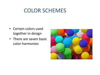
COLOR SCHEMESDefinition: http://en.wikipedia.org/wiki/Color_scheme Color schemes are used to create style and appeal. Colors that create an aesthetic feeling when used together will commonly accompany each other in color schemes. A basic color scheme will use two colors that look appealing together.
COLOR SCHEMESDefinition: http://en.wikipedia.org/wiki/Color_scheme Color schemes can also contain different shades of a single color; for example, a color scheme that mixes different shades of green, ranging from very light (almost white) to very dark.
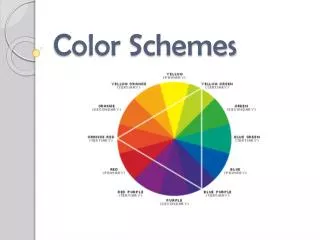
COLOR SCHEMESDefinition: http://www.color-wheel-pro.com/color-schemes.html The monochromatic color scheme uses variations in lightness and saturation of a single color. This scheme looks clean and elegant. Monochromatic colors go well together, producing a soothing effect. The monochromatic scheme is very easy on the eyes, especially with blue or green hues. The primary color can be integrated with neutral colors such as black, white, or gray. Pros: The monochromatic scheme is easy to manage, and always looks balanced and visually appealing. Cons: This scheme lacks color contrast. It is not as vibrant as the complementary scheme. Tip: Use tints, shades, and tones of the key color to enhance the scheme.
COLOR SCHEMESDefinition: http://www.color-wheel-pro.com/color-schemes.html The analogous color scheme uses colors that are adjacent to each other on the color wheel. One color is used as a dominant color while others are used to enrich the scheme. Pros: The analogous color scheme is as easy to create as the monochromatic, but looks richer. Cons: The analogous color scheme lacks color contrast. It is not as vibrant as the complementary scheme. Tips: Avoid using too many hues in the analogous scheme, because this may ruin the harmony. Avoid combining warm and cool colors in this scheme.
COLOR SCHEMESDefinition: http://www.color-wheel-pro.com/color-schemes.html The triadic color scheme uses three colors equally spaced around the color wheel. This scheme is popular among artists because it offers strong visual contrast while retaining balance, and color richness. The triadic scheme looks more balanced and harmonious. Pros: The triadic color scheme offers high contrast while retaining harmony. Cons: The triadic color scheme is not as contrasting as the complementary scheme. Tips: Choose one color to be used in larger amounts than others. If the colors look too showy, try to subdue them.
COLOR SCHEMESDefinition: http://www.color-wheel-pro.com/color-schemes.html The complementary color scheme is made of two colors that are opposite each other on the color wheel. This scheme looks best when a warm color is against a cool color. When using the complementary scheme, it is important to choose a dominant color and use its complementary color for accents. Pros: The complementary color scheme offers stronger contrast than any other Color scheme, and draws maximum attention. Cons: This scheme is harder to balance than monochromatic and analogous schemes, especially faded warm colors are used. Tips: For best results, place cool colors against warm ones, for example, blue versus orange. Avoid using faded warm colors (e.g. browns or dull yellows).
COLOR SCHEMESDefinition: http://www.color-wheel-pro.com/color-schemes.html The split complementary scheme is a variation of the standard complementary scheme. It uses a color and the two colors adjacent to its complementary. This provides high contrast without the strong tension of the complementary scheme. Pros: The split complementary scheme offers more nuances than the complementary scheme while retaining strong visual contrast. Cons: The split complementary scheme is harder to balance than monochromatic and analogous color schemes. Tips: Use a single warm color against a range of cool colors to put an emphasis on the warm color (red versus blues and blue-greens, or orange versus blues and blue-violets). Avoid using faded warm colors (e.g. browns or dull yellows), because this may ruin the scheme.
COLOR SCHEMESMoment of mindfulness… "There is no blue without yellow and without orange.“ by Vincent van Gogh "Colors are the smiles of nature.“ by Leigh Hunt