Exploring Color Harmony in Art
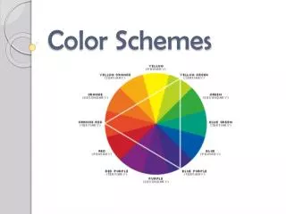
Discover the fascinating world of color schemes in art history, from primary and secondary to complementary and analogous. Explore works by Fernand Léger and Paul Cezanne, and learn about the relationships between red, yellow, blue, green, orange, and violet hues. Delve into tertiary and analogous colors in Bet Borgeson's vibrant pieces.

Exploring Color Harmony in Art
E N D
Presentation Transcript
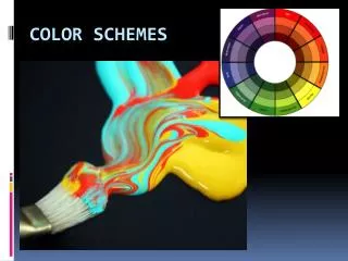
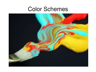
Color Schemes Primary Secondary Complementary Analogous Warm Cool
Red Yellow Blue Primary Fernand Le'ger, The Card Game, 1917, 50x76
Secondary Green Orange Violet Paul Cezanne, Mont Saint-Victoire, 1904
Complementary Colors Color Opposites
RedGreen YellowViolet Blue Orange
Tertiary Colors Intermediate Colors
Primary + Secondary Tertiary
Analogous Similar Colors Bet Borgeson, Garden Hydrangeas, 1982, Color pencil on gesso
Close Up Bet Borgeson, Garden Hydrangeas, 1982, Color pencil on gesso


