Download

1 / 13
130 likes | 273 Vues
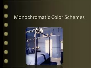
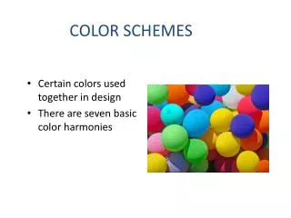
Monochromatic color schemes utilize variations in lightness and saturation of a single color to create a clean and elegant look. This approach is visually soothing, especially with hues like blue or green, and integrates well with neutrals such as black, white, or gray. While it ensures balance and ease of management, it may struggle with highlighting key elements due to a lack of contrast. Tips include using tints and shades, and exploring analogous schemes for more depth while maintaining simplicity.

E N D
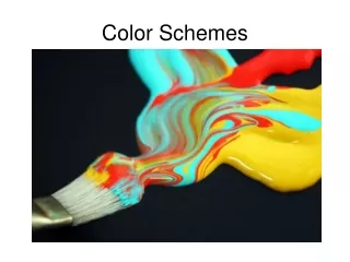
Monochromatic color scheme Examples: The monochromatic color scheme uses variations in lightness and saturation of a single color. This scheme looks clean and elegant. Monochromatic colors go well together, producing a soothing effect. The monochromatic scheme is very easy on the eyes, especially with blue or green hues. You can use it to establish an overall mood. The primary color can be integrated with neutral colors such as black, white, or gray. However, it can be difficult, when using this scheme, to highlight the most important elements. Pros:The monochromatic scheme is easy to manage, and always looks balanced and visually appealing. Cons:Thisscheme lacks color contrast. It is not as vibrant as the complementary scheme. Tips: 1. Use tints, shades, and tones of the key color to enhance the scheme. 2. Try the analogous scheme; it offers more nuances while retaining the simplicity and elegance of the monochromatic scheme.
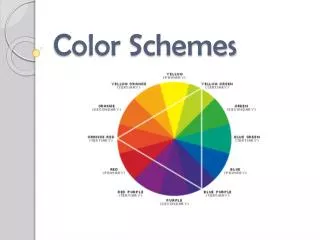
Analogous color scheme Examples: The analogous color scheme uses colors that are adjacent to each other on the color wheel. One color is used as a dominant color while others are used to enrich the scheme. The analogous scheme is similar to the monochromatic one, but offers more nuances. Pros:The analogous color scheme is as easy to create as the monochromatic, but looks richer. Cons:Theanalogous color scheme lacks color contrast. It is not as vibrant as the complementary scheme. Tips: 1. Avoid using too many hues in the analogous scheme, because this may ruin the harmony. 2. Avoid combining warm and cool colors in this scheme.