Download
1 / 10
170 likes | 501 Vues
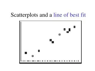
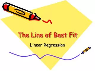
Unit #2: Exploring Data. Scatterplots and Finding a Line or Curve of Best Fit. Trend Line. Scatter Plot – a graph that relates two groups of data. What does this trend tell us about grades and how much TV you watch?. Positive Correlation – both sets of data increase together.

E N D
Unit #2: Exploring Data Scatterplots and Finding a Line or Curve of Best Fit
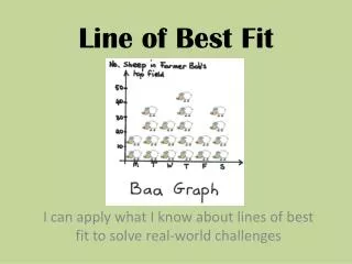
Trend Line Scatter Plot – a graph that relates two groups of data. What does this trend tell us about grades and how much TV you watch?
Positive Correlation – both sets of data increase together. Negative Correlation – one set of data increases, while the other decreases. There are 3 kinds of scatter plot correlations: No Correlation – when the data doesn’t seem to be related.
What kind of correlation would you expect between the following data sets? • A person’s age and the number of pets he/she has • The number of times you brush your teeth and the number of cavities you have • The number of days it rains in a year and the number of umbrellas sold
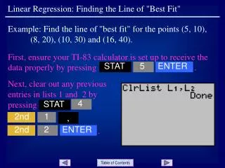
Using the GC to make a scatterplot : • Go to STAT and enter your x values under L1 and your y values under L2 • Go to STATPLOT, hit 1 key • Turn Plot 1 ON, highlight the Scatterplot • For X List, enter L1 • For Y List, enter L2 • Pick any symbol under Mark • Choose Zoom 9
Using the GC to find a best-fit line (after doing the scatterplot): y=ax+b • Go to STAT and choose CALC, press 4 for linreg • Press enter • Record a and b and write equation y=ax+b • Go to Y= and enter the line equation. • Press GRAPH
Your screen should say that a=1.04… and b=3.695… This is in the form of y = ax + b. • What is the equation of the best-fit line? • Using your equation, estimate the height of the seedling at 8 days and at 17 days.
Enter each of the points in your GC. • Find the equation of the best-fit line. • Using your equation, estimate the number of subscribers in the year 2000 and in the year 2008.
Line of Best Fit for Quadratic Data in GC Data values for our scatterplot: (4, 3.1), (5, 4.74), (6, 6.13), (7, 7.26), (8, 8.14), (9, 8.77), (10, 9.14), (11, 9.26), (12, 9.13), (13, 8.74), (14, 8.1) To find the quadratic curve of best fit, choose 5:QuadReg under STAT/CALC Predict the value for y when x is 3. Predict the value for y when x is 16.
1. Find the quadratic equation that best fits this data.2. What is your estimate for the population in 1955?3. What is your prediction for the population in 2020?