Download
1 / 8
80 likes | 204 Vues
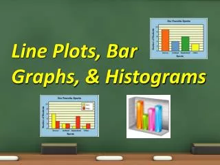
This guide explores the essentials of bar graphs and histograms, two fundamental tools in data visualization. Bar graphs represent categorical data using solid bars, making it easy to compare quantities—like the number of students walking to school across various states. In contrast, histograms illustrate the frequency of numerical data organized into intervals, like the winning scores of recent Super Bowl games. Learn to distinguish between the two, understand their applications, and discover key concepts like mean, median, mode, and outliers for better data analysis.

E N D
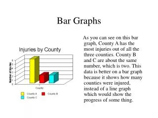
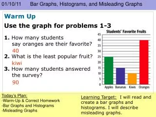
Bar Graph • Uses solid bars to represent quantities • Don’t forget the title and labels! • Ex: Students that walk to school
How many states have you traveled to? (We can all count Missouri!)
Histogram • Uses bars to represent the frequency of numerical data that have been organized into intervals
Histogram EX: The winning scores of recent Super Bowl games have been organized in this frequency table.
What’s the difference? • Bar Graphs show categorical data • Histograms show numerical data in intervals
Let’s Review! • Line Plot • Stem-and-Leaf Plot • Mean • Median • Mode • Range • Cluster
S’more! • Gap • Statistics • Outlier • Measure of Central Tendency • Key • Bar Graph • Histogram