Bar Graphs and Line Graphs
This guide covers the essentials of bar graphs and line graphs, showcasing how they effectively display and compare data. Bar graphs can be vertical or horizontal, useful for answering questions about data sets such as average temperatures or ticket sales. It includes step-by-step instructions for creating both bar and double-bar graphs, as well as a detailed explanation of line graphs for showing changes over time. Each section contains practical examples to help solidify understanding, making it ideal for students and educators.

Bar Graphs and Line Graphs
E N D
Presentation Transcript
VOCABULARY A bar graph can be used to display and compare data. A bar graph displays data with vertical or horizontal bars.
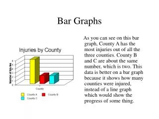
Additional Example 1: Reading a Bar Graph Use the bar graph to answer each question. Which biome in the graph has the least average summer temperature?
Example 2: Reading a Bar Graph Use the bar graph to answer each question. Which biomes in the graph have an average summer temperature of 30 C or greater?
Example 3: Making a Bar Graph Use the given data to make a bar graph. Step 1: Find an appropriate scale and interval. The scale must include all of the data values. The interval separates the scale into equal parts. Step 2: Use the data to determine the lengths of the bars. Draw bars of equal width. The bars cannot touch. Step 3: Title the graph and label the axes.
Tickets Sold Grade 8 Grade 7 Grade 6 215 285 310 Example 4 Use the data to make a bar graph.
VOCABULARY A double-bar graph shows two sets of related data.
Club Memberships Club Art Music Science Boys 12 6 16 Girls 8 14 10 Example 5: Problem Solving Application Make a double-bar graph to compare the data in the table.
Club Memberships Club Band Chess Year Book Boys 9 14 16 Girls 11 7 15 Example 6 Make a double-bar graph to compare the data in the table.
VOCABUALRY Data that shows change over time is best displayed in a line graph. A line graph displays a set of data using line segments.
Population of New Hampshire Year Population 1650 1,300 1670 1,800 1690 4,200 1700 5,000 Example 7: Making a Line Graph Use the data in the table to make a line graph.
Example 8: Reading a Line Graph Use the line graph to answer each question. A. In which year did CDs cost the most? B. About how much did CDs cost in 2000? C. Did CD prices increase or decrease from 1999 through 2002?
Example 9 Use the line graph to answer each question. A. In which year did CDs cost the least? B. About how much did CDs cost in 1999? C. Did CD prices increase or decrease from 2001 to 2002?
VOCABULARY Line graphs that display two sets of data are called double-line graphs.
Stock Prices 1985 1990 1995 2000 Corporation A $16 $20 $34 $33 Corporation B $38 $35 $31 $21 Helpful Hint Use different colors of lines to connect the stock values so you will easily be able to tell the data apart. Example 10: Making a Double-Line Graph Use the data in the table to make a double-line graph.