Bar Graphs
Bar Graphs. Bar Graph or Double Bar Graph (REVIEW). A bar graph uses length of bars to represent numbers and COMPARE data. In some cases, the use of a pair of bars to compare data is more useful. This kind of graph is called a double bar graph. How do you make a bar graph?.


Bar Graphs
E N D
Presentation Transcript
Bar Graph or Double Bar Graph (REVIEW) • A bar graph uses length of bars to represent numbers and COMPARE data. • In some cases, the use of a pair of bars to compare data is more useful. This kind of graph is called a double bar graph. MathisFun.Com- Organizing and Comparing Data; Math on Call p. 262-313
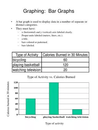
How do you make a bar graph? • Create a title • Draw an x and y axis (LABEL what each one represents!) • Plot the information given onto the graph Example: Last week’s temperatures in degrees Fahrenheit were: Monday- 45 Tuesday- 60 Wednesday- 48 Thursday- 55 Friday- 56 Saturday- 68 Sunday- 70 Let’s make that into a bar graph.
It should look like this: degrees (Fahrenheit) day of the week
How do you make a double bar graph? Last week’s temperatures in degrees Fahrenheitwere: Monday- 45 Tuesday- 60 Wednesday- 48 Thursday- 55 Friday- 56 Saturday- 68 Sunday- 70 Last week’s temperature in degrees Celsius were Monday- 7 Tuesday- 16 Wednesday- 9 Thursday- 12 Friday- 13 Saturday- 20 Sunday- 21 A double bar graph is used to compare two things at once using the same graph. To create a double bar graph you have to… Create a title Draw an x and y axis (LABEL what each one represents!) Make a key to represent what each of the different bars stand for Plot the information given onto the graph
It should look like this: temperature (in degrees) day of the week Based on the graph answer these questions: Which day of the week was the hottest in degrees Fahrenheit? Which day of the week was the coldest in degrees Celsius?
Histogram (REVIEW) • Histograms show how often data falls into different ranges or intervals. MathisFun.Com- Organizing and Comparing Data; Math on Call p. 262-313
How do you make a histogram? Histograms are VERY similar to bar graphs and double bar graphs but: • There are NO gaps between the bars in a histogram. • The x axis is measured in intervals or ranges. • Make a title • Draw an x and y axis (LABEL what each one represents!) • Make sure your x axis is in intervals • Plot the information given onto the graph
EXAMPLE: You asked customers who bought one of the blue dresses how old they were. The ages were from 5 to 25 years old. You decide to put the results into groups of 5. Then you put the data you collected onto a histogram. Blue Dress Poll number of dresses ages