Bar Graphs
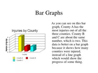
Bar Graphs. A Bar Graph compares categorical variable(s) with a quantitative variable. The categorical variable goes on the X axis, and the quantitative goes on the Y axis. For example…. Categorical Variable : Borough. Quantitative Variable : Percent of Hispanics (Dominican).


Bar Graphs
E N D
Presentation Transcript
A Bar Graph compares categorical variable(s) with a quantitative variable. The categorical variable goes on the X axis, and the quantitative goes on the Y axis.
For example… Categorical Variable: Borough Quantitative Variable: Percent of Hispanics (Dominican)
A bar graph can also compare two categorical variables with a quantitative variable: Categorical Variables: Borough Hispanic Nation of Origin Quantitative Variables: Percent of total Hispanics, by NOO
You can/should change the scale on the Y axis based on the range of your data
If you have two or more sets of quantitative data that combined equal 100%, you can also make a Segmented Bar Graph