
Uploaded by
dayo
0 SLIDES
206 VUES
0LIKES
Line Graphs
DESCRIPTION
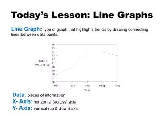
Line Graphs . ...and when to use them. Line Graph . A line graph shows data that change over time. This graph shows, how the number of hours teens spent listening to the radio each week, changed from 1998 to 2003. Line Graph .
Download

1 / 0
Télécharger la présentation 
Line Graphs
An Image/Link below is provided (as is) to download presentation
Download Policy: Content on the Website is provided to you AS IS for your information and personal use and may not be sold / licensed / shared on other websites without getting consent from its author.
Content is provided to you AS IS for your information and personal use only.
Download presentation by click this link.
While downloading, if for some reason you are not able to download a presentation, the publisher may have deleted the file from their server.
During download, if you can't get a presentation, the file might be deleted by the publisher.
E N D
Presentation Transcript
-
Line Graphs
...and when to use them - Line Graph A line graph shows data that change over time. This graph shows, how the number of hours teens spent listening to the radio each week, changed from 1998 to 2003.
- Line Graph From 1998 to 1999, the line segment goes up to the right. This shows that the listening time increased.
- Line Graph From 1999 to 2003, each line segment goes down to the right. This shows that the listening time decreased.
- Line Graph In 1998, teens spent about 11 h listening to the radio. By 2003, this had decreased to about 8.5 h. The overall decrease from 1998 to 2003 was: 11 h-8.5 h=2.5 h
- Line Graph We can infer that teens’ radio listening has declined since 1999.
-
Bar Graphs
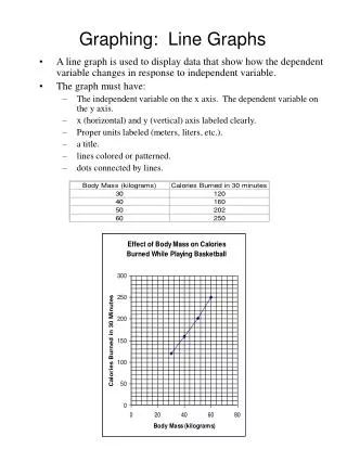
...and when to use them - Bar Graphs This graph show how much time people spend watching TV each week. Age Groups Hours Watched Each Week
- Bar Graphs From the graph: Adult women watch about 26 h of television each week Age Groups Hours Watched Each Week
- Bar Graphs From the graph: Teens watch about 14 h Age Groups Hours Watched Each Week
- Bar Graphs From the graph: Adult men watch about 21 h of TV Age Groups Hours Watched Each Week
- Bar Graphs We can infer that adult women watch almost twice as much TV each week as teens. Age Groups Hours Watched Each Week
- Bar Graphs Adult men watch about 7 h more TV than teens Age Groups Hours Watched Each Week
-
Circle Graphs
...and when to use them - Circle Graphs In a circle graph, data are shown as parts of a whole. This graph shows the types of radio stations people listen to.
- Circle Graphs Adult Contemporary is about ¼ (25%) of the circle. We infer that about ¼ of people 12 years and older who listen to the radio are tuned to adult contemporary stations.
- Circle Graphs Each of CBC, Country, and Talk has about the same share of the listening audience, about 1/10 (10%).
- Circle Graphs We infer that about ½ (50%) of the listening audience to CBC, country, talk, or rock radio stations.


More Related